Summer 2012
A disappointing splash

Making Wet: The Magazine of Gourmet Bathing
By Leonard Koren. Designed by Esmilia Burchiellaro and Leonard Koren Imperfect Publishing, £24.95

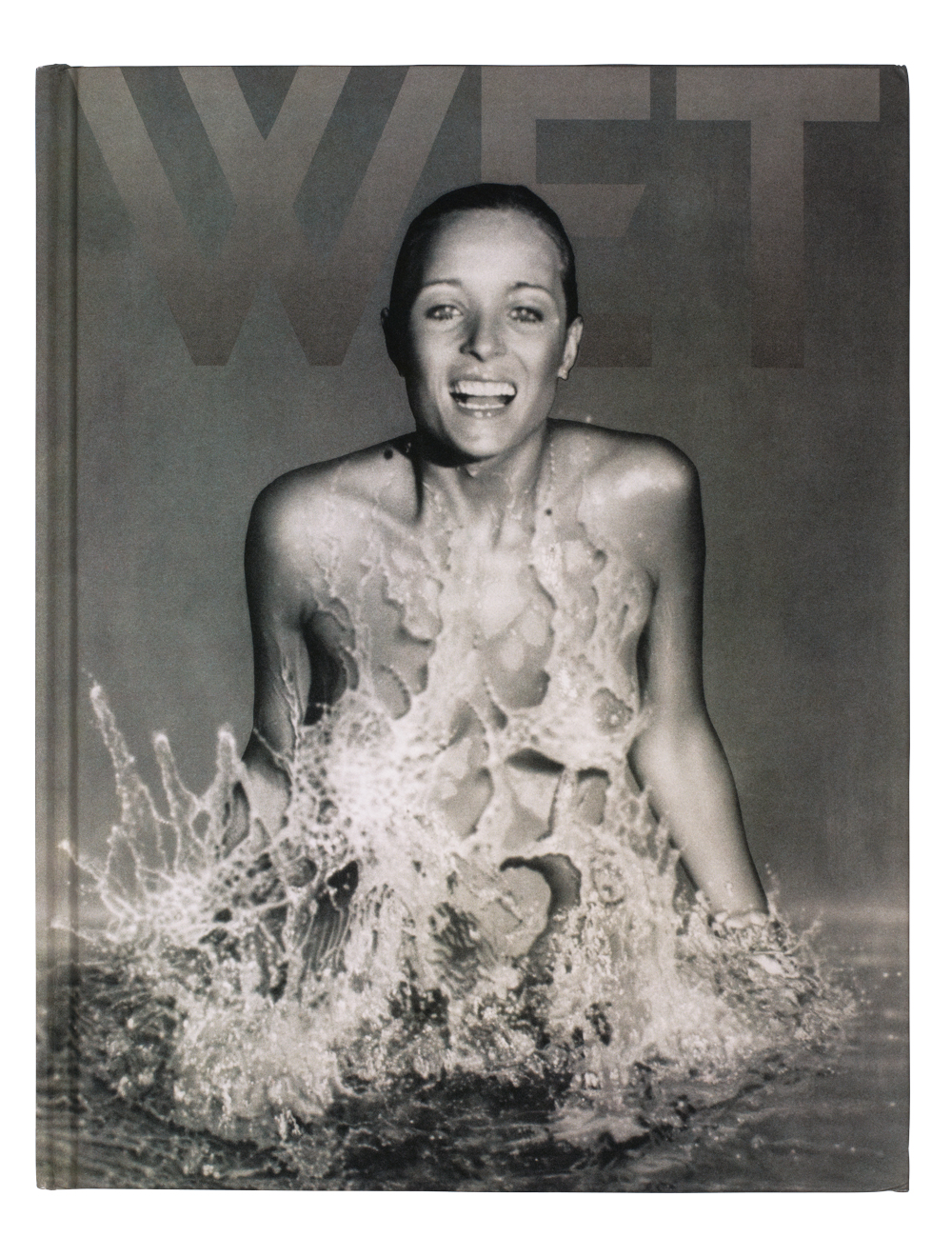
The archly titled Wet: The Magazine of Gourmet Bathing has a semi-legendary reputation as both an off-the-wall publishing venture and a graphic artefact. The crazy idea of Leonard Koren, who had studied architecture and art, it was published mainly in Venice, California from 1976 to 1981. When Wet is shown in graphic histories, it is usually reduced to just two or three covers, the most famous of which is April Greiman and Jayme Odgers’ shrine-like image of the teen idol Ricky Nelson for the ‘Religion’ issue (#20) – I have illustrated it this way myself. Even in the US, Wet has been hard to see; anywhere else it is close to impossible.
This makes a whole book about Wet something of an event: a chance to assess at last whether the magazine lives up to rumours of its status as a trailblazer. Koren has published it himself and his text is a vivaciously written and amusing memoir of what sound like great times working on the issues. ‘At dawn there was always a pleasant burned-out moment; the music gave way to silence, and the eight or nine of us assembled savoured the violet-tinged gloom to the accompaniment of awakening sea birds.’ Just like all-nighters in the Eye office.
A spread showing a poster designed by Leonard Koren, using a photograph by Larry Williams, for a Wet event in Los Angeles ca. 1977. Top: cover uses a Guy Fery photograph from Wet's July/August 1978 issue.
The book has no independent assessments of Wet and this lack of perspective on what might be interesting about the magazine 30 years later seriously limits its usefulness when it comes to visual understanding. Only 19 of the 34 covers are shown (Nelson is missing) and almost every cover and spread appears as a full page bleed, making it impossible to gauge what the issues felt like as objects. A mere two text pages are reproduced and there are no sequences to show developing approaches to typography and layout – random photos on Flickr give a slightly better impression. Instead, Koren and his co-designer, Emilia Burchiellaro, favour full and double-page photographs and drawings, with a minimum of page furniture. The postmodern graphic new-waveness of the magazine comes across mainly from the covers.
It’s such a bizarre evisceration of a bellwether project that one wonders whether copyright issues, or contributors refusing to participate, dictated the selection. Inevitably, there are plenty of pictures of people taking goofy baths, but despite the inclusion of celebrity covers (Debbie Harry, Richard Gere) there is no strong sense from either the illustrations or text of Wet’s later commitment to pop culture. Star music writer Kristine McKenna conducted interviews with Brian Eno, Captain Beefheart, Nico, Iggy Pop and David Byrne, and Wet published pieces on Robert Smithson, Kenneth Anger and David Lynch. The magazine’s fan site (wunderland.com) is a better guide to the issues’ contents. This retrospective is not the gem it could have been.
First published in Eye no. 83 vol. 21 2012
Eye is the world’s most beautiful and collectable graphic design journal, published quarterly for professional designers, students and anyone interested in critical, informed writing about graphic design and visual culture. It is available from all good design bookshops and online at the Eye shop, where you can buy subscriptions, back issues and single copies of the latest issue.


