Summer 2017
Bruce Rogers in the twentieth century

The Noblest Roman: A History of the Centaur Types of Bruce Rogers
By Jerry Kelly and Misha Beletsky<br> David R. Godine, $45<br>

The Centaur types are arguably the greatest achievement of the Indiana-born typographer and book designer Bruce Rogers (1870-1957). In The Noblest Roman – which continues the long association of Bruce Rogers research with staff at the Cary Graphic Arts Collection at Rochester Institute of Technology in New York – Jerry Kelly and Misha Beletsky set out to give the definitive history of Centaur’s many versions and revisions, with particular focus on the foundry type and hot-metal type. The introduction offers several reasons why further study is justified, including the complex origination of the design, issues about ownership of the design and type materials over the years, and deviation from normal procedures in the creation of a version for Monotype composition. The authors’ research has uncovered more information about the story than was previously known, and type design historians will welcome their detailed account.
Early sections establish the importance of the roman types of Nicolas Jenson of Venice in the fifteenth century – admired for their proportions, spacing and elegance. William Morris selected Jenson’s type as the model for his ‘ideal’ roman, reinventing them in his Golden Type in 1890. Morris in turn influenced Rogers’ early work. In 1902 Rogers drew his own Jenson-based adaptation, which became the Montaigne typeface. He returned to the Jenson models over ten years later, hoping that the new pantographic punchcutting machine would improve the misinterpretations the punchcutter had made with Montaigne. The Centaur foundry type was cast for the exclusive use of the Metropolitan Museum of Art in New York, although Rogers was entitled to use it, too. The 14-point capital letters were first used in 1914 by the Museum, and the complete font was cast in 1915; a further seven sizes, of capitals only, were cut later. Rogers first used the type in 1915 for an edition of The Centaur, a short prose work by the French poet Maurice Guérin – hence the type’s name.
The authors untangle complex information about the dates, terms and conditions of usage, and ownership of the design and fonts. They put forward considered arguments, backed up by evidence from correspondence, agreements, and other documents in the Museum’s archives, regarding disputed matters, such as who initiated the design of Centaur: Henry Watson Kent at the Met, or Rogers himself?
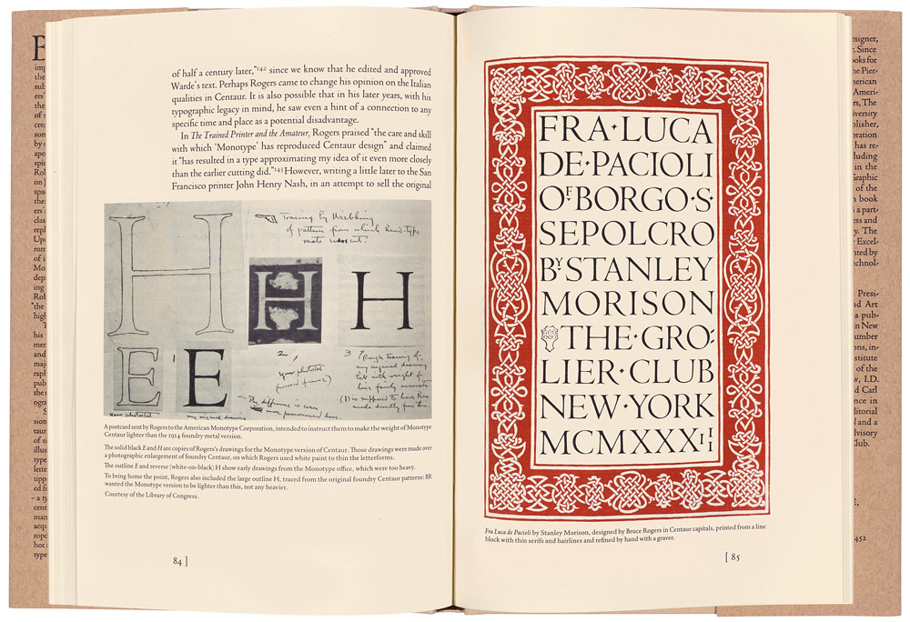
In 1928, when he was living in England, Rogers supervised the creation of a version of Centaur for the Monotype Corporation’s typesetting machines. The authors have found evidence that the creation of Centaur was an interesting exception to established Monotype practices: American Monotype started the process of making Centaur by making three trial cuttings; but the drawings and proofs of trial cuttings were then transferred to Monotype’s English company. The American company also remained in the picture during the development and even received matrices, although Centaur was never released by them. It is interesting to learn that Rogers intended Monotype Centaur to be lighter in weight than the original foundry version. Monotype released the first of seventeen sizes in England in 1929 – the first time that Centaur was available to the printing trade. Frederic Warde’s Arrighi italic type was cut to accompany Centaur roman for Monotype composition, having previously been successfully paired with it as a foundry type. Rogers used Monotype Centaur for his design of the Oxford Lectern Bible of 1935, often regarded as the most outstanding use of the type.
Centaur was subsequently adapted to photocomposition and digital typesetting technology with Monotype – as well as being adapted for a small tape-operated composing machine called a Justowriter in the late 1940s. The life of the foundry type materials is revealed beyond the closure of the Museum press in 1949.
At points during the book there are chances to make useful visual comparisons between different types: type specimens of Morris’ Golden Type, Rogers’ Montaigne, foundry Centaur and Monotype Centaur can be compared with other typefaces that take Jenson as their model. The book also includes a small selection of pages by notable designers who have employed Centaur, and a list of books printed in the original foundry Centaur type.
The volume is beautifully designed and printed and has many illustrations, including a letterpress print from freshly cast foundry Centaur capitals. The images are large enough to allow interpretation
of the details of letterforms; for a few of them, such as Rogers’ and Warde’s original artwork for Centaur and Arrighi, it would have been nice to know the measurements. The book is set in digital versions of Centaur – the body text is co-author Jerry Kelly’s recent digital rendering
of foundry Centaur.
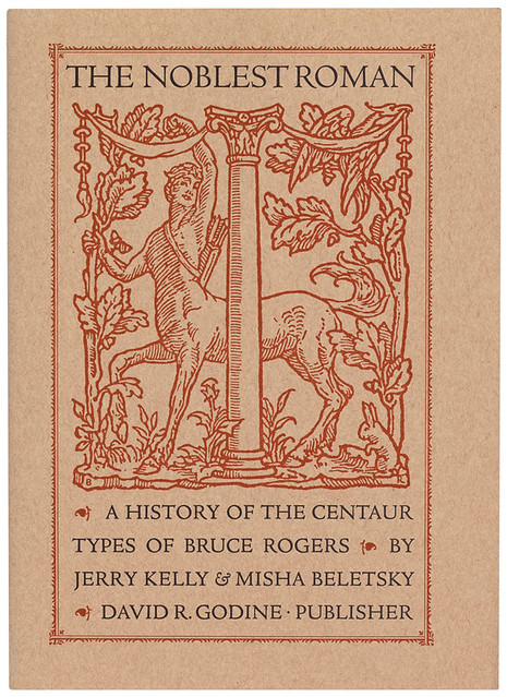
Cover of The Noblest Roman: A History of the Centaur Types of Bruce Rogers showing the Monotype Centaur Types. Book design: Jerry Kelly.
Top: Fra Luca de Pacioli by Stanley Morison, 1933, designed by Bruce Rogers in Centaur capitals.

Sallie Morris, researcher, designer, Buckinghamshire
First published in Eye no. 94 vol. 24, 2017
Eye is the world’s most beautiful and collectable graphic design journal, published quarterly for professional designers, students and anyone interested in critical, informed writing about graphic design and visual culture. It is available from all good design bookshops and online at the Eye shop, where you can buy subscriptions, back issues and single copies of the latest issue. You can see what Eye 94 looks like at Eye before You Buy on Vimeo.

