
Summer 2017
Non-woolly mammoth
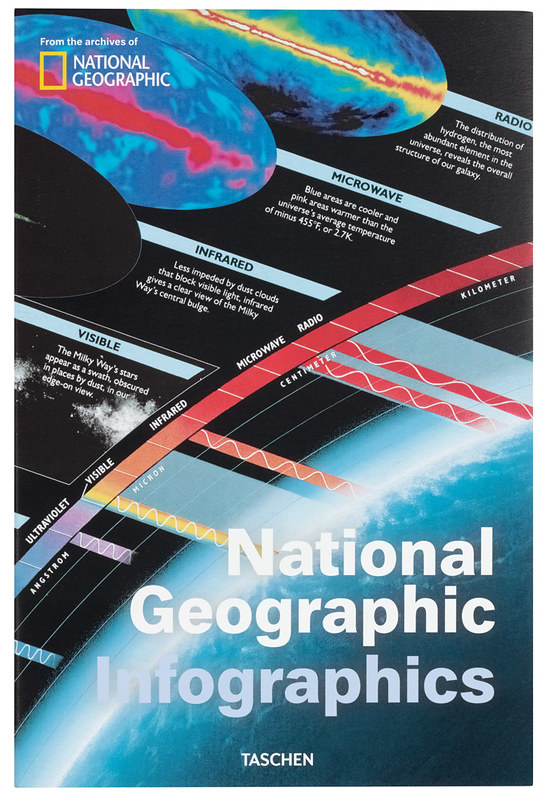
National Geographic Infographics
Edited by Julius Wiedemann <br> Preface by Kaitlin Yarnall <br> Essay by Nigel Holmes <br> Taschen, £44.99 <br>
There are few publications that can boast the depth of resource, aspiration and expertise as National Geographic magazine. Founded by expeditionists, pioneers and cartographers who documented their rich discoveries for a broader audience, it was initially intended for 200 of its chartered members. One hundred years later it had grown to a whopping monthly circulation of 14 million copies across 43 languages.
From the first issue in 1888, it established a relevance and necessity for information graphics, and some of its earliest ventures into mapping and diagrams are shown in this book. These early examples were straightforward visual communications that provided readers with an additional level of understanding.
In the magazine’s quest to present a narrative for human exploration and discovery, it required the artistic combination of illustrative diagrams with precise cartography to reveal the unseen and to interpret the unknown. Over time, this approach – a careful balance between imagination and fact – became a distinguishing feature of the title.
The combination of written articles, graphics and, later, photography became the core components for the magazine’s success in storytelling. Readers could find themselves on their own journey of discovery within its pages, and were given the opportunity to unearth a broader understanding of our history, culture and global ambitions.
Scanning through this collection it becomes clear how varied the visual approaches were throughout National Geographic’s extensive archive, how distinctive the quality of its editing and how considered the craftsmanship. It is here that we see the best of the magazine’s portfolio, often under the names of its biggest stars, such as Fernando G. Baptista, whose wonderful rendering is shown in one of several fold-out graphics that feature throughout the anthology.
Collating 129 years of visual explanations cannot have been an easy task for Kaitlin Yarnall, the magazine’s deputy creative director, and it is no surprise that a mammoth-sized book (480pp) was necessary to encompass the treasures of the archive. Rather than being a chronological catalogue of work, the book is organised into seven main themes on key topics: History, The Planet, Being Human, Animal World, World of Plants, Science and Technology, and Space. The intention is to educate as well as entertain, giving a welcome amount of space to provide added context to each infographic, and ensuring this is more than a catalogue of greatest hits.
This anthology provides a trusted homage to one of the most devoted infographic publishers of all time, where a commitment to quality research and well crafted graphics have been key to the magazine’s long-standing reputation.
Cover from National Geographic Infographics. Design: Praline (Giovanni Pamio and David Tanguy). All images from the archives of National Geographic.
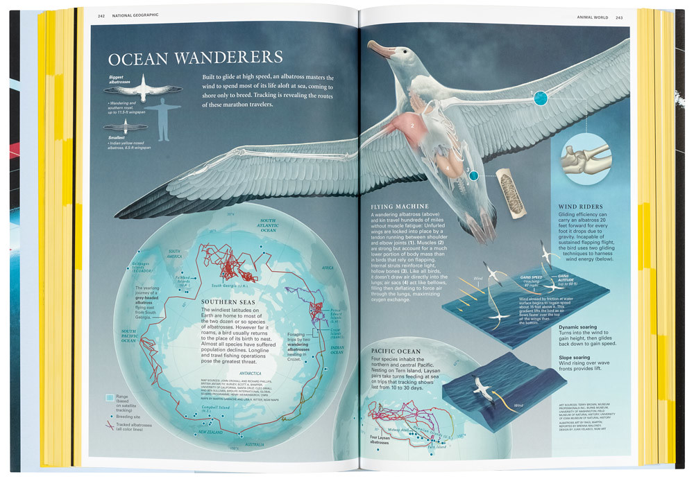
Top: Spread designed by Juan Velasco showing albatross illustration by Raúl Martín.
Fraser Lyness designer, London
First published in Eye no. 94 vol. 24, 2017

Eye is the world’s most beautiful and collectable graphic design journal, published quarterly for professional designers, students and anyone interested in critical, informed writing about graphic design and visual culture. It is available from all good design bookshops and online at the Eye shop, where you can buy subscriptions, back issues and single copies of the latest issue. You can see what Eye 94 looks like at Eye before You Buy on Vimeo.