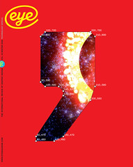
Winter 2008
Pieced together

Cut & Paste: European Photomontage 1920-1945
Estorick Gallery, London<br>24 September –21 December 2008 <br>Curating this exhibition of 150 paper-and-glue works, some more than 80 years old, was a labour of love for the Berlin film-maker, artist and writer Lutz Becker. It was also an unrepeatable experience. ‘These works are so fragile that every time they’re exhibited, it depreciates the quality of the paper,’ he says. ‘And they have to go back into the dark to rest for a month or two. I had to glue quite a few together.’
Becker divides his exhibits into the Russians and the rest (German, French, Italian, Dutch, Czech, Hungarian). It is fascinating to compare John Heartfield’s relatively minimalist use of photography in Germany with the Russians’ multidimensional compositions. ‘It’s enough to have a photograph and to add a little colour,’ declared Heartfield in 1926, but the Russian room is exhilaratingly cacophonous. They like to fill every patch of white paper, says Becker.
Beyond the political message-carriers, there are many original adverts, book jackets, stage and cinema designs. Moholy-Nagy’s set for The Merchant of Berlin is a dazzling composite of a teeming city with a prescient focus on transport; Walter Ruttmann’s 1927 Symphony of a City is part of a breathtaking storyboard. Becker’s own cine-montages – reconstructions of Eisenstein films for the Hayward’s 1971 ‘Art & Revolution’ show – are a reminder that he approaches photomontage as a film-editor. ‘What we do in time happens in simultaneity in photomontage on the page,’ he says, pointing to Bruno Munari’s delicately graceful The Smell of an Airplane (1936), where a tiny plane is glued to a nostril on a woman’s painted face.
Among the Soviets, the Latvian Gustav Klucis produced gorgeous postcards for the All (Soviet) Union Olympics in 1928. Playing with symmetry and serial patterning, he exploits flat, bright colours to highlight the photo-images, an effect as satisfying as a repetitive melody. In response to demand for propaganda imagery, works by Rodchenko et al. become increasingly labour-intensive, involving thousands of photo-fragments – landmarks, logos, crowds.
Nikolai Sidelnikov and Solomon Telingater epitomise the ‘page-filling’ style and confirm the power of a non-verbal narrative. Becker says that The 5-Year Plan for the Food Industry of the USSR Will Raise Productivity, with its trademark blues and perfect symmetry, designated ‘Unknown designer, ca. 1932’, is almost certainly by Sidelnikov. El Lissitsky’s photomontages stray furthest into fine art – they are still decades ahead of their time.
With photomontage now routinely practised by artists, designers and amateurs, what better time to bring these magnificent works into the light, however briefly? ‘I hope people engaged in digital montage will come and see what their ancestors were doing,’ says Becker. ‘Because, in spite of their age, they still have a currency.’
As if proof were needed, the ad for Stolychnaya vodka currently showing in London cinemas is an animated Rodchenko poster with dramatic lettering, geometric patterns and black-and-white cutouts of crowds, buildings and ships moving in serial rhythms.
Sue Steward, writer, broadcaster, picture editor, London and Brighton
First published in Eye no. 70 vol. 18, 2008
Eye is the world’s most beautiful and collectable graphic design journal, published quarterly for professional designers, students and anyone interested in critical, informed writing about graphic design and visual culture. It is available from all good design bookshops and online at the Eye shop, where you can buy subscriptions and single issues.
