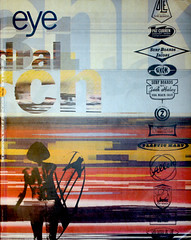
Spring 1995
The Swastika as symbol

The Swastika: Constructing the Symbol
Malcolm Quinn<br>Routledge
Littered with phrases such as ‘hypertrophied singularity’, and drawing deeply on semantic theory and philosophy, Malcom Quinn’s book The Swastika: Constructing the Symbol (Routledge, £25.00), is not for the faint-hearted reader. As he acknowledges, in writing about the swastika he is in dubious company, and it is perhaps an attempt to distance himself from the assorted neo-Nazis and devotees of the occult who share his interest that he has chosen to write such an uncompromisingly academic text. This is a pity because some of his ideas deserve a wider audience than they are likely to receive.
Part of the book is a comparison of the Nazis’ use of the swastika and corporate identity designers’ use of logos. The swastika, says Quinn, not only functioned in ways which were in advance of corporate identities of that era, but were far more complex than anything done today. ‘The truth is that the Nazi swastika was not “just like” a corporate logo; it might be more accurate to say that the logo is an etiolated swastika,’ he writes.
Quinn gives fascinating examples of the Nazis’ usage of the swastika which foreshadowed later ideas in corporate design. In 1993 Goebbels passed laws which forbade ‘trivial’ uses of the swastika, for example as decoration on cufflinks or children’s toys, just as companies later tried to prevent unauthorised use of their logos.
The swastika, argues Quinn, was used to epitomise what the Nazis saw as a desirable future situation (Aryan purity and domination). This is very similar to what corporate identity designers do today when they link the introduction of a new corporate design to a mission statement. Rather than summing up the present reality, the new logo represents what the company intends to be – it is an image of a glorious future. Corporate identity designers may think they discovered the idea, but the Nazis were using the swastika in this way 1920.
Almost in passing, Quinn mentions Benetton and gives a fascinating analysis of why morally charged advertising, which is utterly unconnected to the products the company creates, is likely to become increasingly common. As products become more similar, he says, this form of emotional message can be seen as a logical next step in the development of corporate communications. It is an argument put forward glibly by some marketing experts, but the depth and complexity of Quinn’s account sheds light on precisely why Benetton’s approach is important and should not be dismissed as either trivial or irrelevant. Again, he argues, the Nazis did it first, using the very complex yet vague emotional connotations of the swastika to communicate directly with their audience.
Julia Thrift, design journalist, London
First published in Eye no. 16 vol. 4, 1995
Eye is the world’s most beautiful and collectable graphic design journal, published quarterly for professional designers, students and anyone interested in critical, informed writing about graphic design and visual culture. It is available from all good design bookshops and online at the Eye shop, where you can buy subscriptions and single issues.
