Spring 2018
Time and type

Futura
Edited by Petra Eisele, Dr Annette Ludwig and Isabel Naegele. Designed by Stephanie Kaplan and Isabel Naegele. Laurence King Publishing, £45, $65, €65
One of the privileges that comes with being a typography and graphic design buff in the digital age is the feeling that printed paper still has a value and a dignity of its own. Even today’s millennials – digital natives – can be seen to develop a new kind of enthusiasm and emotionality about their work when exposed to ‘the real thing’, the touch and smell of the printed object.
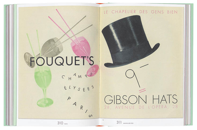
Books about design history occupy a place in the space between the computer screen and the historical artefact. In the days of letterpress, printing yearbooks and high-level trade magazines often did contain the real thing: prints from an original page of set type or original lithographs pasted in. But today’s photographic reproduction and printing techniques, and superb varieties of matte stock, come close to that sense of authenticity. Open up a spread of this lovingly produced Futura book and you almost find yourself in a vintage type specimen or magazine issue.
I am not sure if there has ever been a fuller, more joyful book about a single typeface. The German version of Futura was produced in 2016 to coincide with an exhibition of the same name at the Gutenberg Museum in Mainz (where the future of written language began). The exhibition was built around a huge collection of typeface specimens that the museum acquired in 2010 from the estate of book designer Philipp Bertheau (1927-2009). Its concept was that of travel in space and time, analogous to the voyage of the historic avant-garde in the 1920s and 1930s, and the travels
of the typeface itself.
The English edition of the book, issued in late 2017, follows the same itinerary. ‘Futura, a journey around the world’ reads one of the divider pages, and what a rollercoaster ride it is. Each chapter focuses on Futura-related events in one city; these chapters are written by an ace selection of writers, including Christopher Burke, Steven Heller, Michel Wlassikoff, Wolfgang Hartmann, Erik Spiekermann and Ferdinand Ulrich. Burke is the author of a ground-breaking 1998 monograph on Futura’s designer Paul Renner; Wlassikoff is France’s prime historian of graphic design; Hartmann is the heir to Futura’s publisher, the Bauer foundry, and the grandson of the company director with whom Renner worked. Most city chapters are collections of smaller essays that focus on one person or one aspect of Futura.
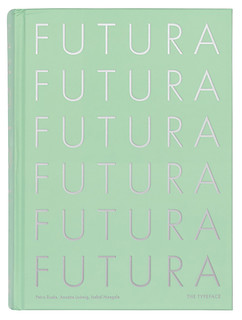
Visually and haptically, the book is stunning. Set in a variety of sizes and weights of Neufville Bauer’s digital version of the typeface, using a tasteful palette of soft background colours and period photography, offering generous, multi-page reproductions of the splendid collection of printed matter that constituted the exhibition, the book successfully avoids the all-too academic touch and feel of many works that discuss type history. The silvery sides of the book block, and the mint-green binding with the word FUTURA embossed six times in the same shining silver (or steel) are not only incredibly attractive, but also reference an aspect of the story: silver / steel was one of the ‘colours’ used for the covers of various typeface catalogues made for the geometric sans serifs that became such a hot thing almost overnight towards 1930.
On an editorial level, the multifaceted structure has its drawbacks. The book’s authors each have a slightly different story to tell, and all these voices make reading the book feel like reading a lively trade magazine. So far, so good. But there is a certain repetitiveness to the first part of the book, where the authors inevitably visit the same ideas and events, and sometimes even the same quotes. So, the book is best when enjoyed in
small portions, rather than read in one go. Browsing the book is a joy; both the image selection and reproduction are impeccable.
The translation, unfortunately, is not. Several times while reading the English edition, I came across statements that seemed to lack logic. When comparing those passages in both languages, I could see something had been lost or garbled in translation. One example: on the first page of the first essay, the English text claims that in 1924, when the first meetings about what became Futura took place, ‘Renner had […] already made a name for himself as a type designer.’ He had taught book design and published a book titled Typography as Art. But a type designer? Futura was his first face, so there can be no question of him having a name in the field before even starting on it. In the German text he is a typographer – it is a common confusion, but not one that should happen on these pages.
What is worse is that this is the kind of statement that lends itself to being cut-and-pasted into a quick online review by a major magazine – which is exactly what happened. Fake news! I came across at least half a dozen of puzzling or downright erroneous English versions of descriptions that were correct in German.
It’s the kind of flaw one is more than willing to cover with the cloak of charity, or love, as the Dutch say.
There should be more books like this, shamelessly obsessive about a myriad of aspects of a single design – aesthetical, ideological, socio-political, commercial, and more – and presented in a way that seems to effortlessly lift the typeface out of its complex historical context and lovingly celebrate Futura’s relevance and sheer youthfulness in the new century.
Cover for Futura, designed by Stephanie Kaplan and Isabel Naegele.
Top: Spread from Futura showing a spread from the ‘Europe et le Studio’ issue of Divertissements typographiques (no. 4, 1931), designed by Maximilien Vox.

Jan Middendorp, designer, writer and author of Dutch Type, Berlin
First published in Eye no. 96 vol. 24, 2018
Eye is the world’s most beautiful and collectable graphic design journal, published for professional designers, students and anyone interested in critical, informed writing about graphic design and visual culture. It is available from all good design bookshops and online at the Eye shop, where you can buy subscriptions and single issues.

