Tuesday, 5:00pm
15 May 2018
Outlook variable
Frederik Baerlaen
David Berlow
Bianca Berning
Petr van Blokland
Verena Gerlach
Minjoo Ham
Gerry Leonidas
Dalton Maag
Laurence Penney
Maciej Połczyński
Norman Posselt
Ulrike Rausch
Ksenya Samarskaya
Jörg Schweinsberg
Underware
Vivek Vadakkuppattu
various designers
Reviews
Technology
Type Tuesday
Typography
TYPO Labs unveiled cool tools for both tyros and trailblazers. In the run-up to TYPO Berlin, Jan Middendorp delivers a considered report

As the Berlin mothership – TYPO Berlin 2018 – approaches, it seems like a good moment to look back at April’s TYPO Labs conference, the past, present and future lure of type tech meetings versus typography-and-design conferences, and the type world at large, writes Jan Middendorp.
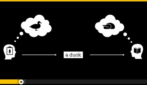
Dalton Maag’s Bianca Berning on the relationship between author and reader.
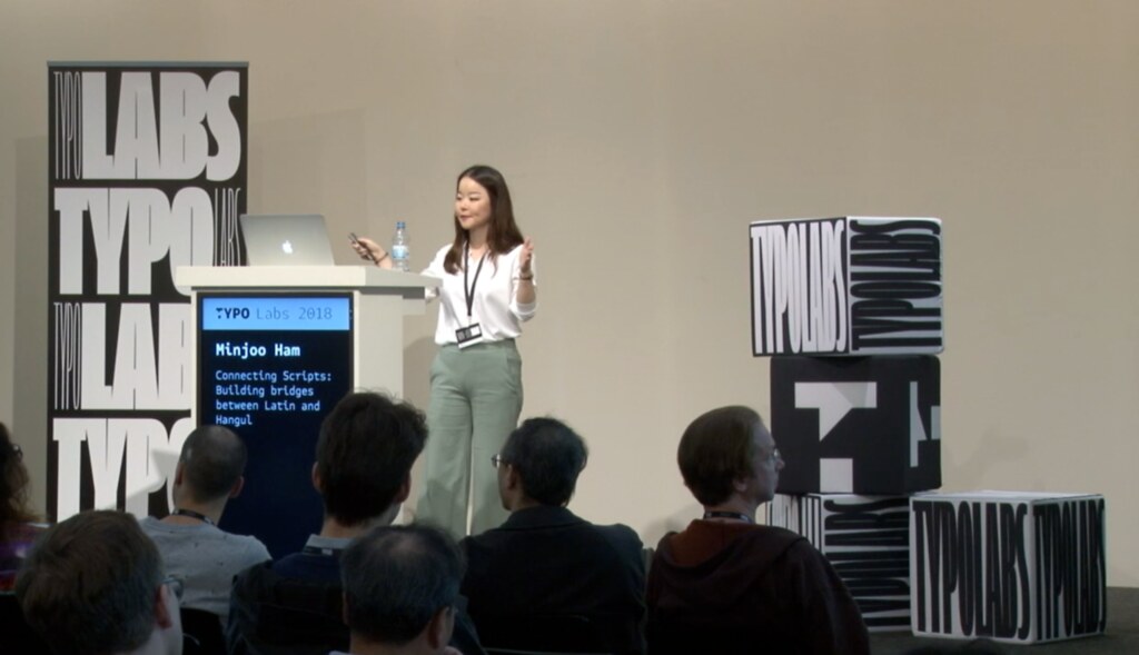
Top: Minjoo Ham presenting ‘Connecting Scripts: Building bridges between Latin and Hangul’.
TYPO Berlin, this year entitled ‘Trigger’ (17-19 May 2018) is the big design conference in the House of World Cultures (HKW). TYPO Labs (12-14 April) took place at the more modest Umweltforum near Alexanderplatz. In his brief introduction, Monotype’s (formerly Linotpe’s) Jörg Schweinsberg reminded us of an early incarnation of TYPO Labs, initiated by Linotype a few years before they were absorbed by Monotype. TypoTechnica, first organised in 2001 as Linotype Font Technology Forum at the company’s then-owner, Heidelberger Druckmaschinen AG.
TypoTechnica did become a major meeting point for the digital type design and production elite. In its effectiveness, it all but eclipsed a yearly event called TypeLab – initially set up by David Berlow and Petr van Blokand as a cheeky impromptu get-together of independent minds in the margin of the all-too-institutional ATypI conference. Energetic and playful during its ATypI editions in Barcelona (1995) and The Hague (1996), TypeLab pointed the way to where a contemporary type conference should go, and that’s what ATypI did. So TypeLab allowed itself to merge into the main event again. The same irreverent and inquisitive spirit, partly from the same people, gave birth to a more independent type tech conference – the triennial Robothon at The Hague’s KABK art and design school, whose 2018 edition coincidentally took place only week before TYPO Labs.
Dutch-German-Finnish type studio Underware speculates about type construction and the meaning of it all.
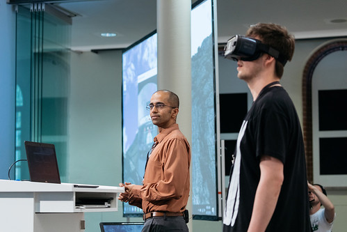
Vivek Vadakkuppattu demonstrating Virtual and Augmented Reality using text and a ‘guinea pig’. Photo: Norman Posselt.
Some of you may ask what a type tech conference is. Isn’t every type design conference about technique and technology? As the Germans say: jein – yes and no. Most typography conferences offer a few lectures and workshops which focus on technological aspects of type design and production. But the geekiness and high tech of both Robothon and TYPO Labs is, at times, beyond comprehension to the ordinary type specialist. Complete pages of code on the screen; technical inside jokes; or speculations that seem over-thought to the outsider but are hailed as paradigm shifts by some of the best minds in the business: those are some features on offer.
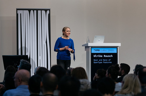
Berlin type designer Ulrike Rausch on the OpenType programming of script-style fonts. Photo: Norman Posselt.
There are roughly two kinds of audience in these conferences: the trailblazers and the still-learners (though most trailblazers will volunteer that they, too, are learning on a daily basis. You have to, these days, in any discipline). Tech-savvy specialists that teach at dedicated type design courses now prefer taking their students to Robothon or TYPO Labs, rather than to a huge event like TYPO Berlin, which is more costly, and in part a multi-media portfolio presentation. Type tech conferences, on the other hand, focus on the innovative and the speculative. Like web conferences, they are get-togethers of major players in the business, who present the latest inventions and updates that will quite probably call the tune in the next few years. As a bonus, these events are small enough for eager students to meet their heroes. But while the more technically inclined will be chuffed to be present at downright scoops in typographic development, other students will be grateful for some more basic explanations or introductions.
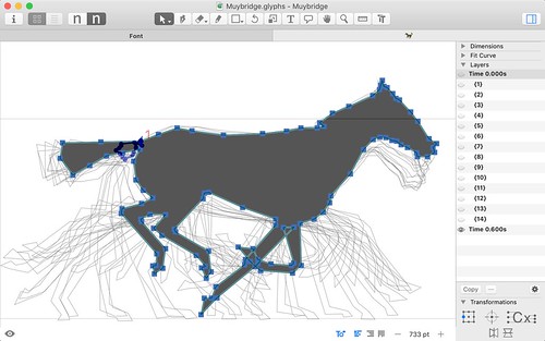
Laurence Penney, who developed the influential test tool Axis Praxis, has made Muybridge’s horse into a variable font.
TYPO Labs offered both. The selection of speakers was pretty balanced gender-wise, and some of the smartest and most communicative lectures, bridging the gap between trailblazers and learners, were presented by women. To mention just two: Brooklyn-based Ksenya Samarskaya opened a vista to places where type designers seldom go, such as virtual reality and 3D animation; Korean Berliner Minjoo Ham gave a thorough but entertaining crash course in Hangul, the Korean script, and insight into the way one can organise the meeting of two writing systems.
The hot theme of the conference was a new OpenType format commonly called Variable Fonts. Developed in an unprecedented collaboration between the biggest players in the type world, variable fonts are an updated take on a 1990s idea: uniting the many styles of a typeface in one font file. A technique that saves bandwidth when sending webfonts and probably simplifies sales administration as well as design, it may also cause confusion among ordinary users about what they are actually buying and how to use it.
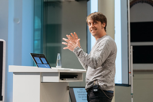
Type designer and engineer Frederik Baerlaen presenting new features in his font editor RoboFont. Photo: Norman Posselt.
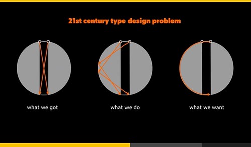
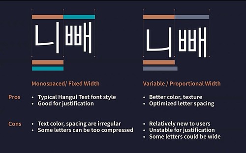
South Korean type designer Minjoo Ham’s explanation of the pros and cons of de-monospacing Hangul.
Variable fonts were rushed out as a technology in 2016 at the Warsaw ATypI conference, but there was not much that was concrete. It wasn’t the big companies that came up with dedicated type design software, striking experiments, or visualisation tools – these were developed, literally overnight sometimes, by micro-companies such as Georg Seifert’s Glyphs or individuals such as Laurence Penney. So it was no surprise that the most thought-provoking presentations in TYPO Labs came from those individuals, while the representatives of the large corporations often seemed to go through the motions of asking attention for their company’s contribution to this Big New Thing. The inclusion of presentations of students’ work was a splendid move. It showed the (possibly unexpected) usability of variable fonts as a tool for creating animated display typography that can be branding as well as stubbornly uncommercial art: the format is a superb and surprisingly accessible means to expand the typographic mind in an educational environment.
But there is a catch. In his keynote speech, Reading professor Gerry Leonidas tackled the theme of technological innovation in his usual critical way. Looking at the conference’s title, ‘How far can we go?’, he assumed that many participants would see that phrase as a challenge to stretch the technology, or a triumphant ode to endless progress. Leonidas’s approach to type design is more down-to-earth. He opened a largely speculative conference by stating that only a type design culture that has a practical mindset and a clear idea of the needs of the market, will be able to ‘pay the rent’. Of course, many young lone wolves pay the rent by doing both. Selecting, through calculation or intuition, flexible and usable aspects of the new technologies, they carve out a niche for themselves as designers of tools, contributors to branding projects (not necessarily for coffee or motorbikes, it can also be an open-air rock festival), games, or art.
Variable fonts adapted in colourful animations by students of Prague’s Uprum Academy.
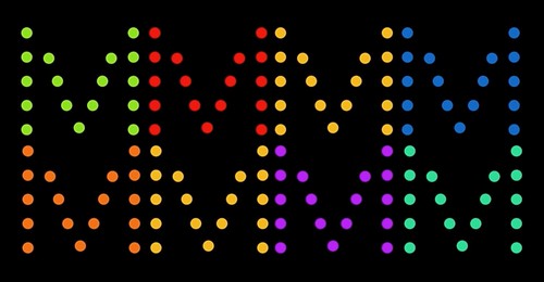
TYPO Labs offered, as it did at its two previous editions, a highly topical overview of the latest developments in type technology and did contain several scoops. I went home mentally exhausted but spiritually uplifted (these people are so kind and willing to share!), and with a bit of doubt in the back of my mind. I do hope that type studios won’t be carried along by the lure of the latest ‘cool tool’, and won’t overlook its limited attraction for the average type user. I also hope that Monotype’s generosity in financing (with the support of Google) and organising (with admirable precision) a conference that gives their competitors additional power and incentives to collaborate, unite, or challenge the establishment, is genuine and long-lasting. The independent young wolves and whelps are the lifeblood of the type world.
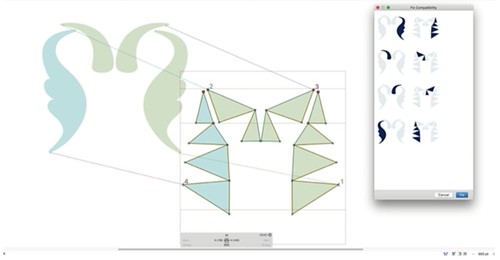
Insight into the process of a variable fonts workshop at the Polish-Japanese Academy of Information Technology in Warsaw. Presented by Verena Gerlach and assistant Maciej Połczyński.
Jan Middendorp, designer and writer, Berlin
Eye is the world’s most beautiful and collectable graphic design journal, published quarterly for professional designers, students and anyone interested in critical, informed writing about graphic design and visual culture. It is available from all good design bookshops and online at the Eye shop, where you can buy subscriptions and single issues.
