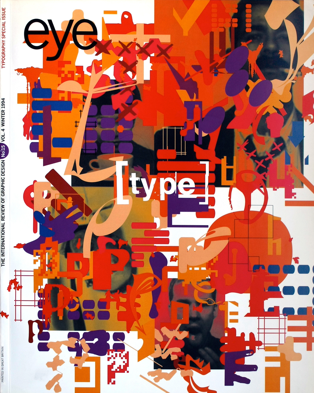
Winter 1994
Central Lettering Record
Central Saint Martins' collection of historical letterforms and type samples is an invaluable resource
The Central Lettering Record at Central Saint Martins College of Art and Design, London, a collection built up by Nicolete Gray and Nicholas Biddulph, contains 10,000 photographs and 3000 slides of lettering of all kinds. It also includes many type manufacturers’ specimens and promotional material from the mid-1950s onwards. This period is marked by several generations of typesetting technology – with the translations of “classic” typefaces at every stage – and a change in the manufacturers’ market from owners of proprietary typesetting systems to end-users of type.
A first look at these specimens produces a sense of awe. Seen en masse there is an amazing richness and diversity, which reflects the graphic mannerisms of the period. In comparison with the flimsy offerings of today, designed down to an economical postage weight, these early examples are surprisingly lavish, particularly those from continental foundries. Because of the lack of catalogue, it is not clear whether the collection accurately reflects the activities of Bauersche GieBerei, Johannes Wagner, Fonderie Olive and others, of merely draws on contacts made by the collection’s founders.
There is no doubt that these are advertisements first and foremost, and as in any form of advertising, there are approaches and malpractices which reappear. Information, other than the historical essays typical of many Monotype and Linotype revivals, is hard to find, and specimens seldom concentrate on the exactness of a type’s proportions, preferring instead to show sample settings – or worse, part alphabets – at a range of sizes.
The obvious solution for covers is to use the typeface name big. The most successful visually are those which unashamedly bear the stamp of their time, with an honesty which puts the well-intentioned historical pastiches to shame. English manufacturers in particular seem afraid to show a historical typeface in modern dress.
Perhaps the strangest aspect of the specimens, and the cliché of the genre, is the ‘invented use’. New typefaces with no pedigree clearly present manufacturers with a problem. The invented use was a convenient way out, and is still with us today.
The interest and importance of this collection is clear: it offers glimpses of earlier ways of working, national traits, and ways of using archaic printing techniques, as well as reminding us of typefaces no longer available and showing the variety of type design at a given moment. But the seductiveness of the visual wealth must not blind us to the fact that the true test of a typeface’s worth lies not in its existence, but in its usefulness.
Phil Baines, typographic designer, London
First published in Eye no. 15 vol. 4 1994
Central Saint Martins has recently begun a two-research project with the aim of transferring much of the collection on to CD-ROM. Phil Baines, the project’s typographical advisor, will give a talk on 7 December 1994 at the Art Worker’s Guild, 6 Queen Street, London WC1.
Eye is the world’s most beautiful and collectable graphic design journal, published for professional designers, students and anyone interested in critical, informed writing about graphic design and visual culture. It is available from all good design bookshops and online at the Eye shop, where you can buy subscriptions and single issues.

