Winter 2010
Do it yourself
Fraser Muggeridge reads a trusty manual that shows how to fix almost anything

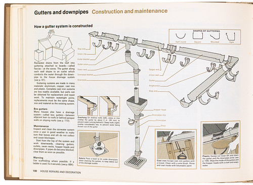
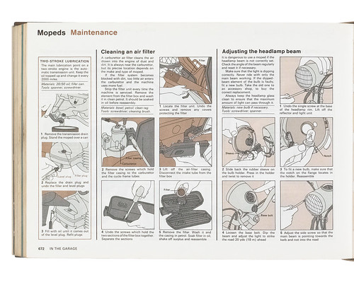
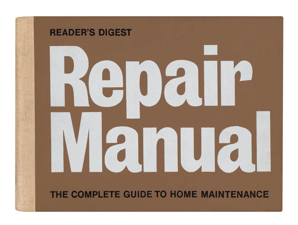
In a pre-‘throwaway’ society where the purpose of DIY (‘do it yourself’) was fixing and repairing, this comprehensive Reader’s Digest publication (running to 704 pages) must have sat on every British home’s bookshelf. The manual covers a wide and diverse range of subjects, from repairing a broken hinge of a book (page 256) to fitting brake shoes to the rear wheel of a moped (page 673).
Detailed but somehow simplified illustrations / diagrams printed in two colours (using different flat tints for each section) provide easily understandable instructions, which nearly 40 years later can still be followed and used today. Thirty-one artists were responsible for the detailed illustrations, a huge and complex undertaking in maintaining a consistent overall style.
The challenge when designing illustrated books is how to arrange text and images on a page. Careful consideration of the content, form and purpose is vital. This layout succeeds by the placement of explanatory text below each image so the user can refer to both at the same time. It sounds straightforward and it works: the manual is a masterpiece of information and book design.
My copy is now showing signs of wear and tear: its front endpaper has come apart from the cover, which is somehow appropriate, as I know exactly where to look in order to carry out the repair.
Fraser Muggeridge is a graphic designer and founder of Typography Summer School.
First published in Eye no. 78 vol. 20.

