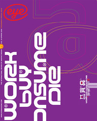
Spring 2009
Golden age?

Sean Adams
Nick Bell
Peter Biľak
Paul Carlos
Catherine Dixon
Nicole Dotin
William Hall
Sibylle Hagmann
Mr. Keedy
Mark Thomson
Alfredo Trivino
Khoi Vinh
various designers
The digital revolution still fuels a creative explosion in the way type is made and sold. Twelve practitioners take stock of the Zeitgeist
For type design, the current moment is one of profound transformation, a ‘sea-change’ that can be attributed to the cultural context in which design operates, rather than from within the field itself. There are economic forces caused by globalisation; increased complexity in the problems designers confront, making interdisciplinary teamwork necessary; and the digital revolution, with its proliferation of new software and use of information and communications technologies.
Type design has become a global industry where boutique shops shine alongside their larger, more established brethren. It is studied, conservative, historically inspired and exquisitely crafted – and its success requires mastery of the digital tools at our disposal.
We asked twelve practitioners – art directors, type designers, educators – to suggest examples of typefaces that characterise the Zeitgeist in the context of constant software updates and technological innovations, and show some of their nominated fonts here. I asked these professionals whether they thought these developments indicated the emergence of a new ‘Golden Age’ in type design, perhaps akin to that heralded by the invention of the printing press in the sixteenth century, the rise of the independent typographer in the early twentieth century (following the development of the mechanical punch cutter and typecasting machines), or the fearless experimentation of the 1990s, triggered by the ubiquity of the personal computer and the democratisation of type production tools.
Most of our participants were unwilling to commit to an all-embracing ‘Golden Age’. Can we see one while we are living it? Or do we have to wait until it is over and the 20:20 vision afforded by hindsight has had time to focus? The answers, if not always straightforward, were thought-provoking and wide-ranging.
The most notable departures from the past seem to be found in the ways in which type design is practised, rather than in the designs of letterforms themselves. Several contributors noted that there was little room for serious experimentation in the day-to-day business of type design. In this respect, perhaps type design’s success as an industry makes it its own worst enemy.
As in the 1990s, formal experimentation can also emerge from the academy. But the practice and craft of type design as a discipline of study on its own terms does not have a fully formed pedagogy. It has only been since the recent introduction of computers that teaching type design beyond the traditional approach of lettering and calligraphy – and realising a fully formed typeface – became possible. Few design schools, however, dedicate entire classes toward teaching type design. Formal experimentation comes in fits and starts. (See ‘Education’ essay by Jan Middendorp.)
One frontier wide open for exploration is the digital realm, where typefaces are not necessarily created for two dimensions but for virtual environments. Directions that warrant a mention here include Peter Cho’s Type Me, Type Me Not and Forefront; Rob Meek’s Meek and Meek FM, his type-as-sound collaboration with Frank Miller; and Hudson-Powell’s Responsive Type Project. These experiments expand the usual definition of ‘type design’ by placing radically different tools in the type designer’s hands.
Technology certainly opens up a different set of interesting questions. The real formal frontier may be in figuring out a systematic way of thinking about type design for the new context of continuous change. Such a project would require recasting the traditional fixed approach of designing type to one that is more emergent and relational, where print-based values do not rule the day (e.g., PTF’s typeface for the Walker Art Center, Eye no. 59 vol. 15). Golden Ages emerge when new technologies find new contexts.
The participants’ choices reflect the conundrum that technology solves as many problems as it creates. Their descriptions of our time as one of consolidation, efficiency, historicity and neutrality show a field still grappling with the ramifications of typography’s democratised tools. From this perspective, we get a sense of why Modernism’s default aesthetic habits die hard. Considering the reverberating ‘echo chamber’ created by constant software upgrades and new utility platforms, type designers are out of breath just trying to keep up.
In subsequent pages, Catherine Dixon, Mr Keedy, Nick Bell, Nicole Dotin, Paul Carlos, Sibylle Hagmann, Peter Bil’ak, William Hall, Khoi Vinh, Sean Adams, Mark Thomson and Alfredo Trivino share their thoughts on the state of type today.
First published in Eye no. 71 vol. 18 2009
Eye is the world’s most beautiful and collectable graphic design journal, published quarterly for professional designers, students and anyone interested in critical, informed writing about graphic design and visual culture. It is available from all good design bookshops and online at the Eye shop, where you can buy subscriptions and single issues.
