Spring 2014
Identity preserved
The labels for Tiptree jams stand out by staying the same

In 1888 Arthur Charles Wilkin founded the Britannia Fruit Preserving Company and started making jam from his small farm in Tiptree, Essex, which had been the family business since 1709. By 1905 the company was producing 170 tons of jam and had changed its name to Wilkin & Sons Limited. It was also at this time that Wilkin started to cultivate a small variety of strawberry called ‘Little Scarlet’, which would spearhead his jam-making success.
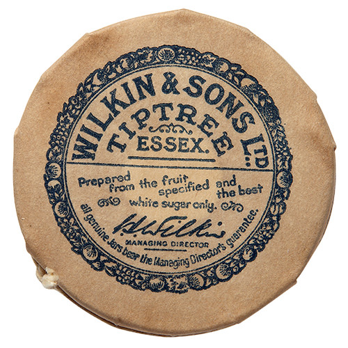
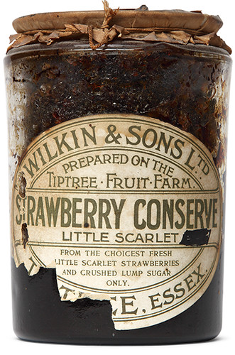
The first glass jam jar had a waxed paper lid tied with string and an oval label created to look optically round when placed on the jar. Despite the passing of a century and a half, most of its design elements have hardly changed. These include the fruit decoration around the lid, the label’s borders and its shape and size. Nevertheless, there have been small changes over the decades, moving from Victorian ornament towards a cleaner, more subdued incarnation.
The jam is widely regarded as a quintessential British brand. In Ian Fleming’s 1957 novel From Russia with Love, it was James Bond’s jam of choice. A Washington Post article in 2004 bemoaned the scarcity of Little Scarlet jam, calling it ‘the edible essence of a claret-colored Bentley.’
Tiptree jar lid design, 1900s. These have remained fairly constant since their inception, retaining the original ornamental border drawing incorporating various fruits. Initially on paper they are now printed on to metal lids.
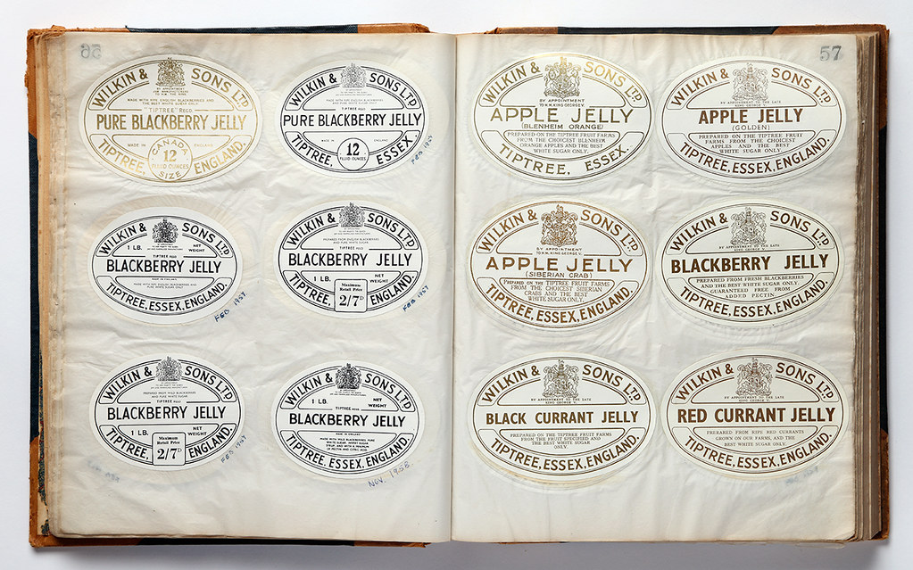
Top: spread from label album in the Tiptree archive recording jam labels in production in the 1950s.
Joint managing director Ian Thurgood talks with amusement about the design companies that occasionally call the company, urge them to streamline or otherwise bring Tiptree’s identity design into the 21st century. ‘They all say “we’ll put some colour on, we’ll put some fruit on”,’ says Thurgood, but he always replies by saying, ‘Thanks but no thanks.’
Tiptree has a small museum and an archive book of its labels – a procession of glassine pages filled with every label they have ever designed. To meet the need for the jam labels to contain a variety of name lengths (to accommodate different fruits) the lettering on the labels was originally drawn by hand. The last person to do this – well into the 1980s – was Donald Sutherland of label printing specialists Ormerods of Rochdale. Since that time there have been experiments with Garamond Pro and Copperplate AB, all termed ‘not quite right’ by Thurgood.
‘Two years ago we decided to stop all these shenanigans and have our own typeface,’ says Thurgood. They handed the label book to lettering designer Sue Pengilley. The brief was to return to the hand-drawn sans serif days of Donald Sutherland and create both a normal and condensed width to give flexibility.
When asked who designs the labels, Thurgood pointed to a desk tucked into the corner of his office. ‘Angela, sitting over there, has been responsible for our labels for some time now. What’s important for us is to have someone who cares about the labels, who loves them, and that’s Angela. It used to be me. I care about every detail of everything we’re doing.
‘If you look at 100 years of Tiptree labels you can see they have changed a lot,’ says Thurgood. ‘But I like to think it’s a “breakable brand” – if you dropped it on the floor and it broke into bits you would still know it.’
Tiptree jar design, 1890.
Jay Prynne, Eye art editor, London
First published in Eye no. 87 vol. 22 2014
Eye is the world’s most beautiful and collectable graphic design journal, published quarterly for professional designers, students and anyone interested in critical, informed writing about graphic design and visual culture. It is available from all good design bookshops and online at the Eye shop, where you can buy subscriptions, back issues and single copies of the latest issue. You can see what Eye 87 looks like at Eye before You Buy on Vimeo.

