Summer 2011
Keepers of the flame
US picture magazines of the late 1960s and 70s are still a vital source of inspiration

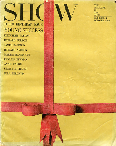
Throughout the 1980s, Henry Wolf would inspire designer audiences with presentations of his art direction from the 1960s and early 70s for Harper’s Bazaar, Esquire and Show. Yet he would invariably end on a sour note. Lamenting the doleful state of contemporary magazines, he would say in his lilting Viennese accent: ‘There was a golden age, and it is entirely over. Today is shit!’ According to Wolf – who still taught magazine design at Parsons – exemplary art direction had gone down the proverbial tubes along with the magazines that had nurtured it.
Listening to that was a real downer. However, Wolf was not entirely wrong. In the United States the period after the Second World War was a fertile time for graphic design in general and editorial design in particular. The number of innovative magazine art directors / designers was commensurate with the weekly and monthly magazines that valued smart design and conceptual art and photography. Magazines led the way and ‘innovation’ was key. Each of these magazines had a distinctive look and visual philosophy – yes, a philosophy – which meant they did not respond slavishly to marketing demands and focus group vacillations. Or, put another way, there were some memorable magazines in the late 1960s and early 70s that still hold up as exemplars of design pacing, conception, drama and elegance.
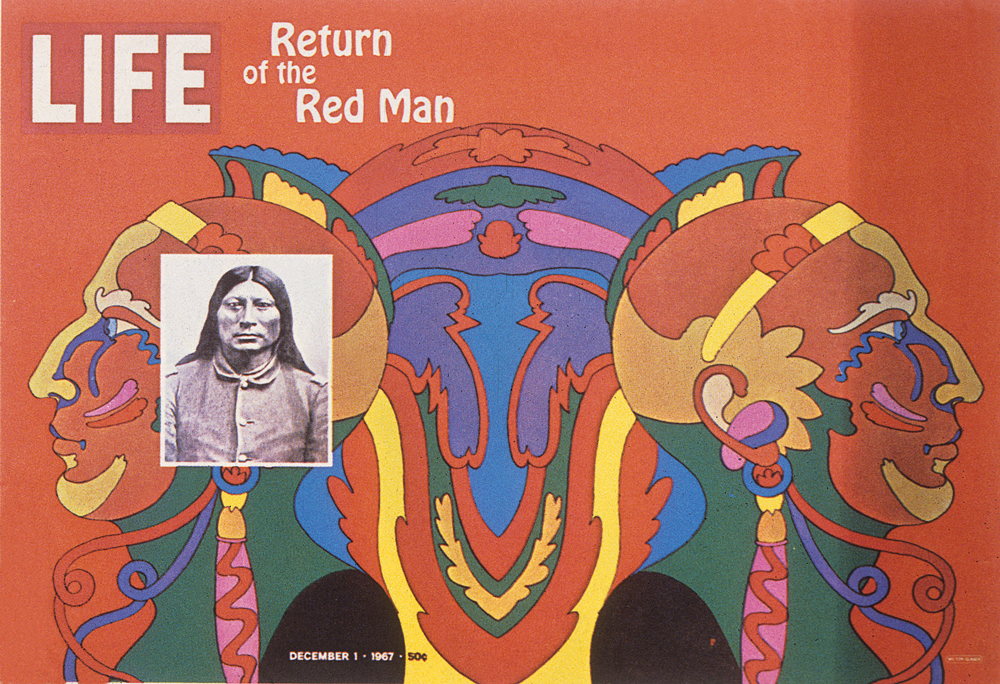
My life with (and in) magazines appropriately began with Life. Although it was not as well designed as art director Allen Hurlburt’s Look, it was exceptional in most other ways. Through Life’s photographic essays, Americans were afforded multiple pairs of eyes with which to view a world that would otherwise be impossible to see. Life was also the bellwether of popular culture. I still vividly recall my first sight of Milton Glaser’s 1967 proto-psychedelic wrap-around cover for ‘Return of the Red Man’. Glaser’s pre-hippie style announced a coming of age in youth culture graphic style – and it was captivating.
Yet it was Look (expertly art-directed by Will Hopkins after Hurlburt’s death) that more precisely captured the youth culture and brought it into the mainstream. Life’s layouts stressed the photographs and the type was fairly bland; Look’s design enhanced the message. It was elegant when necessary, bold when appropriate, and almost always eye-catching. You didn’t just flip through and throw it away. Look was a keeper.
This was a time before ‘the editorial well’ had been plugged up with ads. Magazines routinely featured as many as 50 contiguous pages without interruption. Stories could run for as many as ten spreads. Designers could go wild with that amount of real estate to fill, and they did.
Herb Lubalin (Eros, Avant Garde), Otto Storch (McCall’s), Walter Bernard and Glaser (New York magazine), Sam Antupit (Esquire), Art Paul (Playboy), Dugald Stermer (Ramparts), Ken Deardorf (Evergreen), Bea Feitler and Ruth Ansel (Harper’s Bazaar) and Wolf were only some of the art directors making stunning magazines from the mid-1960s through the mid-70s.
While Life and Look were important in my life, the ‘slick’ mainstream magazines (as opposed to the newsprint rags I worked for) that truly inspired me to be a magazine art director – and collector – can be whittled down to four: Lubalin’s Avant Garde, Wolf’s Show, Stermer’s Ramparts and Glaser / Bernard’s New York magazine.
Starting with the last, it is hard to express my weekly joy at finding a new issue on the newsstand every Monday. In 1968 New York magazine was overtaking the venerable New Yorker as the periodical of choice for city dwellers between eighteen and 50 years old (quite a span). The reason was the clever integration of ‘service’, news and commentary, and the novel use of illustration (mostly conceptual), photography (mostly Life quality) and typography (pull quotes and bold Egyptian headlines). The total package was engaging but the individual parts were essential to its success. For instance, New York had the first ‘conceptual’ table of contents, with related fragments of artwork, so that each week the added game was to determine what the ToC theme was. I borrowed that conceit for my own publication years after New York stopped the practice. The game never got tiring.
During the late 1960s, when the anarchic look of underground newspapers reigned, Ramparts was a leftwing political magazine that straddled the line between ‘alternative’ and mainstream, with relentless investigative journalism and commentary about corrosive issues such as the Vietnam war. It adopted the conceptual covers pioneered by George Lois for Esquire earlier in the 1960s and its format – particularly its signature Oxford rules – was the acknowledged inspiration for both Rolling Stone and New York magazine. Visually, it was also the wellspring for strident satiric graphic commentary, which doubtless influenced the methods of New York magazine and the New York Times op-ed page.
Show was neither political nor apolitical, but its content, while focused on entertainment and popular culture, was not ruled entirely by fashion. So it is best described as the anti-tabloid. Every spread was deliberately and elegantly designed on a conceptual armature. Nothing was in the magazine simply for ‘show.’ Every designed element had a reason, though not always an obvious one.
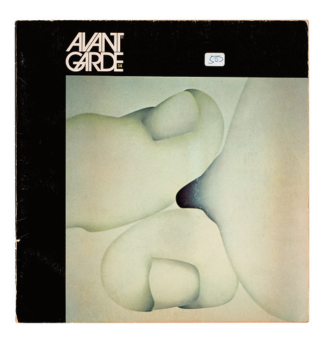
Avant Garde magazine, with the eponymous font Lubalin designed for its logo (which was to become one of the most popular typefaces of the late 1960s), was on the edge of mainstream magazine design. All the design mannerisms that defined the Modernist / eclectic nexus – ‘smashed’ phototype, illustrated headlines, strict grid armature and conceptual illustration and photography – appear in the square-formatted, perfect-bound Avant Garde. It never came out on time, but each new issue was like the release of a new fashion. For me it was a handbook of inspirations and for years I copied – with much less facility – Lubalin’s typographic high jinks.
At the risk of sounding as dour as Henry Wolf, I don’t know of any mainstream magazines today that can influence art directors and designers in the same way as these did (although there are some niche mags that might). Print magazines are no longer a primary source of design inspiration. Yet, looking back at Wolf’s golden age, I am inspired to jump back into the fray and make the next generation of magazines – which means digital ones – as influential as they were.
First published in Eye no. 80 vol. 20.

