Spring 2011
Port: Prêt à porter
Jeremy Leslie, Port’s iPad app designer, explains his methods

‘The iPad environment is so unforgiving,’ says MagCulture’s Jeremy Leslie. ‘In print there’s so much more subtlety because of the way the ink changes the surface of the paper.’
Consequently, when you export print files directly to an app, as so many magazine and newspaper publishers are keen to do, the result on the iPad’s flat, shiny tablet surface is what Leslie calls ‘a graphic bunfight’.
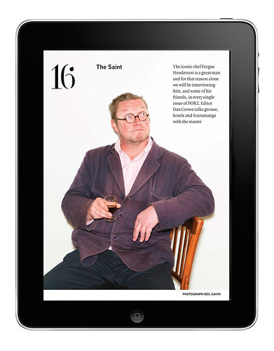
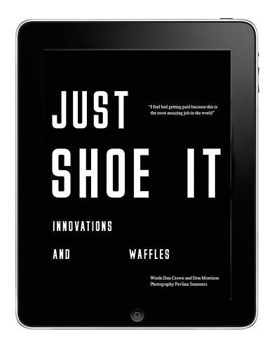
For Port’s app, available for no charge from iTunes, Leslie has opted not to replicate the opulence of Port’s physical experience but rather to find nuances in the display that subtly change the experience of reading on the tablet. These include the pulsating down arrow at the foot of the screen of certain articles, and short animations for the screens that start each major feature: words appear slowly in the black void until the headline is complete.
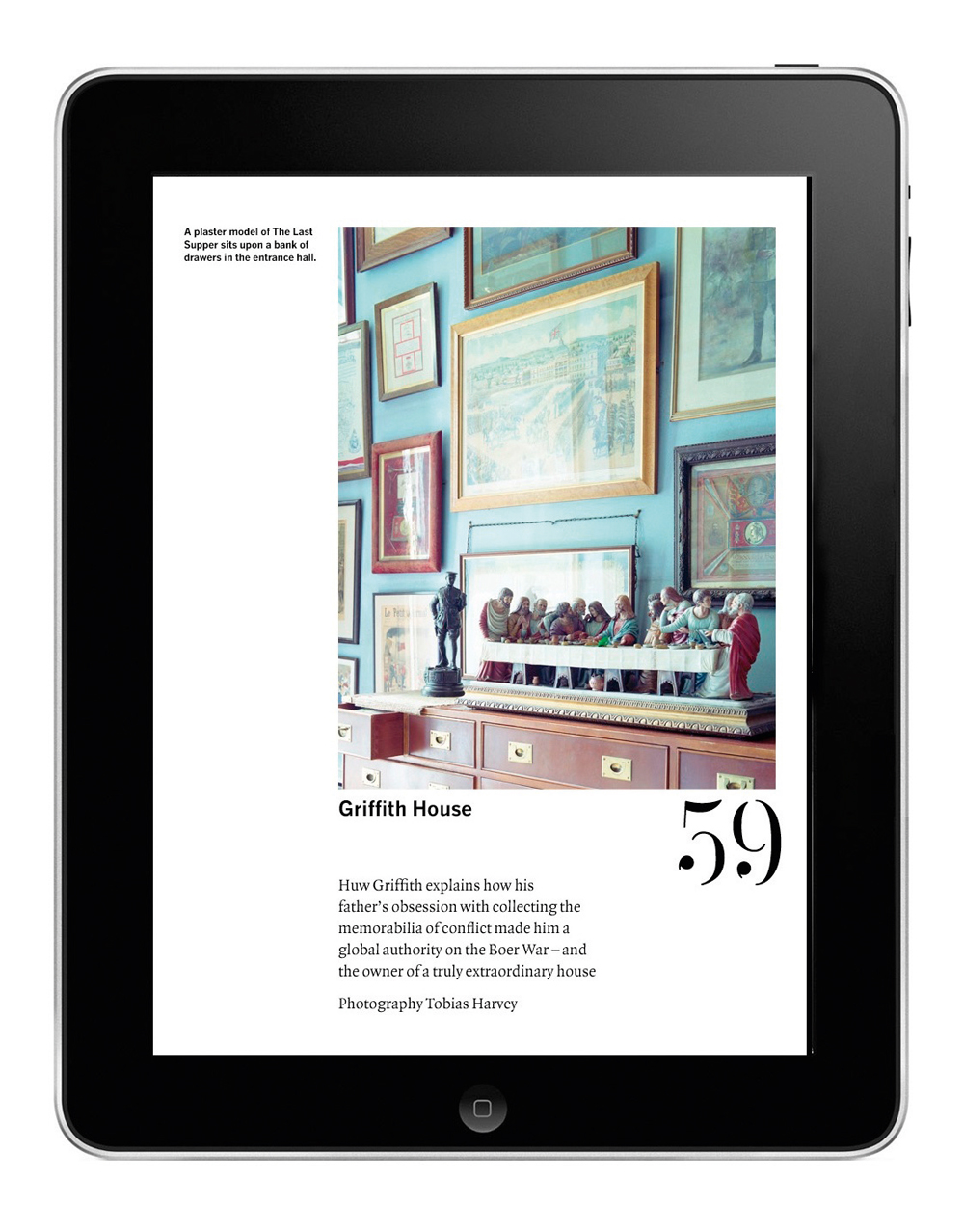
Another difference between mag and app is scale: the iPad screen cannot reproduce Port’s dimensions or its spaciousness, or replicate the hierarchy of type choice and size. The spread, which Leslie calls the printed magazine’s ‘killer app’, and a core element of magazine layout since the times of Brodovitch and Fleckhaus, is not an option.
Doesn’t turning the iPad through 90 degrees to landscape format give him something like a spread? ‘Waste of time!’ laughs Leslie. Having worked as a consultant to several publishers anxious to turn best-selling titles into apps, he laments the energy expended in making magazines that read both ways. In his view, the landscape format is best suited to video – which Port doesn’t yet feature.
The Port app attempts to tackle the leisurely ‘visual essay’ aspect of the printed content by arranging pictures in slightly overlapping screens: in the Rula Jebreal profile, you can see a sliver of the next screen’s photo to the right of the column. In some of the Greenland photos you swipe across wide pictures that are shared across two or three screens: it’s like looking at a gatefold one page at a time.
Leslie says that the Port iPad app is not so much ‘the answer’, more his ‘contribution to the discussion’. But what do the publishers think? Matt Willey says: ‘I’ve been very hands-off with the app. I pitched the idea to Jeremy over a coffee and I’ve been supremely comfortable with him getting on with it.’
First published in Eye no. 79 vol. 20.

