Winter 2010
The little journal that grew big

How Dave Eggers’ design ethos contributed to the success of his publishing ‘empire’, McSweeney’s

The varied output of McSweeney’s, the San Francisco-based publishing mini-empire, has a distinctive design sensibility. But it is difficult to characterise. In its various publications – the eponymous quarterly journal; The Believer, a monthly; Wholfin, a quarterly DVD magazine; books under four related imprints; and a website, McSweeney’s Internet Tendency – there is an almost defiantly anti-design aesthetic. Type and illustration reign supreme, and the designs hark back to an earlier craft-based age, sometimes Victorian, sometimes postwar pulp.
At a time when so much of conventional publishing is on its knees, McSweeney’s is self-deprecatingly modest about its achievements. The website refers to its ‘many, very smallish divisions’. The company has fewer than a dozen employees but a steady stream of ambitious projects.
There does not seem to have been any grand plan for world domination when Dave Eggers (b. 1970) launched Timothy McSweeney’s Quarterly Concern in 1998. The huge success of his first book, A Heartbreaking Work of Staggering Genius, was still to come (it was published in 2000) but Eggers, who was working on magazines in New York, already had a clear idea of what he wanted to do with his new journal.
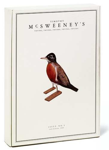
Below: McSweeney’s 4, 2000, was the first issue with a colour cover, packaging several booklets into this outer box. Illustration and design: Dave Eggers.
Top: cover of Sweeney’s 9, 2002.
A proud bookishness
The first issue published only work that had been rejected elsewhere. But from that issue, the dominant style of McSweeney’s writers was established: there is humour, with a touch of the absurd rather than fashionable snarkiness; descriptions are clear and almost deadpan, and sentiment is not sniffed at. Increasingly over the years, there is a strong political undercurrent to both the writing and the chosen themes. Eggers himself has written movingly about post-Katrina New Orleans in Zeitoun and Sudan in What Is the What. McSweeney’s 26, published in 2008, took as its theme ‘Where to Invade Next’, making the case for invasions of North Korea, Syria, Iran, Sudan, Pakistan, Venezuela and Uzbekistan.
McSweeney’s, however, is nothing if not eclectic in its subjects and writing styles, but that variety is contained within a distinct design sensibility. ‘Grouping together such distinctive authors as Jonathan Lethem, George Saunders, Joyce Carol Oates, Roddy Doyle and David Foster Wallace is about as easy as herding cats,’ Stephen Amidon told readers of The Times in 2008, but pointed out that most of the contributors ‘share an occasional interest in mixing reportage and fiction, as well as in buffing the surfaces of their prose with italics, unusual fonts and antiquated typography.’
Combine that antiquated typography with a more modern taste for illustration and you come about as close as you can to defining the McSweeney’s design style. ‘[Here] the Modernist principle of ‘activated’ white space seems empty, both wasteful and useless, because every place is seen as a potential space to hold meaning,’ wrote Andrew Blauvelt in Eye 35. A proud bookishness is at the core of what McSweeney’s does. Typography matters, but it is rarely taut and refined – all of McSweeney’s publications revel in plenty of words.
The interest in design certainly has been one thread from the start. The cover of the first journal proclaimed its dedication to ‘Stamping out sans serif fonts’. This injunction was shared with a host of others: ‘eschewing the recent work of Saul Bellow’, ‘waiting for the likely second coming of Olaf Palme’, ‘hoping for redemption through futility’, etc.
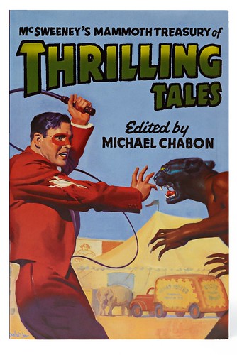
Below: the cover of McSweeney’s 10, 2003, features an illustration by 1930s pulp artist H. J. Ward taken from an issue of Red Star Mystery. Covering lettering by David Coulson.
New and misguided
There is a precise document recording the genesis of McSweeney’s. A four-page email from Eggers in July 1998 describes what he plans to do with his new quarterly magazine. ‘If you have a story that’s good, but conventional, you’d probably be better off sending it somewhere legitimate. This thing will be more about trying new, and almost certainly misguided, ideas.’ He originally circulated this email to his friends, but it also seems to have been passed around like samizdat within an upstart American literary culture.
McSweeney’s was hardly the first iconoclastic literary journal but it may well have been the first with such an acute design awareness. It wasn’t just the jibe against sans serif, but the degree of care both in design and in production.
Elizabeth Kairys, then art director of Salon, was involved in the early McSweeney’s work but the design, like just about everything else to do with the company, stems from Eggers himself. The inspiration is found in old books, pulp magazines, advertising fliers, mad, the art group Fluxus, half-forgotten literary journals and a host of other references.
Page through the Art of McSweeney’s (Chronicle / Tate Publishing), and you’ll find regularly scattered stories about Eggers doing a sketch of what a cover should look like.
Although the preoccupations of McSweeney’s are very contemporary, there is something almost Victorian in the respect of craft and tradition that runs through its works. Eggers and his colleagues are acutely conscious of this: ‘It should be noted that no one at McSweeney’s has any formal training in book design or production,’ the website proclaims. ‘We came together and remain together only out of a mutual love of words, of the neverending process of reinventing language to best help us understand the world and ourselves, and are committed to the neverending process of reinventing book-making to best guarantee those words live and last.’
For the first several years, McSweeney’s quarterly and the first few books from the imprint were printed in Iceland by Oddi. Eggers chose Oddi because he’d long been intrigued by Iceland, and because he came across an art book, Harsh Realty by photographer Peter Garfield, produced there. The accounts of his collaboration with Oddi in Art of McSweeney’s show that he found people there as involved in the craft of creating printed objects as he was.
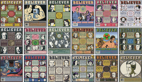
While Eggers and his colleagues show great care for the tactile elements of their work – good printing, well chosen papers, unusual bindings – the actual act of design has been simplified in the extreme. Consider, for example, how Eggers describes the template he created for The Believer magazine: ‘We knew the design staff had to be minimal, or basically nonexistent. So the general task was to design a template that was clear and memorable, and simple and unchanging enough that one person could maintain it.’
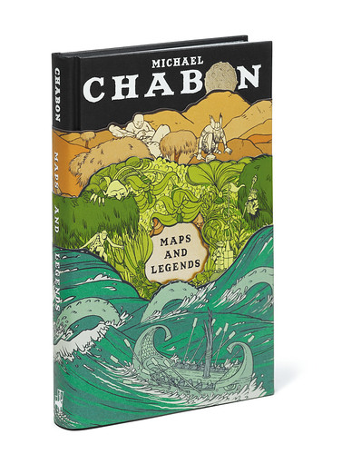
The McSweeney’s brand is perhaps most visible in its books, such as Eggers’ own Zeitoun (2009) or Michael Chabon’s Maps and Legends (2008) with its three-piece dust jacket. These are not art books but the delight in the traditional crafts of book-making is evident: good bindings, stamped covers, cut-outs, raised type, artwork printed directly on the cloth cover – techniques that had virtually vanished from standard book publishing. When you browse in a bookstore, the McSweeney’s titles demand to be picked up and pored over.
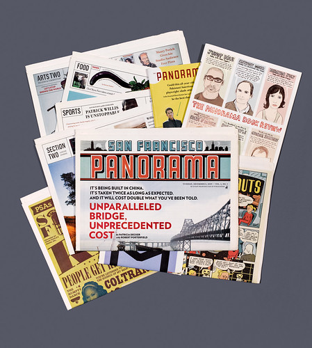
Below: McSweeney’s 33, ‘The San Francisco Panorama’, a single-issue ‘newspaper’, was sold by newspaper vendors in San Francisco for one day only - Tuesday, 8 December 2009. Its 320 pages were packed with investigative journalism, reviews, comics, a glossy magazine and infographics. Art direction and design by Dave Eggers, Brian McMullen and Chris Ying.
Changing constellation
The organisation of McSweeney’s seems more like a new-wave technology company than a literary enterprise. A Web 2.0 company may have a few staff in San Francisco, programmers in Bangalore, a business end outsourced to a third party, and a changing constellation of talents that come into and out of projects as the needs arise. This kind of organisation echoes the nature of the Web, with its ‘small pieces, loosely joined’, in the words of writer David Weinberger. So it is with McSweeney’s. The ‘many, very smallish divisions’ run largely autonomously, with the small central staff acting more as connective tissue than anything like the command-and-control hierarchy of traditional businesses. The staff of The Believer, for example, are scattered around the US – largely in New York and San Francisco. Heidi Julavits, its co-editor, notes in Art of McSweeney’s that The Believer’s first staff meeting took place about a year and a half after launch.
McSweeney’s doesn’t make a fortune but that is not the aim. Brian McMullen, art director, states it simply. ‘We survive,’ he says. ‘That’s a win. We’re able to do projects that interest us and we get to eat.’ Survival is particularly relished given the near-death experience the company had at the end of 2006, when its distributor went bankrupt, owing McSweeney’s 0,000. Perseus Books took on the distribution, paying 70 cents on the dollar, and an eBay auction largely eliminated the loss.
Below: covers of The Believer. Eggers designed a template for the magazine that would be ‘clear and memorable, and simple and unchanging enough that one person could maintain it’.
Publish and survive
Such an experience makes any small business conscious of its mortality. It hasn’t, however, slackened the innovative urges of McSweeney’s. In 2009, this led to the publication of ‘Panorama’, sold for one day in San Francisco by newspaper hawkers and available since (as McSweeney’s 33) in the kind of independent bookstore that carries their publications. This 320-page broadsheet (15in x 22in), including magazines and posters was newspaper-like, even if it contained little news. ‘Panorama’ quickly sold out its initial 20,000 run, and a second run of a further 20,000 sold out as well. Eggers told the San Francisco Chronicle at the time: ‘It is our unorthodox belief that the Web and the newspaper can coexist, but that physical forms of the written word need to offer a clear and different experience […] Anyone who wants to borrow our ideas can do so.’
McSweeney’s 36, out December 2010, comes in a big, ‘head-sized’ box with more than 500 pages in the form of booklets, postcards, maps and a 40-inch ‘scroll of fortunes to clip and use’.
The clear entrepreneurial spirit of Eggers has led him in other directions as well. In addition to McSweeney’s and the steady output of his own writing, in 2002 he and teacher Ninive Calegari co-founded a non-profit tutoring, writing and publishing centre for under-18s at 826 Valencia in the Mission District of San Francisco. 826 Valencia (see Eye 48) provides after-school tutoring, field trips, workshops and in-school programmes – all free of charge – on expository and creative writing. The 826 concept has since spread to seven sister centres around the us, each with an eccentrically themed store on site (pirates in San Francisco, superheroes in New York, space travel in Seattle, cryptozoology in Boston, time travel in Los Angeles, secret agents in Chicago), and inspired similar ventures in Ireland (led by Roddy Doyle) and the UK (Nick Hornby’s Ministry of Stories in Hoxton, London). Among 826’s more visible output are two collections of children’s letters to the US president and first lady, both published by McSweeney’s.
There are no grand entrepreneurial lessons or revelations about the future of publishing to be had through examining McSweeney’s. It’s too idiosyncratic and driven, at least in its first decade, by its ruling genius, Eggers. But there is this wholly optimistic conclusion: it is still possible to do creative, humorous, fantastical things in publishing and survive.
’s>
Todd Pruzan recalls McSweeney’s ‘cavern club’ era
Any magazine that has been around for a while – Time, say, or National Geographic – can offer a decent graphic-design history lesson in a procession of covers. They’re coltish at first, these covers, earnest with their solemn serifs; but as technology advances, they gain an extroverted confidence. Look at an 1872 cover – hey, there’s an illustration. 1928 – whoa, a photograph! 1955 – a colour photo! 1984 – dude, a hologram!
McSweeney’s does this trick in time-lapse. Here we are, only twelve years since the first issue came out, looking for all the world like a hilariously melancholy medical journal from the age of phrenology and typhoid. Dave Eggers was 28 at the time. I was, too, and guys that age really have no business knowing how to channel the nineteenth century. Our punctuation comes closest: we put full stops after every title. I’d lobbied for commas – periods, I felt, should have gone after the bylines – but the intent was unmistakable.
Everything from its logotype down to its apologetic 4pt jokes was executed in Garamond 3, and the effect was surprisingly subtle. Dave worked that single font like a celebrity chef who prepares a beautiful five-course stunt meal using nothing but a chicken and a blowtorch. He could be equally monomaniacal about food or music. From a distant room of his sprawling Brooklyn apartment, a stereo might get its shirt caught on a single song for hours or weeks – the Flaming Lips’ ‘Race for the Prize’, Beulah’s ‘If We Can Land a Man on the Moon, Surely I Can Win Your Heart’ – to create a stubborn editorial soundtrack.
Put in Beatles terms, the first four issues were McSweeney’s Cavern Club era: all black-and-white visuals, with its reverberating spin on a familiar sound. As with the Beatles, McSweeney’s own beguiling psychedelia crept in a little at a time: first an illustration, then a colour photograph, then a DVD, and then, inevitably, a salacious Icelandic celebrity tabloid reprinted in miniature in its incomprehensible entirety. McSweeney’s grew up fast, Dave moved in to San Francisco and I remain a grateful fan.
Todd Pruzan worked at McSweeney’s from 1998 to 2000.
Above: Three-piece cover of Michael Chabon’s Maps and Legends (2008) published by McSweeney’s. The ‘belly bands’ (each printed in five different Pantone colours) depict characers from he book on ocean, land and mountains. Illustration: Jordan Crane. Triple-jacket design by Dave Eggers.
Non-designer as hero: Eggers takes on the mighty AIGA
When Dave Eggers stood up before a thousand professional designers at ‘Voice’, the 2002 AIGA conference, writes John L. Walters, people crowded in to see this ferociously bright upstart who had created a small but widely discussed publishing sensation – McSweeney’s – while simultaneously writing one of the most talked-about novels of the time – A Heartbreaking Work of Staggering Genius.
What they got was something more like a super-smart stand-up routine, as Eggers proudly showed the fruits of his early career as an untrained ‘Mac hack’ – a few gormless examples of typical desktop publishing, including a ‘Special Achievement’ certificate decorated by coloured balloons. He displayed what he claimed to be a page from his next novel – a Quark page of solid text. He followed this with one with paragraph indents, and another with a few bits of extra page furniture.
The deadpan delivery had the audience in stitches (only Simpsons’ creator Matt Groening got more laughs at ‘Voice’) but behind the faux-innocence there was a challenge: if anyone with a computer can set text, who needs designers? (Eggers, after all, had put ‘If words are to be used as design elements then let designers write them’ on the cover of the second McSweeney’s.)
He ‘accidentally’ dropped in a slide of an ibm annual report that pastiched the devices familiar from his own little journal: centred serif text; eccentric subheads; boxes, rules and circles. This was an affectionate slap – pro designers needed him more than he needed them.
However the McSweeney’s graphic style didn’t spring directly from Eggers’ head, as he demonstrated with some of the obscure Victorian covers and title pages that had inspired him: literary journals, instructional manuals and pamphlets with the series title of ‘Rare books on avoided subjects’.
In conversation with moderator John Hockenberry, Eggers declared his love for this pre-Modern era of undesign, saying that he thought that contemporary books were too aloof: ‘They take themselves too seriously.’ The implication, though he didn’t say this, was that graphic designers were to blame. The audience, AIGA members all, lapped it up.
First published in Eye no. 78 vol. 20
Eye is the world’s most beautiful and collectable graphic design journal, published quarterly for professional designers, students and anyone interested in critical, informed writing about graphic design and visual culture. It is available from all good design bookshops and online at the Eye shop, where you can buy subscriptions, back issues and single copies of the latest issue. You can also browse visual samples of recent issues at Eye before You Buy.

