Summer 2008
The right stuff

Though touted as the ‘university of the air’, it was the OU’s graphic design that made it a revolutionary success.

The Open University, the first distance-learning degree-awarding body, is rightly lauded for its major contribution to education worldwide. It is consistently highly rated for teaching, and its research – including design research – is world-class. Its social impact is beyond measure and if you’ve never looked into it, visit its website to see the sheer range and depth of its courses. Forget the myth that this is getting a degree for watching TV – as a graduate of the OU myself, I can tell you it is hard but rewarding work.
In all this, though, it is easy to ignore the contribution graphic design has made to the success of the OU. Any lecturer will tell you that having lots of ‘stuff’ to tell students is no good if the manner in which you present it is not geared towards learning. As a former graphic designer, OU graduate and now lecturer of ‘stuff’, it did not take me long to nominate the OU (and its in-house design department) for an overdue place in the new canon.
The importance of design in the delivery of the OU’s courses was recognised at the start, though it was difficult to know how to fit it in to traditional hierarchies: the first ‘designer’ at the OU was employed on a secretarial grade because no adequate description of her role existed. The early days were pioneering for all concerned; the design team effectively grew up together, pulled from around the country, often straight from college, to work in then-new Milton Keynes on a new venture in a new field. It wasn’t just the students who were learning.
Each course is custom-designed to suit the material – no templates here: designers work with course teams (academics, editors, illustrators, software developers) for a year before release, with academics having about two years or more to work on them before that. To be successful, designers need to get to know the contents, and if that means finding out about nanotechnology or Renaissance Europe, so be it. It must be a fascinating job.
The OU defined multimedia before designers elsewhere realised there was more than just paper. Its courses are delivered via print, audio, video and online, and while the rest of the industry still seems to be coming to terms with accessibility, this has been a core feature of OU materials since day one. It pioneered the design of learning materials in a way that has influenced not only distance-learning but traditional methods of teaching as well. Sadly, many universities and colleges fail to learn the lesson, thinking distance- and e-learning are simply a case of converting course notes to PDFs and uploading them to a website. It is not that simple.
From the famous (and recently updated) logo to materials to accompany the OU’s award-winning co-productions with the BBC, the OU’s in-house design team has surely had more effect on society than any other design group or ‘heroic’ individual.
Nominating it for the new canon is a pleasure. Though why it has never received a design award for its consistently excellent work is a mystery.
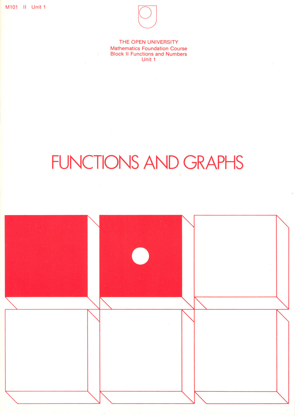
Top: single-colour cover for mathematics textbook M101 Unit 1, 1984. Design: Graphic Design Group of the Open University.
First published in Eye no. 68 vol. 17 2008
Eye is the world’s most beautiful and collectable graphic design journal, published quarterly for professional designers, students and anyone interested in critical, informed writing about graphic design and visual culture. It is available from all good design bookshops and online at the Eye shop, where you can buy subscriptions and single issues.

