
Spring 2010
Up close and tight
The legendary Herb Lubalin brought humour, sensuality and a contemporary flourish to complex typographic arrangements.
Herb Lubalin’s typography has been described as ‘smashed’, but nothing about his arrangement of letters on a page is violent or accidental. His methods were the stuff of legend – and none involved a sledgehammer. Nothing goes to pieces. Rarely have complex typographic arrangements been so unified. Lubalin’s marker-pen comps on tracing paper were as decisive as finished artwork. With a razor blade, he customised serifs, ascenders and descenders to his liking – some letters barely touching, others lovingly intertwined. Few designers set text in Lubalin’s ligature-rich Avant Garde with the energy and clarity its designer brought to the page.
Though his career spanned five decades, Lubalin’s best work seems to inhabit a frozen moment, wedged between the corporate orthodoxy of 1960s Modernism and the Art Deco revival of the 1970s, a period of rich typographic eclecticism that endures and appeals to young designers today.
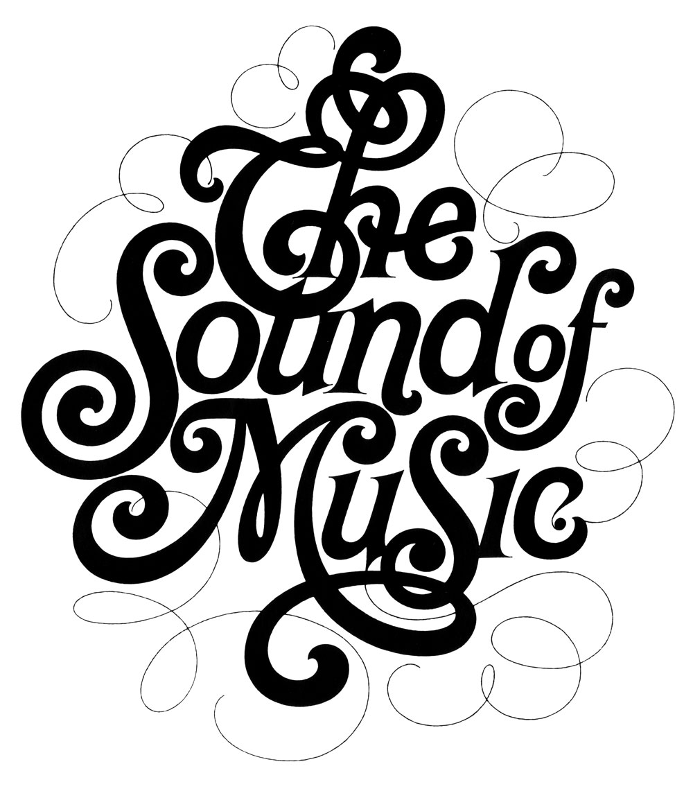
Lubalin took the best of Modernism – its rigour, geometry and tightly constructed compositions – and added humour, sensuality and lots of flourishes. Look at his logotypes: from the chubby Spencerian hand-lettering for The Sound of Music programme to the whisper-thin justified stack for the Cooper Union. Each is poetic but rigorously balanced – the centre holds.
Brooklyn-born Lubalin attended the Cooper Union, where he was an anomaly – left-handed, colour-blind and a man of few words – but excelled in calligraphy. Shortly after graduating in 1939, he joined the ad agency Sudler & Hennessey (later Sudler, Hennessey & Lubalin) as an art director. In 1964, at the age of 46, he left to set up his own shop (whose name underwent a series of changes based on evolving partnerships with Aaron Burns, Tom Carnese, Tony DiSpigna, Ernie Smith, Roger Ferriter, and Alan Peckolick).
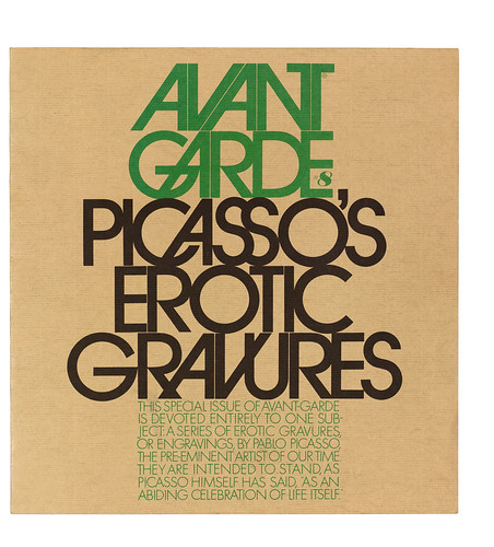
He helped launch three magazines: Eros (1962, see Eye 25), Fact (1964) and Avant Garde (1968). He continued to work on advertising, noting that ‘the most intriguing thing about advertising is writing the headline’. For Ebony magazine, he art-directed and co-wrote six confrontational ads in 1968, each with an unforgettable headline: ‘Some of our best friends are bigots’, ‘We’re dreaming of a black Christmas’ and ‘You don’t have to love us. Just give us your business’ (Don Draper couldn’t have said it better).
Lubalin never liked the term ‘typographer’, finding it too reductive. ‘Typographics’ – a word coined by Burns – was, he said, ‘as good a name for what I do as any.’
Lubalin designed four typefaces: ITC Avant Garde Gothic (1970), an outgrowth of his logotype for the magazine; Ronda (1970); Lubalin Graph (1974), a slab serif; and ITC Serif Gothic (1974). Tied as they are to Lubalin’s work or the publications they helped define, these fonts are fiendishly hard to employ effectively.
Almost three decades after his death (in 1981), his influence and relevance was celebrated in ‘Lubalin Now’ (5 Nov–8 Dec 2009), an exhibition curated by Mike Essl and Alexander Tochilovsky of ME/AT for the Herb Lubalin Study Center of Design and Typography at the Cooper Union. (See some examples in ‘Make each letter speak out loud’.)
The best work, like Gretel’s three-dimensional type-based motion graphics for Yahoo!, or Alex Trochut’s intricate, ribbon-like typography, was bold, dense and carefully wrought.
More than any new work in the show it was the wall mural, covered in hundreds of Lubalin logos, that held the spectators rapt. In this case, the sum was greater than the parts.
First published in Eye no. 75 vol. 19.
Eye is the world’s most beautiful and collectable graphic design journal, published quarterly for professional designers, students and anyone interested in critical, informed writing about graphic design and visual culture. It is available from all good design bookshops and online at the Eye shop, where you can buy subscriptions and single issues. You can browse a visual sampler of Eye 75 at Eye before You Buy.