
Summer 2026
Modern lovers
Manchester’s The Modernist champions mid-century design and architecture. Critique by Rick Poynor
Every issue of The Modernist architectural magazine, launched in 2011, is devoted to a theme. This is not a novel editorial device and it could be constraining, but in this case it generates an unpredictable and fascinating stream of articles. In a recent issue (no. 55), defiantly titled ‘Ordinary’, the quotidian delights range from the humble British three-pin plug to Dieter Rams’s imperishable 606 shelving system, with a guided tour around the theatrical staircase at Berthold Lubetkin’s Bevin Court housing project – ‘staged like a Constructivist ballet’ – written by someone who lives there.
In a foreword to The Modernist’s first issue, the acerbic critic Jonathan Meades, who remains a patron on the masthead, urged the magazine to ‘mock the timidity’ of those who fail to see the beauty in Brutalism. While it might seem that a publication created by The Modernist Society would only be inclined to accentuate the positive, issue 55 also features a depressing portfolio of severe and soulless blocks of modern flats looming over crestfallen rows of old brick houses that somehow cling on.
Cover of issue 47 of The Modernist, 'Machine', 2023. Design: Trevor Johnson, Craig Johnson and Lily Platt. Cover image: Tower Cranes study by himHallows.
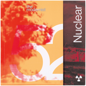
Top. Cover of issue 52, 'Nuclear', 2024. Design and artwork: Johnson INC and Lily Platt.
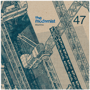
With issue 41, The Modernist broke loose from a curiously unfunctional narrow vertical format based on multiple folding pages – it was somehow both involving and distancing at the same time. The new design by the renowned Mancunian designer Trevor Johnson and his brother Craig (the society is based in Manchester) transformed the magazine into a 20 cm square. They clad this engagingly nifty container in highly tactile card covers printed in just two colours, like a museum catalogue designed by Willem Sandberg ca. 1960 (see Eye 25).
Johnson’s primary inspirations were Swiss and Italian publications from the 1950s to the 1970s. He used tightly leaded sans serif on a three-column grid, ranged left with line spaces between paragraphs. The type could be black on a coloured page or white out of silver or black. These formal variations reflected a significantly higher number of images packed into 60 or 72 pages. Some excellent issues ensued, among them ‘Machine’, ‘Music’ and ‘Layout’ (an edition with intense graphic designer appeal: Irma Boom’s books, the grid, the philosophy of Karl Gerstner and 1970s ‘Manchester Modernist’ Norman Wilson rediscovered).
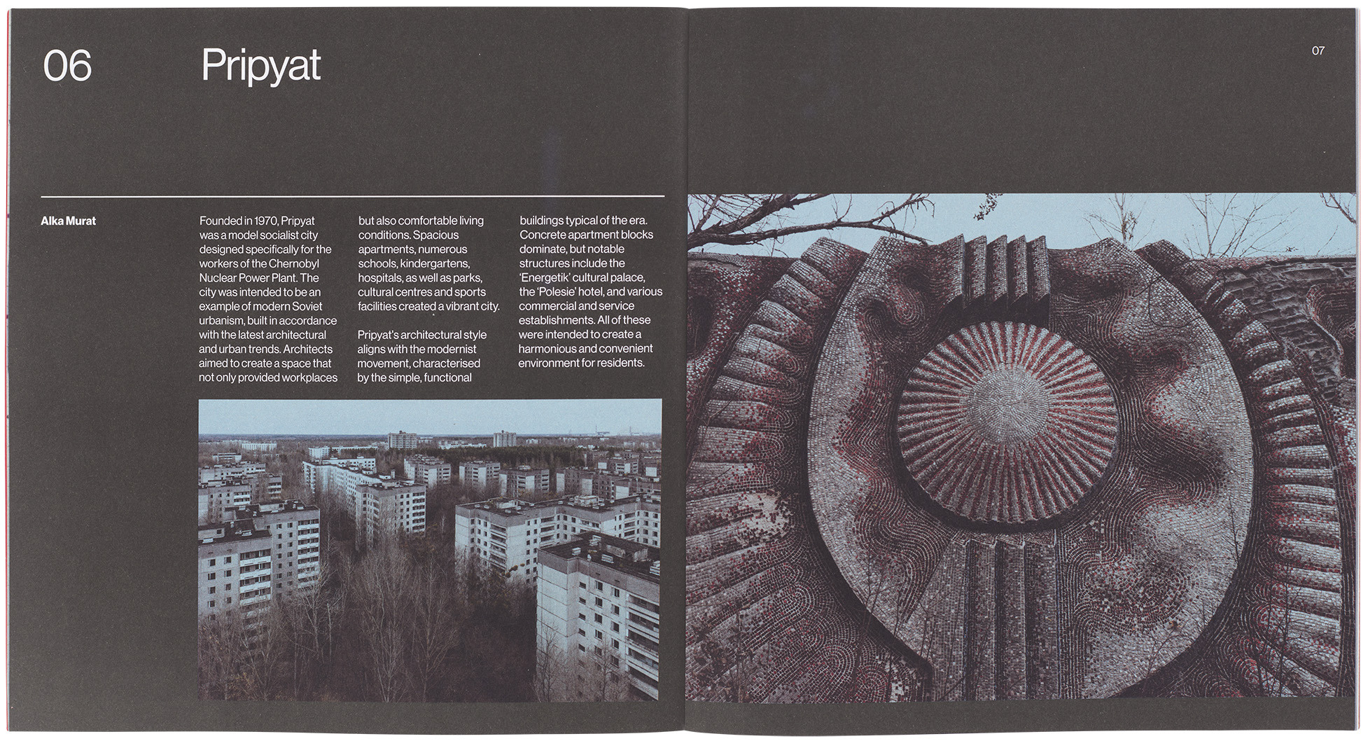
Feature about the contaminated and abandoned city of Pripyat in Ukraine in the 'Nuclear' issue.
Opening page of feature about Span housing development in issue 55, 'Ordinary', 2025. Design: Johnson INC and Lily Platt.
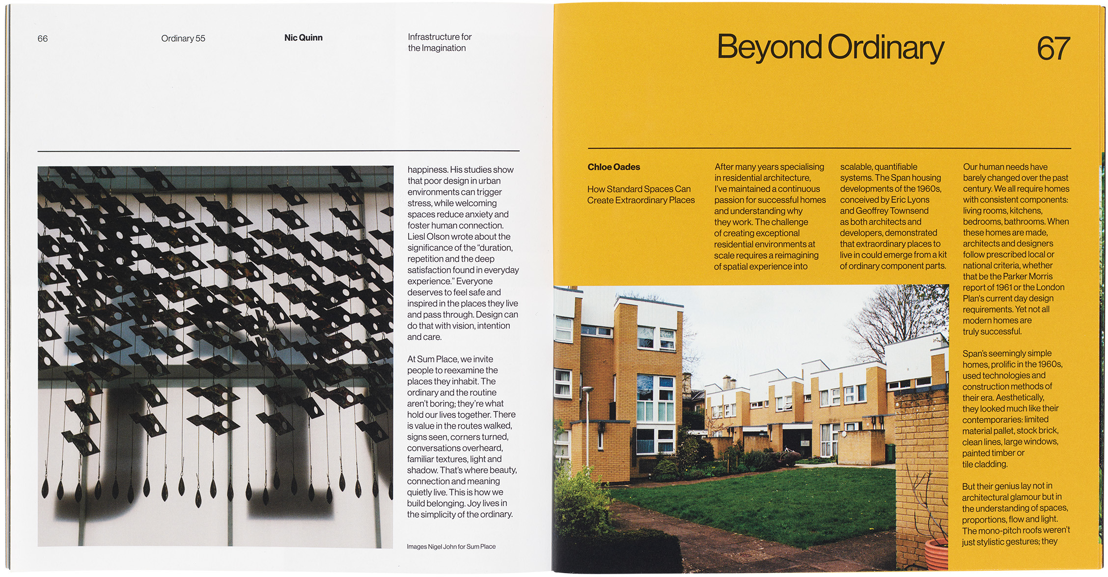
A new round of changes arrived with issue 50. The page size stayed the same but the grid was adjusted to four inevitably narrower 4 cm columns, perhaps to allow greater flexibility of picture placement. A fractional increase in leading improved legibility. The pages acquired a higher, more visible shoulder, with a horizontal rule capping the columns and still leaving a generous head margin.
The most significant rethink in terms of the magazine’s visual image and impact was a change of cover paper stock to allow vibrant colour – issue 52, ‘Nuclear’ (2024), glows an alarming orange and red. The front cover is trimmed by about 25 per cent to reveal the first page emblazoned with the theme, printed vertically, and a contrasting image. Less successful is the over-inflated issue number, the leastinteresting editorial element, which now dominates the covers. It is eye-catching yet repetitive, gesturing at Modernist dynamics to no clear purpose.
Otherwise, the ‘Nuclear’ issue showed the confidently assertive new design at its best. The nuclear power theme was timely, part of a wave of interest in our nuclear history and legacy that includes the photobook The Nuclear Sublime (see Eye 109) and Atomic Albion (2025), an exhaustive survey of nuclear power stations. Revealing visual research encompasses darkly atmospheric photos of the abandoned city of Pripyat near Chernobyl, counter-intuitively optimistic pictures of landscapes with nuclear reactors, interior shots of the Dungeness B power station, technical diagrams, protest graphics, archival photos and tatty paperbacks with atomic themes. These visually led stories are organised with an effortless sense of flow. The magazine may be small compared to genre norms, but it always feels dense with information and cultural interest.
From its starting point – as a platform for society members committed to the celebration of Modernist architecture in Britain – The Modernist has matured into a publication that touches on subjects of wide public concern. The latest issue (56) addresses the theme of ‘Pleasure’. This imaginative range of topics is all the more impressive for a magazine that is a by-product of other activities rather than a main focus. The society produces a plethora of talks, tours, exhibitions and films about notable buildings. It has an extensive publishing programme (see review of Modernist Graphic Design in Britain, Eye 108) and an attractive shop in the centre of Manchester, where back issues can be found. In a field – architecture – that has never lacked publications of high calibre, The Modernist has been tended with devotion by its founders and friends, and evolved its own unique voice.
Rick Poynor, writer, Eye founder, Professor Emeritus, University of Reading
First published in Eye no. 110 vol. 28, 2026
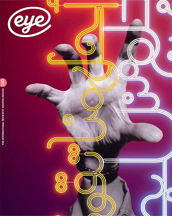
Eye is the world’s most beautiful and collectable graphic design journal, published for professional designers, students and anyone interested in critical, informed writing about graphic design and visual culture. It is available from all good design bookshops and online at the Eye shop, where you can buy subscriptions and single issues.