Summer 2015
Online rhetoric
Though intended to make its contents ‘democratic’, art website The Space is a perplexing jumble. Critique by Rick Poynor

‘The Space is about changing the way we produce art and the way we consume art, making it more open, making it more democratic,’ says Alex Graham, chair of The Space, a venture by the BBC and The Arts Council of England devoted to introducing audiences to new art. First launched as a pilot in 2012, the website was rebooted with a new look last year.
I will come to The Space’s design in a moment, but let’s linger over that mission statement, which appears in a video about a digital ‘art hack’ at Tate Modern. It’s a very contemporary kind of aspiration, slips down a treat and perhaps you agree with every word. But it packs in some large assumptions. Are they actually correct? If we need to change the way we produce art, then there must be something wrong with the way we currently do so. But is that the case? And are all the ways we produce art wrong, or only some of them? The allusion to how we ‘consume’ art is another meaninglessly broad claim. Audiences experience art – surely that is a better way of putting it – in numerous ways. Precisely what aspects of these encounters need to be changed and why?
The answer comes in the next bit of the sentence. According to the speaker, art is not open or democratic enough. Yet in reality, art has never been more publicly available and accessible to audiences. Art galleries and museums, not least Tate Modern, are packed with people attracted by effective marketing and publicity. The need to justify public funding long ago began to change the way that some art is produced and consumed, though not necessarily always for the better. To insist that art be democratically accessible to the maximum number because that is the bureaucratic mandate now is to impose arbitrary limitations on what art can be or do. Is that what The Space’s chair is getting at?
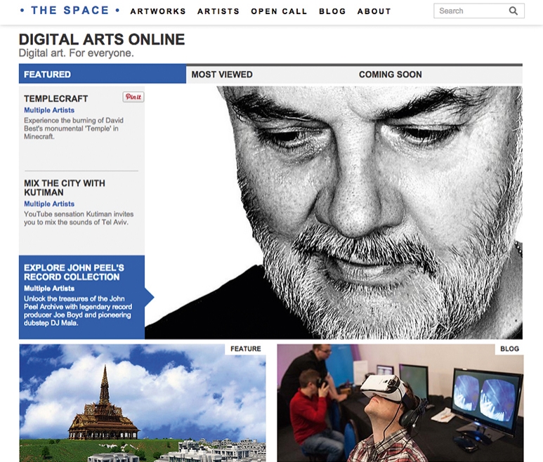
The Space functions as a portal for accessing online projects jointly produced with institutions such as Tate Modern, the Barbican Centre, Sage Gateshead and the Edinburgh Festival, as well as smaller scale initiatives. For a project that has received £16 million of investment, the site’s tight and boxy look is disarmingly basic and almost generic. After initial brand identity work by Wolff Olins, the site is designed in-house. The default sans serif conveys nothing exciting or distinctive about the venture’s perspective or ethos, and the overuse of uppercase for headings, titles and names is pedestrian. In the blog, which publishes news stories and features, the line width is much too long for comfortable screen reading. It is perplexing to see the most basic principles of textual accessibility ignored and such details make the talk of ‘democracy’ and ‘openness’ look even more like bureaucratic hot air.
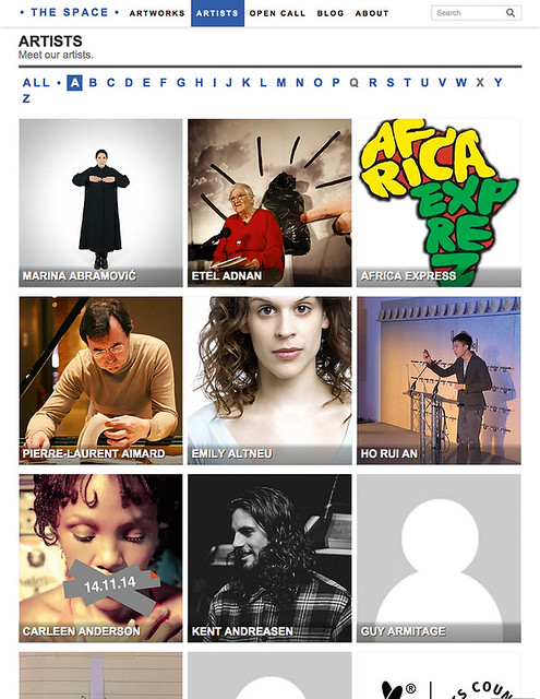
Index to artists featured on the website.
Top: The record collection of the late BBC Radio 1 presenter John Peel, introduced by record producer Joe Boyd. The Space, www.thespace.org
Although this is not a review of The Space’s content, there is some good material on the site. I enjoyed Africa Express’s version of Terry Riley’s In C, which can be watched while learning about minimalist art at Tate Modern. Staying on a musical theme, the selective tours of the late DJ John Peel’s vast record collection, starting with producer Joe Boyd, promise to be an evolving treat.
City of Drones by Liam Young, John Cale and digital agency Field (see Eye 80), part of the Barbican’s ‘Digital Revolution’ show, is a vertiginous flight through a digital landscape and exemplifies the site’s optimistic (if not glib) commitment to ‘Digital art. For everyone.’
These artworks were all filed under ‘Featured’ or ‘Most Viewed’ and were easy to find. Everything else is stored alphabetically under the heading ‘Artists’. Here, though, little thought has been given to the browser’s needs. The name of each artist is placed on a picture, usually a portrait, and it is necessary to roll over the name to find out what the person does – poet, photographer, singer / songwriter etc. This description could easily have been included on the top layer, with supplementary information hidden below. While the site features artists of all kinds, they are jumbled together and not organised by category and there is no way of retrieving, for instance, performance artists, other than using the general search. However when I did this, I got ‘no results found’ even though I could see Marina Abramović, labelled by the site as a performance artist, listed in the ‘A’ section.
The main problem with The Space, apart from its lacklustre look, is that it needs much sharper editing and curating. It would be so much more engaging if it were conceived more like a magazine that acts as a front-end to diverse but well organised kinds of content. If comedy acts such as Gamjarbot and Red Bastard are worth including as a branch of art (personally, I would dispute it), then build up a section, explore the topic and explain it, as well as showing it. Publishing and broadcasting have known how to do this for decades.
If the aim is to open things up for an even wider online audience, then don’t muffle the issues with unfocused, amateurish presentation. The application of intelligence is the way to make the arts accessible.
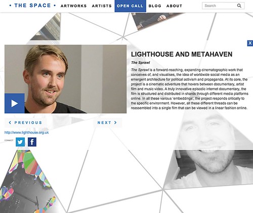
Metahaven (see Eye 71) in partnership with Lighthouse won an open call to create a project for The Space.
Rick Poynor, writer, Eye founder, London
First published in Eye no. 90 vol. 23, 2015
Eye is the world’s most beautiful and collectable graphic design journal, published quarterly for professional designers, students and anyone interested in critical, informed writing about graphic design and visual culture. It is available from all good design bookshops and online at the Eye shop, where you can buy subscriptions, back issues and single copies of the latest issue. You can see what Eye 90 looks like at Eye before You Buy on Vimeo.

