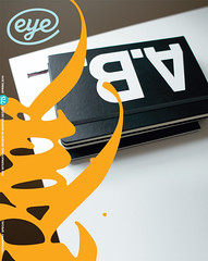
Spring 2010
Poetry of colour

Interaction of Color: New and Complete Edition
By Josef Albers<br>Yale University Press, £150There are two types of primary colours: additive and subtractive. The subtractive primaries (CMYK) are made of pigment and become darker when combined, while the additive primaries (RGB) are made of light and become brighter when combined. In this formulation, Yale University Press’s new expanded edition of Josef Albers’ Interaction of Color is distinctly additive, brightening the corners of this influential classic and broadening it to a two-volume slipcased set.
With coloured bindings inspired by one of Albers’ lessons, these volumes operate in concordance: one carries the text, the other an expanded set of 145 plates created by the artist and his students. The reworked design brings Interaction of Color closer to its original 1963 edition, which, according to Nicholas Fox Weber, the executive director of the Josef and Anni Albers Foundation, was a ‘set of unbound folders [...] heavier and larger than anything Yale University Press had ever published’.
Once again more suited to a museum patron’s coffee table than an art student’s backpack, this comprehensive set changes our interaction with Interaction, insisting we clear a space, spread the book of plates beside Albers’ descriptions and learn the act of seeing colour afresh. In lesson after lesson, Albers shows the mutability and pliancy of colour as a creative material, how it is changed by the colours surrounding it, by the time we spend looking at it, by its distance from our eye, and by our eye’s own imperfections as a perceptual apparatus.
Weber’s new foreword paints the book’s progress – and Albers’ career more generally – as a triumph over adversity, pointing out his impoverishment during the Weimar inflation, the discrimination he faced as a German at Yale after the war, and finally his efforts to persuade Americans of the value of his practice and pedagogy.
Weber is best, though, when he is providing flourishes of biographic colour, including Albers’ favourite place to eat potato pancakes, or his evocative comparison of painting to spreading butter on pumpernickel bread. (Like your sense of colour, your experience of breakfast may never be the same.)
Art instructors and autodidacts alike will appreciate this new edition – the classroom is thoroughly present throughout. ‘On the blackboard and in our notebooks we write: colour is the most relative medium in art,’ Albers instructs. He is a great master of analogy, teaching colour relativity with an anecdote about three jugs of water, each at different temperatures. He describes the slipperiness of colour memory with an almost Pop request to recall the red of Coca-Cola. Throughout, these tutorials turn into a kind of lyric free verse, with their texts broken for sense and set like poems on the page.
From a lesson on ‘2 natural effects’, Albers observes, ‘The water of a swimming pool with blue walls will look dyed with blue because of diffused reflection. Observing the white or blue steps within the water, we will discover that with each step down, the blue of the water increases progressively.’
The surface of this new edition may shimmer a bit more, but its lessons only grow deeper with time. Dive in.
Rob Giampietro, principal, Project Projects; teacher, RISD and Parsons; New York
First published in Eye no. 75 vol. 19 2010
Eye is the world’s most beautiful and collectable graphic design journal, published quarterly for professional designers, students and anyone interested in critical, informed writing about graphic design and visual culture. It is available from all good design bookshops and online at the Eye shop, where you can buy subscriptions and single issues.
