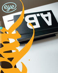
Spring 2010
The font now arriving at Platform 1

Helvetica and the New York Subway System
Blue Pencil EditionsStories in the glossier design books usually have neat endings: the project is completed successfully, beautifully photographed and the designers and clients live happily ever after. Only we know real life isn’t like that … it’s messier, more complex and the loose ends don’t always get tidied up.
Paul Shaw’s Helvetica and the New York Subway System (Blue Pencil Editions, helveticasubway.com) is an attempt to find out how things really happened on one project and along the way it becomes both a design detective story and an exercise in meticulous typographic archeology.
In 1967, Mayor Lindsay’s Task Force on Urban Design declared the New York subway was ‘the most squalid public environment of the United States.’ One of the many problems was the chaotic signage information provision for its users. Shaw tells how in 1966 the new, Modernist design group Unimark International and two of its founders, Massimo Vignelli and Bob Noorda, were hired by the New York City Transit Authority to make some proposals for a new approach. So began the twenty-year saga of designing and implementing a signage system for the network. It’s a tale of inadequate budgets and organisational mismanagement in the face of a massive task, combined with frustration as the designers come up against the signpainters who actually produced the graphics.
The story’s central mystery is finding the evidence for how Standard, the typeface originally specified for the project – known in Europe by its original name Akzidenz Grotesque – came to be replaced by Helvetica.
Shaw sets Unimark’s work in its graphic design context. He has spoken to all the (duly footnoted) participants, followed the trails and collected the photographic evidence. Originally published online at AIGA Voice in 2008, this is an exemplary piece of design research and a rich, intelligently designed book. The archive images of design reports, successive implementation manuals and the ageing and amended signage itself (below) are poignant reminders that the real world isn’t as shiny or simple as those design case studies and credentials pitches make out.
First published in Eye no. 75 vol. 19 2010
Eye is the world’s most beautiful and collectable graphic design journal, published quarterly for professional designers, students and anyone interested in critical, informed writing about graphic design and visual culture. It is available from all good design bookshops and online at the Eye shop, where you can buy subscriptions and single issues.
