Friday, 2:52pm
13 July 2012
Noted #39

Eye editors
Jonathan Barnbrook
Gareth Hague
Bibliothèque
Wolff Olins
Graphic design
Posters
Typography
Visual culture
Olympic graphics watch – pictograms, logos & signs that keep the flame alive

Here are a few reflections on Olympics graphics that caught our attention.More to come – please send us your sightings via Flickr and Twitter.
One Look to rule them all. And 250,000 items of design. Creative Review’s Patrick Burgoyne visits the Olympic Park for an in-depth report on ‘The look of the Games’.
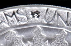
For possibly the smallest implementation of Wolff Olins’ 2012 logo (above), see ‘Art in your pocket?’ on the Eye blog.
‘Me too!’ is a post on the Alias blog by Gareth Hague (who designed the official 2012 typeface) on drawing Olympics graphics.
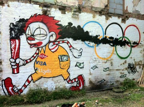
If LOCOG were to appoint an ‘official supplier of caustic commentary on the commercialisation of sport’ it would surely be Jonathan Barnbrook, whose 2004 Olympukes pictograms (below) seem as relevant as ever.
Below: Digital strategy innovation from Perfect Curve’s Siobhan Sharpe, who explains why MySpace has an exciting role to play in the legacy of the Olympic Games.
The ‘Fit’ exhibition of alternative posters (top, Bibliothèque) continues at the Window galleries, 107-109 Charing Cross Road, London WC2. See the complete set on Eye’s Flickr pages.
Eye is the world’s most beautiful and collectable graphic design journal, published quarterly for professional designers, students and anyone interested in critical, informed writing about graphic design and visual culture. It is available from all good design bookshops and online at the Eye shop, where you can buy subscriptions and single issues. Eye 83 is on its way to subscribers worldwide – thanks for your patience.

