Friday, 10:00am
28 April 2017
Noted #81
Stephen Banham
Jeremy Tankard
Alistair Hall
Book design
Graphic design
Illustration
Magazines
New media
Posters
Typography
Visual culture
De Worde, Span, Cashcow Oblique, Bad Decisions and Oz magazine

Here are a few things that caught our attention in recent weeks.
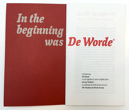
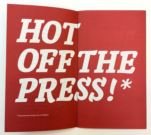
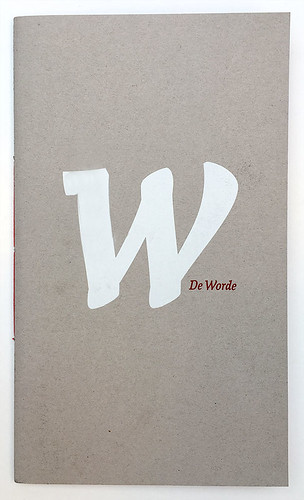
Jeremy Tankard’s most recent typeface De Worde celebrates the 60th anniversary of The Wynkyn de Worde Society. It is beautifully showcased in a sample booklet designed by Alistair Hall (We Made This).
Spreads and cover of sample book, for Jeremy Tankard’s De Worde, designed by Alistair Hall (We Made This). It is named after the printer Wynkyn de Worde (1455-1534), known as the ‘Father of Fleet Street’.
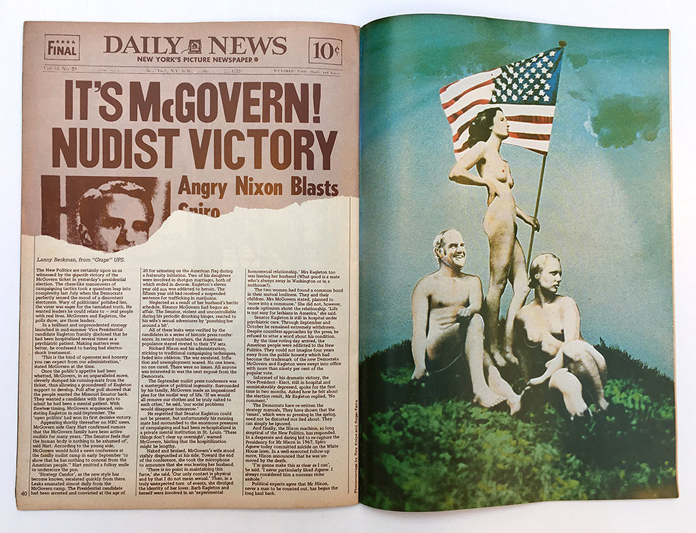
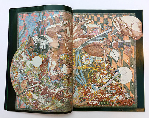
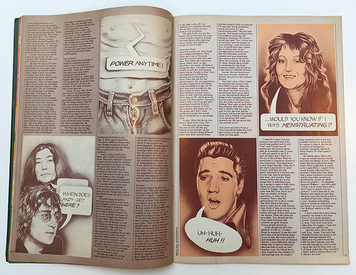
Top: Spread showing photomontage by Roy Knipe and Roger Perry from Oz magazine no. 44, September 1972.
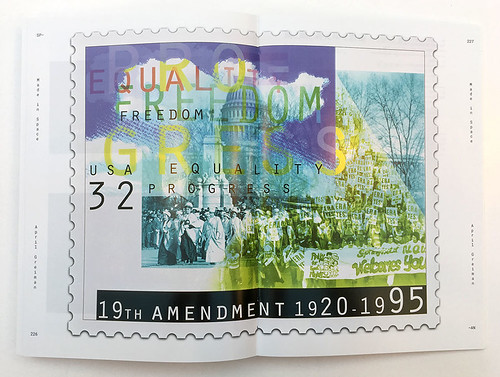
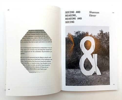
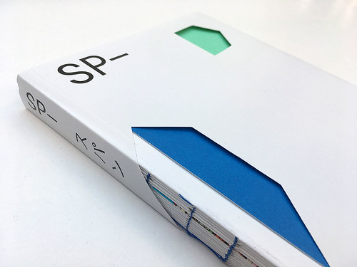
Span no. 2 ‘Conversations about design and technology’, the latest edition of Google Design’s annual reader, is published in English and Japanese and is edited by Amber Bravo and Rob Giampietro. It brings together nineteen essays, including ‘How Sony Found its Voice’ by Dejan Sudjic, ‘Made in Space’ by April Greiman and ‘Preparing Designers for Jobs That Don’t Exist (Yet)’ by Anne Burdick, that reflect conferences in Los Angeles and Tokyo.
See ‘Spiritual values in a digital age’ in Eye 13.
Spread from Span no. 2 (Google Design) showing a spread from April Greiman’s essay ‘Made in Space’, showing the nineteenth amendment commemorative stamp, 1995.
Opening spread for Shannon Ebner’s essay ‘Seeing and reading, reading and seeing’.
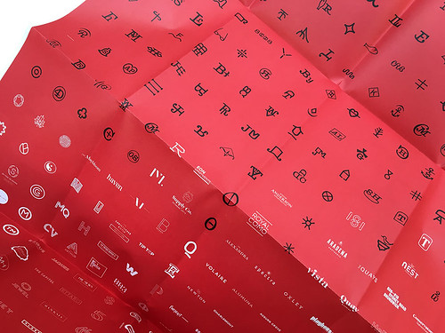
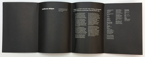
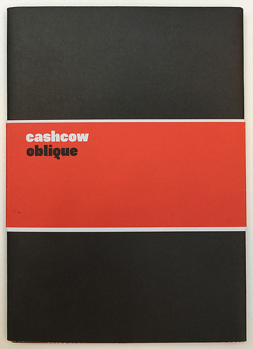
Cashcow Oblique is the third publication in a series ‘exploring the cultural, social and political dimensions of typography’ made by Australian designer Stephen Banham. It surveys two of Australia's economic booms – the livestock boom of 1873 and the current real estate boom – and their crossover with graphic design through brand identities.
See ‘Reputations: Stephen Banham’ in Eye 46.
Detail from Stephen Banham’s publication Cashcow Oblique. Banham writes: ‘Rather than being critical of any specific developer or development it [Cashcow Oblique] instead presents a survey of marks – connecting graphic design with the two things that designers never discuss – money and history.’
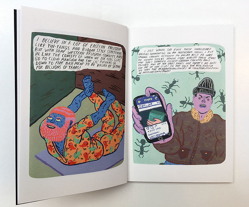
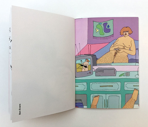
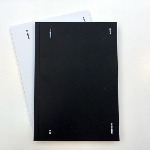
Bad Decisions is a new small-format quarterly publication, curated by Noble People’s director Axel Lagerborg. It is the first in-house publication from Noble People, a ‘multidisciplinary label and creative platform for artists in the fields of music and fine art’, and features work by illustrators such as Jean Jullien, Alice Meteignier and Tim Head, among many others.
Will Laren.
The illustrators in Bad Decisions reflect on current events including celebrity and consumer culture, political issues and more.
Ben Evans.
Prompted by an inquiry from Katie Garland, granddaughter of Ken Garland, we asked our distinguished neighbour Ian Wright to take another look at the underground alternative magazine Oz no. 44, September 1972, ‘The Virgin Sperm Dancer’, which he bought from a stall in Soho Market while at art college.
Ian Wright: ‘I was always a bit afraid of Oz magazine. Now I look at it properly it’s full of engaging content the likes of which we don’t seem to see in current journalism.’
See ‘Oz 16: The Magic Theatre Issue’ in Eye 24.
Spread from Oz showing an illustration by David Baird.
Spread showing illustrations by Roy Knipe.
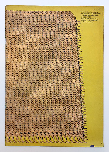
Oz magazine no. 44, September 1972, edited by Richard Neville, missing its cover.
Eye is the world’s most beautiful and collectable graphic design journal, published quarterly for professional designers, students and anyone interested in critical, informed writing about graphic design and visual culture. It is available from all good design bookshops and online at the Eye shop, where you can buy subscriptions and single issues.
