Winter 2017
Exposing the menace
David King’s posters integrated type and image with power and uncompromising political commitment. By Rick Poynor

David King pursued one of the most multifaceted and intellectually ambitious trajectories in British graphic design. His working life divided into several phases of activity, though they were all related by his central concerns, and any one of them could have been a career. In the 1990s, King seemed to drop out of graphic design, calling it a young person’s occupation, and his work became all but unknown to a later generation. The former Sunday Times designer who won a shelf-load of D&AD awards took no part in industry celebrations and events. Elsewhere, though, as author of innovative visual histories of revolutionary Russia, King remained highly visible, his books and exhibitions acclaimed in newspapers around the world. A room at Tate Modern, showing printed matter from his huge private collection, was a permanent fixture and in 2016, just before he died, Tate acquired King’s collection of Russian graphics and photographs for the nation.
The political posters King designed from the late 1970s to the mid-1980s were but one facet of his output, yet in this body of work, too, he made an exceptional contribution. In 2003, Christopher Wilson asked King whether it had been his conscious intention to create a visual style for the Left (Eye 48). ‘Absolutely,’ King replied and it was an entirely justifiable claim. From disparate strands he forged a graphic identity for the British Left that has never been bettered and obituaries from that direction were quick to acknowledge his work’s impact and influence. For Paul Holborow, who commissioned him for the Anti Nazi League, King was an ‘extraordinary’ designer. ‘Whenever the NF [National Front] attempted to organise – local and council elections, meetings, street stalls – a barrage of high quality propaganda met them,’ he recalls in Reminiscences of RAR, a collection of interviews about Rock Against Racism, for which King designed the star logo.
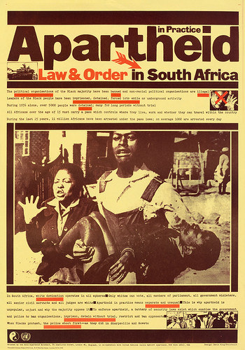
Poster for the Anti-Apartheid Movement’s Apartheid in Practice series, all designed by King, 1978.
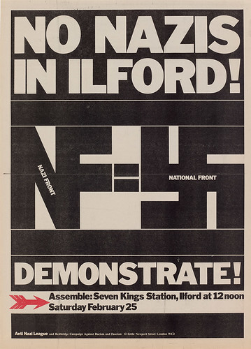
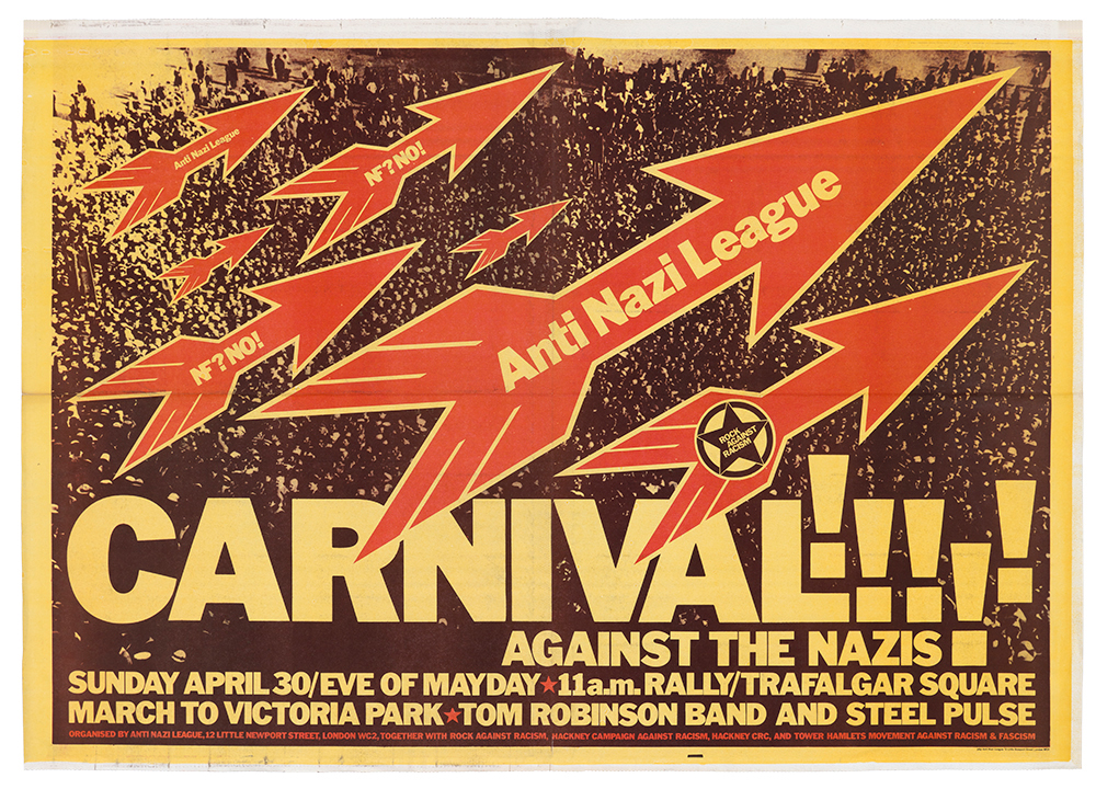
Top: Poster for Rock Against Racism and the Anti Nazi League, 1978. King’s posters have a journalistic directness and immediacy, leaving the viewer in no doubt about what is happening and what needs to be done about it.
When King’s political posters have been shown over the years there has been an inevitable tendency to reproduce the same handful of classics created for the Anti-Apartheid Movement and the Anti Nazi League. The full breadth of his political poster work only became apparent to me sifting through his plan chests after he died, in the company of Judy Groves, his close friend and graphic partner. More workaday posters sit alongside graphically intricate constructions, but the rock-solid conviction and tone of voice are remarkably consistent. This is a body of work with phenomenal concentration and power, based on a graphic language perfectly adapted to the expression of urgent political messages in public places.
‘To make sure I got the message across, I went for blackness with a second printing, thick slab rules, unfussy typefaces – strong basic design elements you can use in conjunction with photography,’ King told Creative Review in 1985. He loved Franklin Gothic and grainy woodletter type, which he enlarged on his photocopier. He likened his personal style to a form of handwriting; once he had developed it, he applied it relentlessly, though never without lashings of variation and nuance.
Single-sheet A4 Anti Nazi League leaflet, ca. 1978, showing posters by King available for supporters to buy at low cost and display in protests. The order form for posters, leaflets, stickers and badges is on the back.
A news story in the Evening Standard, 9 January 1978. Demonstrators outside the Old Bailey in London brandish King’s Anti Nazi League poster in a protest against a racist summing-up by Judge Neil McKinnon.
There was always a journalistic tendency to label King’s graphic style as deriving from Constructivism – a Blueprint interview in 1984 notes that he ‘bridles’ at the term and Groves says the description continued to irritate him. Constructivism was undoubtedly an influence after he started visiting the Soviet Union in 1970, initially for the Sunday Times, and it was logical for King, as a political designer, to take inspiration from suppressed Russian Revolutionary graphics rather than overused bourgeois sources. He also pointed out that the elementary conditions of production – the ‘lack of money, materials and time’ – were still much the same in the 1970s. But Constructivism was leavened by other influences, most notably the political work of Robin Fior (Eye 32), who taught him at the London College of Printing; in 1962, he worked with Fior on Peace News. ‘I had been politically engaged at art school,’ King told Groves in an unpublished interview.‘From 1960 to 1963 I did some political work for CND, the Committee of 100, things like that. I did a huge CND banner in 1964.’ All this laid the groundwork for his later political posters.
King’s 1978 poster for the Anti Nazi League frames a photograph of a frightened Jewish boy rounded up by the Nazis in 1943 in the Warsaw Ghetto – an image that came to symbolise the Holocaust.
King and Groves met in 1972 and later they lived together. Groves had attended Marxist study groups; she was politically active, went on marches and was a union leader – mother of the chapel – at Time Out, the weekly news and events magazine. She regularly discussed South Africa and apartheid with colleagues in journalism. When they teamed up, King was still working for the Sunday Times Magazine. ‘He was already political but this reinforced it and was very involving,’ she says.
King was appalled by the brutality of the South African police’s response to the June 1976 uprising in Soweto, where hundreds of protesters died. ‘People used to get in touch with him because they’d seen his features in the Sunday Times Magazine,’ says Groves. ‘The late Mike Terry [leader of the Anti-Apartheid Movement] would have asked him if he was interested in doing something for Anti-Apartheid and when they saw how very interested he was it took off from there. And the same thing with the Anti Nazi League. It was Laurie Flynn [editor of Socialist Worker] who suggested David as being the best militant graphic designer and what a good choice.’
Poster for an Anti Nazi League student campaign against the National Front. Adapting a 1937 photograph of Benito Mussolini and Adolf Hitler watching a Nazi parade, King swaps the Italian fascist’s head for NF leader John Tyndall.
Poster for a local Anti Nazi League demonstration about the far right’s campaigning presence in east London.
The posters and other graphics King designed for the Anti Nazi League, the anti-racist organisation founded in 1977 by the Socialist Workers Party, had an impact it may be hard to grasp now that so much graphic communication – even the ‘poster’ image – has migrated to the digital realm. Print runs could extend to 70,000 copies. For a poster titled ‘Never Again!’ – with the slogan ‘Stop the Nazi National Front!’ – King used a photograph of Jews being rounded up in the Warsaw Ghetto during the 1944 uprising. Demonstrators carried the posters above their heads on sticks and the images received further dissemination whenever national newspapers published photographs of the marchers. The Anti Nazi League sold supporters – individuals, organisations, trade unions and workplaces – posters, stickers, and badges with the Anti Nazi League arrow designed by King. Ten posters could be ordered for 80p, 20 for £1.40.
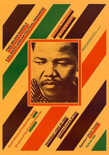
King made equally arresting use of diagonal formats. His 1980 poster for Nelson Mandela, then imprisoned by the South African regime, flashes its message of militancy like a hazard warning.
King’s pride in the work, as well as his commitment to the cause, can be gauged from his correspondence. He entered the ‘Never Again!’ poster (and others) into the 7th International Poster Biennale in Warsaw and the poster received a prize for ‘reminding the world about these terrible and unfortunately true historical facts’. In a letter of acknowledgment in July 1978, King wrote, ‘The threat of a resurgence of fascism in Britain over the last two years, due mainly to mass unemployment, racism, and the erosion of basic rights and living standards through the crisis of capitalism, has made it necessary to build the Anti Nazi League. Hundreds of thousands of leaflets, posters, badges etc., have been distributed throughout the country, exposing the Nazi menace wherever it has appeared.’
The ‘Never Again!’ posters are King at his most laser-like. As a graphic designer, he was deeply shaped by his decade of experience as a visual journalist laying out stories about politics, history, sport and crime for the Sunday Times Magazine. For the visual journalist, as for any kind of journalist, the substance of the message comes first, and it must be articulated and delivered as clearly as possible. ‘I’m less into form than content,’ King said in 1985. ‘I’ve never been interested in typography for its own sake since I see it simply as a vehicle for visual communication.’ Nearly three decades later, quizzed in these pages, he was still insisting on the point: ‘I’m interested in content far more than I am in form.’
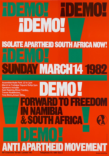
King’s 1982 poster for an Anti-Apartheid Movement demonstration, based on a horizontally banded structure, was easily adapted to make an ad for the back of City Limits magazine, for which he designed the covers.
The direction of King’s career – the building of his fabulous Russian archive; the research and construction of his books – proves his point. Yet the posters have far more interest as form, wedded to content, than his assertion of priorities might imply. King often pushed a graphic device much further than necessary to make his point. In the famous ‘Carnival Against the Nazis’ poster, the single exclamation mark he could have opted for becomes a jostling throng of exclamation marks, breaking free from the horizontal bands of type and underscoring the flight of arrows above the crowd. The combined image conveys an unstoppable excitement and drive. One might regard exclamation marks as a cliché, a tacky effect to be employed only sparingly, but throughout his posters King transforms the marks through force of conviction into something plastic and vital, doubling them up, piling them on in multiple sizes, turning them into structural components, pivots and lynchpins.
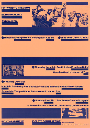
King relished repetition and rhythm. Some of the protest posters are almost musical. He cut up every component, moving them around until he was satisfied, before sticking them down with hot wax. El Lissitzky used slab rules to underline words, but never with the uninhibited zest that King brings to ‘Forward to Freedom in South Africa and Namibia!’ The rules have an ostensibly functional purpose. They highlight dates and times and key words, and divide the poster into layers. As always with King, freedom, urgency and a natural authority go hand in hand. But it’s hard to believe, no matter how pressing the cause, that the designer in him wasn’t relishing the placement of every fibre of graphic material as he pieced together the poster.
A predominantly typographic design from 1980, once again in support of Anti-Apartheid, treats the monochrome photographic elements like ‘typographic’ material – in the style of typophoto – to be slotted into position.
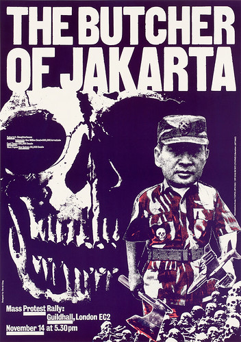
In one of King’s most accusatory posters, Suharto, president of Indonesia, is held to account for the deaths of many thousands. The axe photomontaged into his hand recalls the figure of the Nazi butcher Hermann Goering in John Heartfield’s 1933 cover for AIZ magazine.
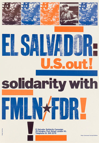
He was a picture editor of rare acumen with a total command of the photograph as a conveyor of meaning. Yet the pictures, too, are given added weight by their graphic use within the design. In the ‘Law & Order’ poster in the ‘Apartheid in Practice’ series, the four heavy rules around the picture by Sam Nzima of a man and woman carrying a dying boy to a clinic serve to intensify the image and make it even more searing. In the ‘El Salvador: U.S. out!’ poster, King shows the tightly buckled leather boot of a military oppressor four times – the shoes of fallen victims can be seen behind it. The colours – blue, orange and near black from overprinting – bind text, rules and photos into a visual statement that is tightly organised while preserving a tone of informality: join this movement now!
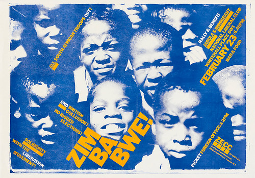
King allows the jostling heads to determine the placement of the information about the Zimbabwe Emergency Coordinating Committee’s rally and benefit. The yellow is slightly out of register, as often occurred with quick and dirty printing, but this only adds to the image’s sense of vitality.
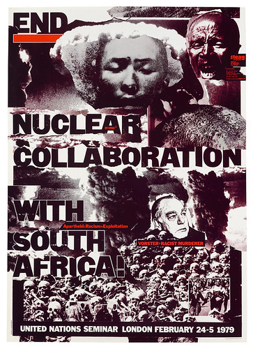
John Heartfield’s political photomontages were another key influence for King, though more for their total engagement and graphic power than their conceptual method. In 2015, King co-authored the monograph John Heartfield: Laughter is a Devastating Weapon, published by Tate, and a display of Heartfield’s artwork and covers for the German news magazine AIZ, partly drawn from King’s collection, was shown at Tate Modern. Two posters indicate an obvious debt to Heartfield. In ‘The National Front is a Nazi Front!’ King grafts the head of NF chairman John Tyndall on to the body of Italian dictator Benito Mussolini. Accused by the ANL red arrow, Tyndall gazes admiringly at Hitler, both of them ascending from a ghastly mound of Holocaust victims. Just as nightmarish is the poster ‘End Nuclear Collaboration with South Africa!’ (1979), where the issue is made into an equation: ‘Apartheid=Racism+Exploitation’. The posters are savagely uncompromising in their sense of imminent catastrophe if racism is not opposed and crushed.
A photomontage announcing a United Nations Seminar visualises South African prime minister B. J. Vorster as the architect of a potential hell on earth.
By the mid-1980s, King’s period of intense involvement as a radical poster maker – usually working for free – was coming to an end. In an obituary in Socialist Review, the left-wing designer Roger Huddle assesses this change of direction quite harshly: ‘He became more concerned with the aestheticism of design rather than its practical application in struggle. For a short time though he was King of Design.’
The reality is more complicated. Aesthetic considerations had always played a part, as we have seen, but King never allowed them to predominate. He was becoming ever more involved in demanding book projects made possible by his growing archive, itself a large claim on his time. By the end of the decade, he and Groves were designing many covers for Earthscan, publisher of books about sustainable development. King was also affected in the mid-1980s by a sense that the cultural and political mood had changed. ‘Today, everyone on the Left is disillusioned,’ he told Direction magazine in 1987. Style was now the dominant force in graphic design and everything was being ‘Brodified’. Neville Brody himself had taken over from King at City Limits magazine and, to some eyes, King’s work looked doggedly heavy and ‘unfashionable’. As he lamented in Direction, even the Labour Party, attempting to refashion itself, was gripped by ‘designer socialism’.
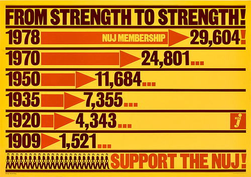
In the late 1970s, King designed a series of posters for the National Union of Journalists, in support of strike action and to encourage journalists to band together in strength. They were shorn of unnecessary adornment, like newsstand bulletins, and as punchy as ever.
Now that time has passed, and being fashionable is no longer an issue, the posters can be seen clearly again. Far from being cramped by his deliberate stylistic choices, King was able to convey the message in whatever register was required. Graphic design’s central concern has always been the close, expressive integration of type and image, and King was an idealistic, politically driven master of the craft.
Poster for the El Salvador Solidarity Campaign, mid-1980s. King’s interest in woodletter types came to the fore in his later political posters. Here the new style fuses with several of his most familiar devices: a banded, asymmetrical structure, heavy rules for editorial emphasis, and integrated picture details.
King uses woodletter again in 1987 for what may be his last poster for the Anti-Apartheid Movement, endowing the call to demonstrate with an air of printshop informality. There is a space at the bottom where local information could be added.
Eye is the world’s most beautiful and collectable graphic design journal, published quarterly for professional designers, students and anyone interested in critical, informed writing about graphic design and visual culture. It is available from all good design bookshops and online at the Eye shop, where you can buy subscriptions and single issues. You can see what Eye 95 looks like at Eye Before You Buy on Vimeo.

