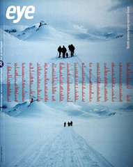
Winter 2000
Self-explanatory

Lucienne Roberts
Sans + Baum
Experimental Jetset
Müller + Hess
Intro
Tony Chambers
Hahn Smith
Postcards from Sans + Baum; Müller + Hess’s Xmas horror …
Self-explanatory
Lucienne Roberts’s lucid postcards remind us of a fundamental truth. That the values of the literary and the literal are a function of the graphic. As she says in Eye 37, ‘The minutiae of typography, the variations in meaning carried by type weight, size indents, line spaces, word breaks and so on are inextricably linked to readers’ perception of the appropriateness and relative worth of the words set.’ The pleasure of typography rests in an appeal to the visual perception of shape and geometry: the typographer exploits the possibilities of the empty. She makes space talk. Roberts’s typographic postcards are more than a variation on schoolyard paradoxes. They give words focus and direction. (J. O’R)
Experimental Jetset and 8vo use cards to show work for and about the Dutch PTT: actual stamps stuck down for EJ’s, and a large format card that explains the process behind 8vo’s work. Both Intro and Hahn Smith indulge in serial card production: the former shows off its CD covers while the latter applies an offbeat Canadian humour to express its core services, in this case ‘Signage’. (Another card in the series promotes their ‘Branding’ abilities with a large-type extract from The Story of O.)
Müller + Hess’s poster bears a ‘Manufacturer’s warning’ in three languages: Christmas could seriously damage your health.
First published in Eye no. 38 vol. 10 2000
Eye is the world’s most beautiful and collectable graphic design journal, published quarterly for professional designers, students and anyone interested in critical, informed writing about graphic design and visual culture. It is available from all good design bookshops and online at the Eye shop, where you can buy subscriptions and single issues.
