Spring 2018
Serious goals
Art director Robert Priest turned editor to make Eight by Eight, an ambitious football title based in Brooklyn

Say ‘Brooklyn’, and several images spring forth – it is the cool epicentre of craft beer, hipster bands, elaborate facial hair and vernacular graphics, isn’t it? What does not immediately come to mind is a football magazine.
This is hardly a surprise – with football (aka soccer) a global business – but Brooklyn seems an unusual base for a seriously beautiful quarterly magazine about the sport. Until you dig a little deeper; there is an Englishman at the helm, in the shape of legendary designer Robert Priest. So, with a World Cup (to be played this year in Russia) around the corner, and the latest issue of Priest’s magazine, Eight by Eight, about to hit the streets, it is time to explore the unique editorial world of ‘the magazine the beautiful game deserves’.
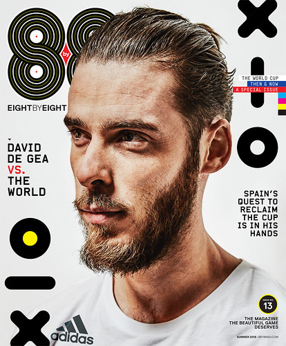
Cover of Eight by Eight no. 13, Summer 2018. David De Gea is a fitting cover star for the World Cup issue, and the knowing ‘beautiful game’ tagline demonstrates that this is a title for true aficionados.
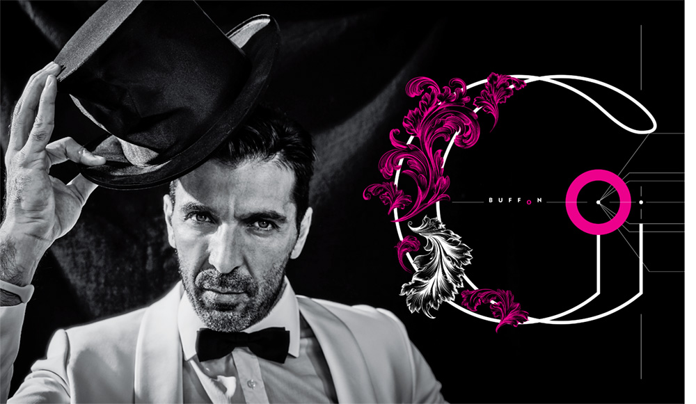
Top. Spread from no. 12, Winter 2017. Roger Neve shot cover star Gianluigi Buffon, the Juventus and Italy goalkeeper, in a shoot ‘inspired by the 1960s films of Federico Fellini’.
There is little that Priest and his design partner Grace Lee do not know about editorial design. In a garlanded career Priest has launched numerous magazines, won a sheaf of awards and co-founded the institution that is American Illustration. He moved from London to New York (via Toronto) at a time when an art director shaped a magazine as much as the editor.
His design and editorial skills encompass a particularly North American mix of high seriousness and playfulness. His signatures include: the use of smart illustrators who bring their intellect to the work, rather than just a style; a layered use of type to impart extra information and visual cues; and a lavish, dynamic visual approach that gives creative collaborators the ability to go beyond the everyday.
From Eight by Eight issue, no. 13, Summer 2018. Manchester United and Spain goalkeeper David De Gea gets the ‘David Beckham’ treatment from regular portraitist Roger Neve, a fashion photographer and soccer lover. Neve brings a glossy, in-your-face style to the magazine, edging closer towards the way brands and advertisers portray football.
Grace Lee, a successful magazine designer, first worked with Priest on an Oprah Winfrey magazine. He then recruited her to be the art director of Condé Nast Portfolio, a foray into the business publication sector for that company. There, looking back for inspiration to Fortune magazine, they created a modern masterpiece that did not survive in the wake of the financial crash.
Their partnership as Priest + Grace followed, launching and redesigning magazines for a variety of publishers. ‘We had the idea in 2009 that we wanted to do something that was ours – we wouldn’t have to wait for the phone to ring. In a way it was a reaction to all the restrictions that we’ve had in the past.’
Another example of Grace Lee’s bold opening spread type treatments, this time adding layers by using the years – and geographical coordinates – of three great moments in Dutch football.
Almost the only subject area not represented in Priest’s CV was sport, and so they decided to launch a global football title, with Priest as editor-in-chief and Lee as creative director.
The world of football magazines, they discovered, is full of competently designed club products and a substantial body of titles such as FourFourTwo and WorldSoccer, which fulfil but rarely exceed, their brief. Priest + Grace’s baby, Eight by Eight – based on intelligent thinking and exquisite visuals – looks like the kind of magazine given wings by massive budgets and large editorial teams. However there is no deep-pocketed publisher providing a time-rich environment here. How do they pull it off? ‘Because we’ve been around so long, we know how to do things,’ Priest explains. ‘There’s really only me and Grace doing this, with one editor, and freelancers who help us out on crunches. Grace happens to be lightning fast, and working together we’re quite efficient.’
No. 12, Winter 2017, features Gianluigi Buffon, also shot by Roger Neve.
That’s some understatement. Twice nominated as ‘Magazine of the Year’ by the Society of Publication Designers (it won in 2015), Eight by Eight’s ambition is ‘to tell stories through excellent journalism; aggressive, modern design; and the best illustration and photography.’ They see their readers as ‘smart and inquisitive, seeking an understanding of the game’s unseen narratives and delighting in its complexities.’
Design often outstrips the writing in the independent magazine sphere, but with a stellar line-up of sports journalists from around the world, delivering substantial editorial, Eight by Eight is well rounded while remaining light on its feet. Priest finds the editor’s chair a novelty. ‘I finally understand the difficulties editors face on a daily basis! And our great goal is to improve the writing issue by issue.’
Visually, there is a real joyfulness about the typography – a dazzling pop to the headlines, and a detailed perfectionism to the handling of the running text. It is hard to pull off this kind of flamboyant page design. There is no place to hide and a lot that can go wrong, but Lee’s brilliance is sure-footed.
No. 11, the Fall 2017 cover was the first to feature a photo, mixing Roger Neve’s portrait of Neymar with paintings by Nathan VanHook, design director of Global Football Footwear at Nike.
Eight by Eight has built a strong roster of illustrators who can capture a famous face: ‘It’s becoming extremely important to have artists who can get as close to perfect likenesses as possible. I see so many illustrations that aren’t quite there. Other than that, we give illustrators a lot of freedom.’ Sometimes the work demands a realistic feel so that unphotographable concepts (a dummy in the mouth of Argentine footballer Ángel Di Maria) can be made to work.
Alongside the portrait and editorial illustrations, the use of narrative comic strips harks back to one of Priest’s first jobs, with art director David Driver at Radio Times, working with one of the greats of the genre, Frank Bellamy, artist of Dan Dare, hero of the boys’ comic, Eagle.
Now Columbian illustrator Diego Patino has taken up that position, with added grit, often bringing his own take on the stories. ‘The comic idea is always in the back of our minds, to make the magazine very entertaining without making it juvenile,’ says Priest. ‘In a funny way, we design the magazine as a sort of modern comic.’
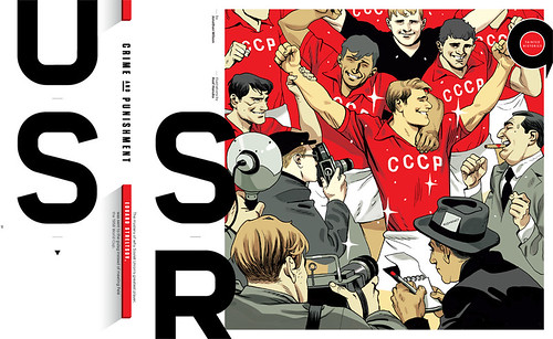
Israeli illustrator and cartoonist Hasaf Anuka’s background in graphic novels informs his pastiche of an earlier era for this feature about Russian footballer Eduard Streltsov, a forgotten, persecuted player from the 1950s.
Diego Patino, whose illustration of the legendary Diego Maradona being harpooned by Argentina’s current footballing king, Lionel Messi, is shown here, told designer / writer Robert Newman that, ‘I always look forward to working with Priest + Grace. When we first met, I felt like pushing their boundaries a little bit, and they turned out to be more than OK with me being gross and over the top.’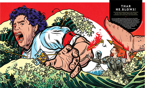
They have also just collaborated with Instagram on a project documenting the Italian team, Juventus. As I talked to them via Skype, Grace Lee was moving around in the background with Eight by Eight football shirts, applying badges to them using a heat press. They are produced by Avery Dennison, badge supplier to the world’s biggest clubs. ‘We collaborated with them, and they made some badges for us. So they do Real Madrid’s badge and Eight by Eight’s!’
I asked Priest what the name means. ‘The goalposts are silent witnesses to the most dramatic moments in the game. They stand eight feet high by eight yards long: Eight by Eight.’
Spread from Eight by Eight no. 12, Winter 2017. Illustrator Wesley Bedrosian had previously worked with Priest at Newsweek, where he made a number of covers using the 3D sculpting program Zbrush. Here he references the Beatles’ Abbey Road LP cover and the plastic figurines of the Subbuteo ‘table football’ game.
Eye is the world’s most beautiful and collectable graphic design journal, published quarterly for professional designers, students and anyone interested in critical, informed writing about graphic design and visual culture. It is available from all good design bookshops and online at the Eye shop, where you can buy subscriptions and single issues. You can see what Eye 96 looks like at Eye Before You Buy on Vimeo.


