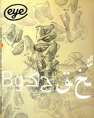
Winter 2003
The loneliest insight?

A broadsheet tackles Helvetica’s use and abuse with the eye of an outsider
An article on typography in the mainstream press is news in itself. As residents of Melbourne spread their copies of The Age newspaper on their Saturday breakfast tables on 13 September 2003, they found, in among the usual array of lifestyle articles that populate the Saturday Review section, an editorial oddity. A substantial feature on the pervasiveness of the typeface Helvetica, and one man’s vehement campaign against its overuse, is not usual fare for The Age, Victoria’s premier broadsheet newspaper; nor, for that matter, for most broadsheets.
Journalists tend to treat typography as a strange cult that they can only handle satirically. The Onion’s spoof report of the ‘Fonty Award’ may be one of the longest newspaper features on typography in recent years, an article on a nonexistent typeface, awards ceremony and typeface designer: sample passage: ‘“A million thanks to all the wonderful folks in the font community who believed in Helvetica Bold Oblique,” said an ecstatic Oliver Rudd, designer of the font, in his acceptance speech . . . “I’d also like to thank Helvetica Regular designer James T. Helvetica, the giant upon whose shoulders I stand. And, of course, the designers of the Visa Card Terms & Conditions booklet …”’
A Guardian columnist picked up The Onion send-up (presumably from a Web trawl) and ran an excerpted version of it that suggests he took it seriously. This gives some indication of the low esteem in which typography is held in broadsheet media; it didn’t even warrant a fact check.
The article on Melbourne-based type designer Stephen Banham (see Eye no. 46 vol. 12) and his battle with the ubiquity of Helvetica in the public domain provides a rare instance of a mainstream newspaper considering typography as something culturally and socially significant. The author, James Button, is City Editor at The Age. His accomplishments include winning a Walkley Award in 1992 for best feature writing, for a Time Australia cover story about where Australia was headed socially, politically and economically.
The Age does not have a graphic design writer, nor even an advertising or marketing writer in its employ. Before he encountered Banham and the work of his studio, Letterbox, Button had never written an article on typography. He recognised in the subject matter both the essence of a good story and a way in which to further explore one of his interests: the way in which ‘small things – in this case a typeface but it could have been a chair, a wineglass or the way a city street is made – tell stories about bigger ideas.’
So Button approached this piece of journalism as he would have any other. He spent a good deal of time with the main character; in the course of his research into the history of the subject matter he conducted interviews with some of its leading authorities based both locally and internationally; and then, when it came to the writing of the piece, he established and maintained a fairly elaborate and extended metaphor – in this instance a legal prosecution case – to give structure to the piece. The tone is neither too serious nor is it flippant; Button’s thinking about design strikes the nail’s head with the aim of a perspicacious outsider.
An observation made towards the end of the story, for example, reads: ‘Then, one day I got it: Helvetica was everywhere! On one two-stop tram trip down St Kilda Road past the Arts Centre I saw it about ten times. But it also struck me that this was a lonely insight. Who else, apart from a few designers, would see the world this way?’
Witness Button’s epiphany about material culture: ‘Because wherever you stand on Helvetica, on his bigger point Banham is right. Even the smallest objects carry the meaning and weight of the world. The glass I just drank from: how was it made and by whom? How has history shaped it? What balance of materials and ideas, use and beauty?’
Button’s new-found understanding was infectious. Readers responded. One commented: ‘Really interesting article in the paper on Sat. Now I can’t look in shop windows. I just look at them.’ Another confided: ‘I read about you in Saturday’s Age with great interest. I’m not a graphic designer, but I do work with one in particular and have noticed that he does everything possible to avoid Helvetica! Now I understand a little more about his state of mind.’ A third enthused: ‘Just read your article in The Age … I kept grinning thinking, thank God finally someone has decided that three or four full pages on typography isn’t such a boring thing to print in the paper.’
Alice Twemlow, design writer, New York
First published in Eye no. 50 vol. 13 2003
Eye is the world’s most beautiful and collectable graphic design journal, published quarterly for professional designers, students and anyone interested in critical, informed writing about graphic design and visual culture. It is available from all good design bookshops and online at the Eye shop, where you can buy subscriptions and single issues.
