Monday, 11:00am
10 December 2012
Sun-cheese wheel-ode
Fraser Muggeridge
Dom Sylvester Houédard
Ken Cox
Edward Wright
Charles Verey
Design history
Graphic design
Typography
Visual culture
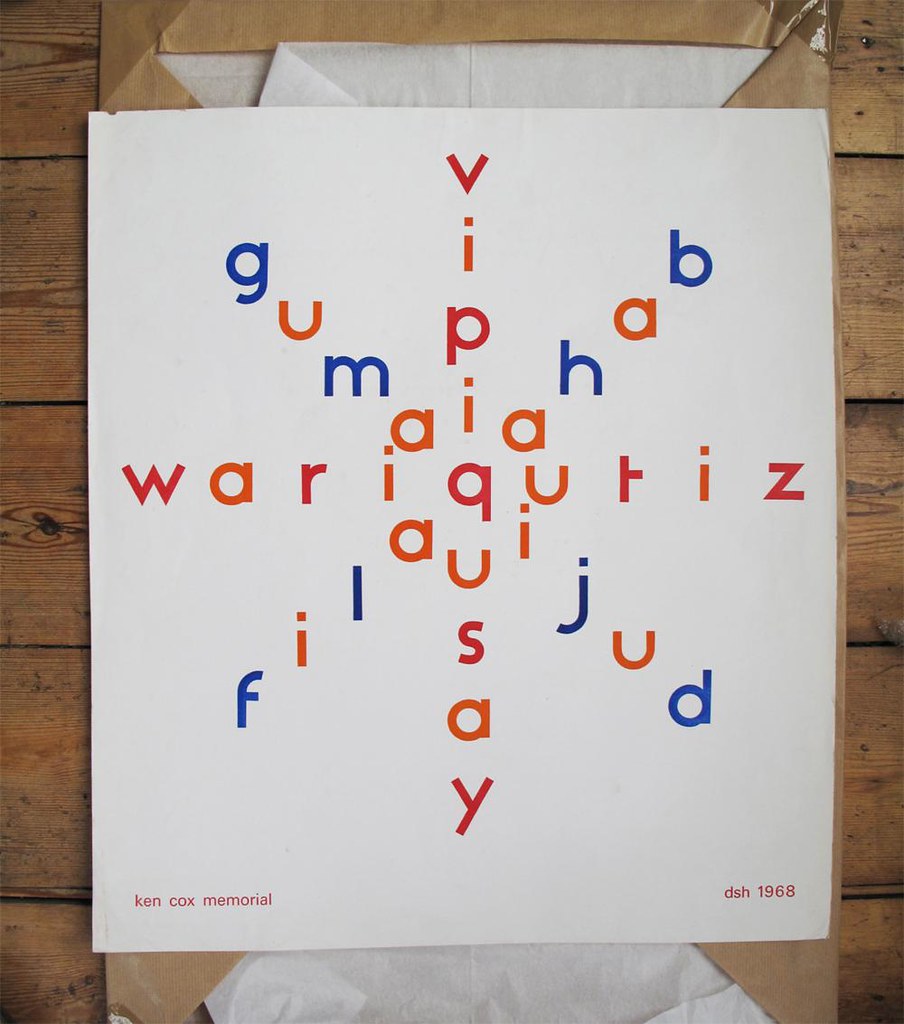
Dom Sylvester Houédard’s 1968 concrete poetry tribute to fellow poet Ken Cox is a double spiral of hand-set type, mysteriously linked by the sport of cheese rolling. Fraser Muggeridge explains.

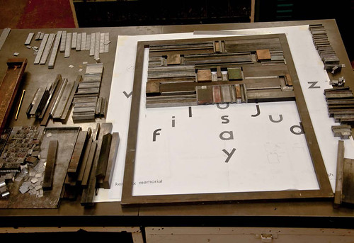
The letterpress printed concrete poem designed by Dom Sylvester Houédard first caught my interest because of its use of the Flaxman typeface, designed by Edward Wright (1912-88) for the International Concrete Poetry Festival in 1967, writes Fraser Muggeridge.
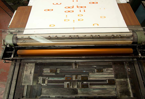
Flaxman was produced in lowercase, in three sizes by R. D. DeLittle in York, and was named after the telephone exchange at the Chelsea School of Art, London, where Edward Wright was head of graphic design. The typeface is now located in the letterpress workshop at Camberwell College of Art where I am a visiting tutor.
The memorial poem was intially printed for Ken Cox (1927-68), a concrete poet and kinetic sculptor based in Gloucestershire, by his friend Dom Sylvester Houédard (dsh), a Benedictine priest and fellow poet. Shortly after Cox’s death, a commemorative exhibition was organised to raise funds for his family, of which the print by Houédard was just one.
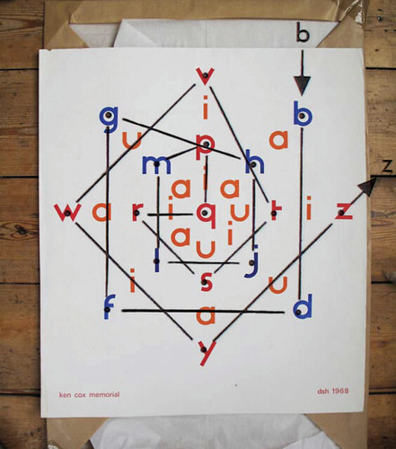
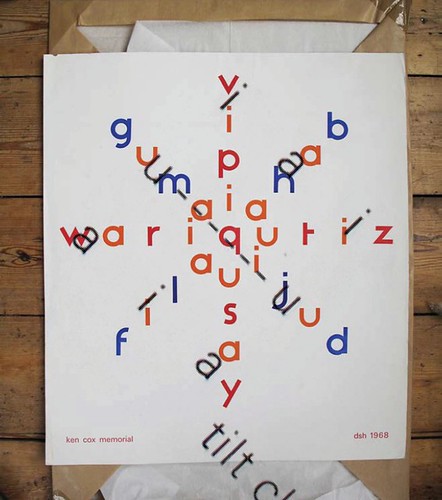
In planning to reproduce Houédard’s piece, Freddy Williams and I questioned the meaning and psychology behind its construction. Did the arrangement of the type reflect the content? The conventions of reading dictated words such as ‘wariqutiz’, ‘vipiqusay’, and ‘gumaqijud’. While nonsensical, the words seemed as though they could have meaning.
Charles Verey, another visual poet from the local area (who ran the south Street publication) carried out Houédard’s typewritten instructions and made the composition from a specimen of letters sent from Edward Wright. An explanation on the back of Houédard’s original print makes the poet’s intention’s clear.
Cox was from Wooton-Under-Edge and Houédard lived in nearby Prinknash Abbey in Gloucester. The Annual Double Gloucester cheese rolling takes place at Cooper’s Hill, reflected in the design, a sun-cheese wheel-ode.
Remove the letters k, e, n, c, o, x (from the alphabet), then split the remaining letters into consonants and vowels. Arrange in a ‘double spiral’ – one which represents the sun wheel and the other, the cheese rolling.
Then add in the vowels titled anti-clockwise and clockwise.
Eye is the world’s most beautiful and collectable graphic design journal, published quarterly for professional designers, students and anyone interested in critical, informed writing about graphic design and visual culture. It is available from all good design bookshops and online at the Eye shop, where you can buy subscriptions, back issues and single copies of the latest issue. You can see what Eye 84 looks like at Eye before You Buy on Vimeo.

