
Summer 2022
Captain airbrush

Illustrator Harry Willock’s role has been overlooked, yet his work with Alan Aldridge produced scores of era-defining works. Mike Dempsey reports. Portrait by Philip Sayer.
The evening of 13 October 2008 was unseasonably chilly as a stream of limos purred by the entrance of the Design Museum at its former location in Shad Thames, London. It was the private view of ‘The Man with Kaleidoscope Eyes’ (see Eye 70), a retrospective of the work of Alan Aldridge. Four decades on from the heady days of the 1960s, the designer was almost unrecognisable from the ‘flower power’ character sporting shoulder-length, dyed-blond hair. Now bald, bespectacled, frail-looking and dressed in black, he was the star of the evening, photographed with pop musicians Sting and Elton John and a bevy of filmmakers, supermodels and royals. There were 3D cut-outs and enormous blow-ups of characters from Aldridge’s work, and even two naked models, their bodies adorned with psychedelic illustrations.
Amid the blizzard of colour and celebrity that evening was designer and illustrator Harry Willock. Few who were there knew of him, or the fact that more than 70 per cent of the works on display had been produced by Willock, a man four years Aldridge’s senior, who had spent three decades behind the scenes. The story of Aldridge’s career, or at least the version Aldridge himself carefully maintained throughout his lifetime, has been told all too often. But there is a different picture, painted by a different hand, and this is what is presented here.
Image from The Beatles Illustrated Lyrics (1969) produced by Aldridge with Willock.

Born in West Bromwich in 1934, Willock was a shy boy whose drawing ability was recognised by a secondary school teacher who suggested he apply for art school. This led him to Ryland Memorial School of Art, where he studied commercial art for two years. At Ryland’s end-of-year show, a local businessman spotted Willock’s work and offered him an apprenticeship at his printing firm, Kenrick & Jefferson, which specialised in bespoke stationery. Aged seventeen, Willock joined the company and systematically worked his way through the different craft disciplines. A quick learner, he mastered line-drawing, hand-lettering, scraperboard illustration and airbrushing. When he had to break off for compulsory national service, he worked in the mapmaking section of the Worcester Military Survey, often finding himself in mobile darkrooms learning the tricky art of reverse writing directly on to film negatives.
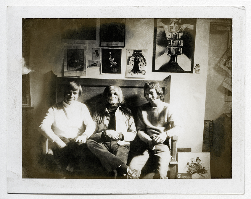
Ink Studios Polaroid, 1967: (L-R) Harry Willock, Alan Aldridge and James Marsh. To the right on the back wall is Ink’s notorious poster for Andy Warhol and Paul Morrissey’s Chelsea Girls.
Back on civvy street, Willock returned to Kenrick & Jefferson, but in 1959 he got a job with The Sunday Times’s marketing division. During his fifth year there, a gangly young man sporting dyed-blond hair joined the publication’s promotions department. His name was Alan Aldridge; little did Willock know he would become inextricably linked with this eccentric-looking character for almost three decades. Aldridge had a seemingly never-ending stream of fresh and varied ideas but often an inability to craft them into life. Having seen some of Willock’s exacting work, however, Aldridge quickly realised that together they could form the perfect partnership to give birth to his imaginings.
Logo for Ink Studios, 1967, designed by Willock using one of his many technical skills – in this case, scraperboard.
In 1965, Aldridge left The Sunday Times, having secured himself a new job via Germano Facetti at Penguin Books, at the time located in a house on John Street, Bloomsbury (see ‘The image as evidence’, Eye 29). At first, chief editor Tony Godwin, always on the lookout for new talent, employed Aldridge as an in-house designer for new ways of presenting covers. Aldridge’s early Penguin covers had to slot within the carefully controlled house grid layout first created by Romek Marber (see Eye 53 and 91) in 1961 for the then overall art director Facetti.
Aldridge found this very restrictive and at odds with his view of design. Godwin had been promoted to perk up Penguin’s sales due to increasing pressure from other paperback imprints such as Pan, Corgi and Fontana. As part of his new strategy, Godwin asked Aldridge to produce some experimental fiction covers, freeing him from the carefully controlled cover house style. The story goes that at a Penguin sales meeting at which some of the new cover experiments were floated, and received well, Aldridge fielded the idea (with Godwin’s backing) that he should take over the art directorship of all fiction covers, much to the displeasure of Facetti. But it was agreed. Apparently, Facetti never spoke to Aldridge again.
Now with a lot on his plate, Aldridge persuaded Willock, still at The Sunday Times, to join him at Penguin, where they began their partnership in earnest. In addition to commissioning covers from external artists, designers and photographers, Aldridge designed a lot of covers himself. An example of an early Aldridge-Willock collaboration can be seen across Penguin’s science fiction series, on books such as Alfred Bester’s Tiger! Tiger!. Aldridge would come up with the idea, create a basic skeletal sketch and then hand it over to Willock to unleash his airbrush. Aldridge’s drawing style had an almost childlike naivety at the time – something that would evolve as his and Willock’s partnership matured. Soon, Penguin fiction covers were making waves, and approaches of work from outside for Aldridge were coming in thick and fast.
Meanwhile, there were boardroom rumblings. Sir Allen Lane, the founder of Penguin, was very unhappy with the change of direction in cover presentation masterminded by Godwin in league with Aldridge. Lane declared pointedly: ‘A book is not a tin of beans.’ The situation was exacerbated when Aldridge turned up for work with prison bars painted on the lenses of his round Lennon-style specs. Lane took this as a personal affront and set about planning to have the designer transferred to Penguin’s offices at Harmondsworth, out of harm’s way. Godwin saw the writing on the wall and resigned in 1967. This was shortly followed by Aldridge’s and Willock’s dismissal. However, by this time Aldridge had external commissions from many quarters, including The Beatles, The Who and The Rolling Stones, making it possible for him and Willock to embark upon a new enterprise.
The Beatles Illustrated Lyrics (1969) became a highly pressurised project for Ink Studios, involving a bevy of external contributors (including Milton Glaser, Tomi Ungerer, Jan Lenica, Barbara Nessim, and R. O. Blechman) as well as these images, produced by Aldridge with Willock. See ‘Multi-coloured mirrors’ in Eye 57.
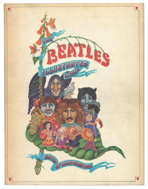
As Ink had no layout designer or typographer, Aldridge, via his old Times network, brought in David Hillman and Gilvrie Misstear to design the book. It became a great success and spawned volume two in 1971.
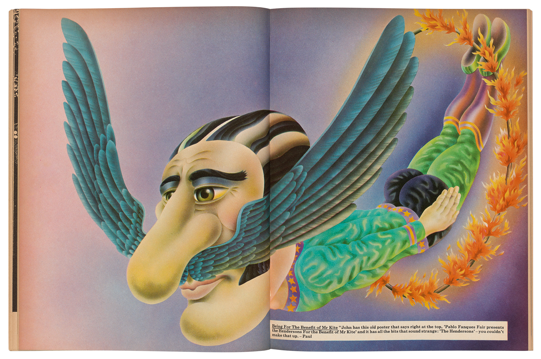
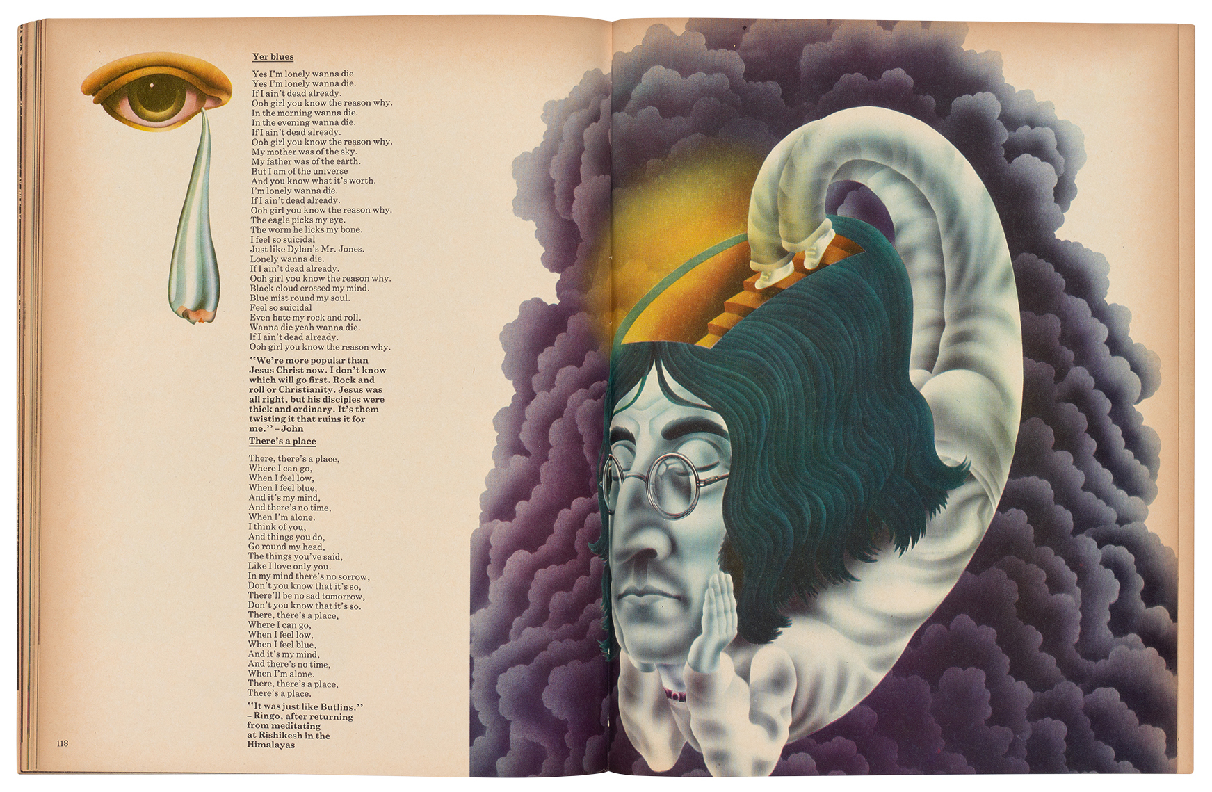
In 1967, with financial backing, Aldridge and Willock set up Ink Studios in a space above Zwemmer’s bookshop on Litchfield Street in London’s West End. With an increasing volume of work, they hired designer James Marsh along with Bob Smithers and Rick Goodale. An early notable project for Ink Studios was The Beatles Illustrated Lyrics, with Aldridge commissioning an array of talent to illustrate Beatles songs (see ‘Multi-coloured mirrors’, Eye 57). It was designed by Sunday Times editorial designers Gilvrie Misstear and David Hillman. Aldridge’s contributions to the book were worked up as pencil sketches. These were handed to Willock, who set about the task of perfecting the drawing and transferring it onto artboard, followed by the painstaking task of masking out the many layers for airbrushing. At the end of the process, a fully fledged Aldridge imagining was realised as an immaculate piece of artwork thanks to Willock’s supreme craftsmanship. ‘Harry was the airbrush genius – Technicolor lungs – but it wasn’t just his technical expertise, but his infectious enthusiasm which shone through,’ says Misstear. ‘I recall asking Alan if I could meet Harry and he said something along the lines of … “Oh, we never let Harry out of his cupboard”.’ However Willock independently picked up a 1969 D&AD Silver Award for the ornate lettering of the die-cut album cover for Ogdens’ Nut Gone Flake by the Small Faces.
By this time, the combination of the pair was formidable, yet within a short space of time, the use of the credit ‘Ink Studios’ disappeared in favour of ‘designed by Alan Aldridge’. Aldridge maintained that it was at the request of his backers. This irked the members of Ink Studios, especially Marsh, who was responsible for making all the three-dimensional models along with illustrating the covers for regular client, New Society magazine, and was unhappy at having his work subsumed by Aldridge.
‘Like many others, I was quite oblivious to any collaboration between [Aldridge and Willock] regarding an Alan Aldridge illustration,’ Marsh recalls. ‘However, I soon learned that Harry was consistently modest about his vital role, and … inexplicably happy for Alan to take all the kudos.’ Within a year, Marsh had left Ink Studios to pursue a successful solo career, which has included a long creative relationship with the band Talk Talk.
Smithers and Goodale were particularly concerned that Willock, whose workload with Aldridge was increasing, was never jointly credited, and they badgered him to confront the designer. But Willock was not one for confrontation and just carried on as usual. In 1971 Peter Morton commissioned the studio to create the identity for the hamburger restaurant The Great American Disaster, located on London’s Fulham Road. It was a big hit, and while Aldridge was away, Morton phoned Willock with a very urgent letterhead job that he needed doing. ‘Nothing too fancy, just simple,’ requested Morton. Willock produced something overnight and Morton was delighted. Within a week, the enterprise was up and running. It was the logo for the Hard Rock Cafe. Fifty years on, Willock’s logo, which is often erroneously credited to Aldridge, is still in use.
By the early 1970s, although frantically busy, Ink Studios wasn’t making enough money for its financial backers, so the company was wound up and Smithers and Goodale went off to do their own things. Meanwhile, under the auspices of a company called Aurelia Enterprises Ltd, Aldridge set up Alan Aldridge Associates, of which he and Willock were both employees, with Aldridge paid £7000 a year and Willock £4000, an arrangement that never changed until they parted company. Had Willock ever signed an employment contract or anything giving over the copyright or ownership of the work he was responsible for? He told me that in his entire association with Aldridge he had never signed anything.
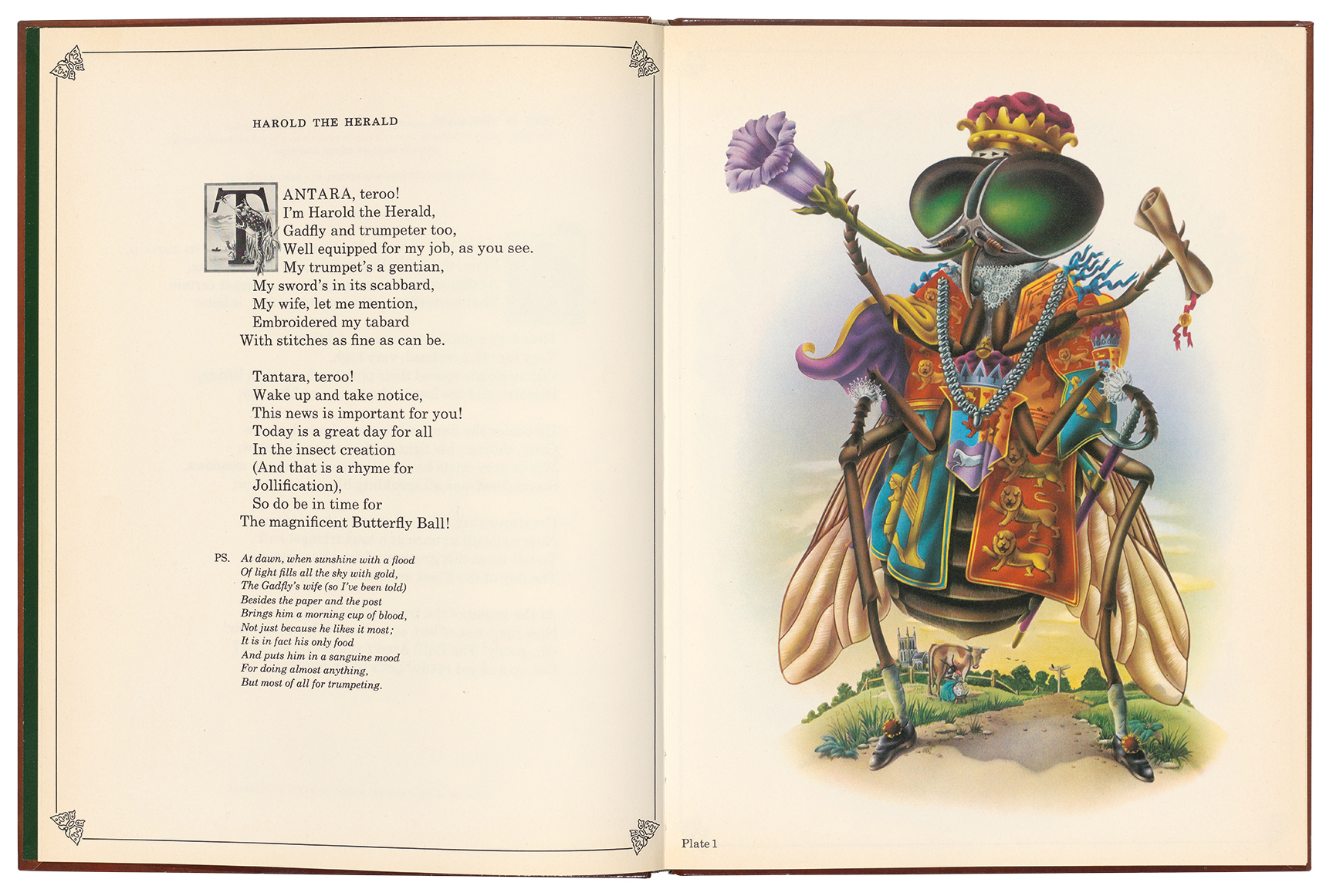
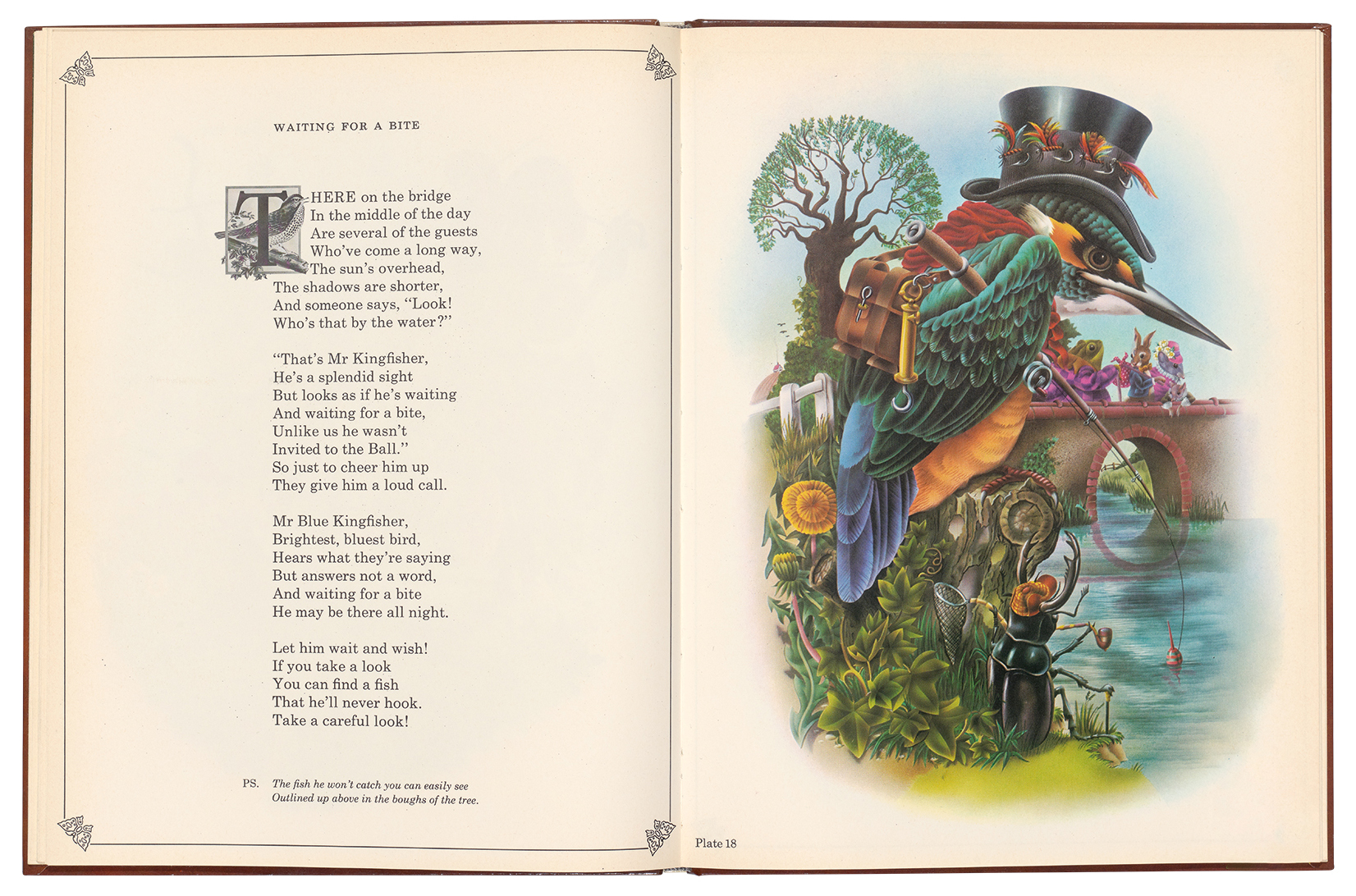
The Butterfly Ball and the Grasshopper’s Feast (1973) was the first of five children’s books on which Aldridge and Willock would collaborate for over a decade.
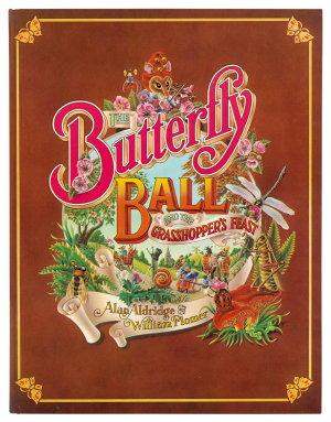
After the demise of Ink Studios, Aldridge had his eye on producing a book, which became The Butterfly Ball and the Grasshopper’s Feast. Published in 1973, it became one of the biggest-selling children’s books of the time, translated into ten languages and with over 250,000 copies flying off the shelves. Willock recalls that in order to produce a single full page illustration for The Butterfly Ball, it was not unusual for him to work on it twelve hours a day for three weeks, because of the complexity and the masking of so many tiny areas for airbrushing. By my calculation Willock spent 180 to 200 hours on each full page image. Based on his £4000 yearly salary in 1972 and working a 60-hour week, an average for Willock, he was receiving around £9.60 per hour in today’s money.
Spreads from The Butterfly Ball and the Grasshopper’s Feast (1973).
By this time, Aldridge had bought and settled himself into a 30-room vicarage in Norfolk with his young family and was planning a second book. Meanwhile, Willock had to set up a small workspace in his modest two-bedroom semi in Bromley, where he has lived for the past 50 years with his wife Hilda (who sadly died in 2021). Now living 130 miles apart and long before the internet, the pair would meet every three weeks at the Museum Tavern in the shadows of the British Museum in Bloomsbury. When Willock arrived with his portfolio, Aldridge would always be tucked away smoking in a corner, where he could view Willock’s latest work away from prying eyes – always a concern for the secretive Aldridge.
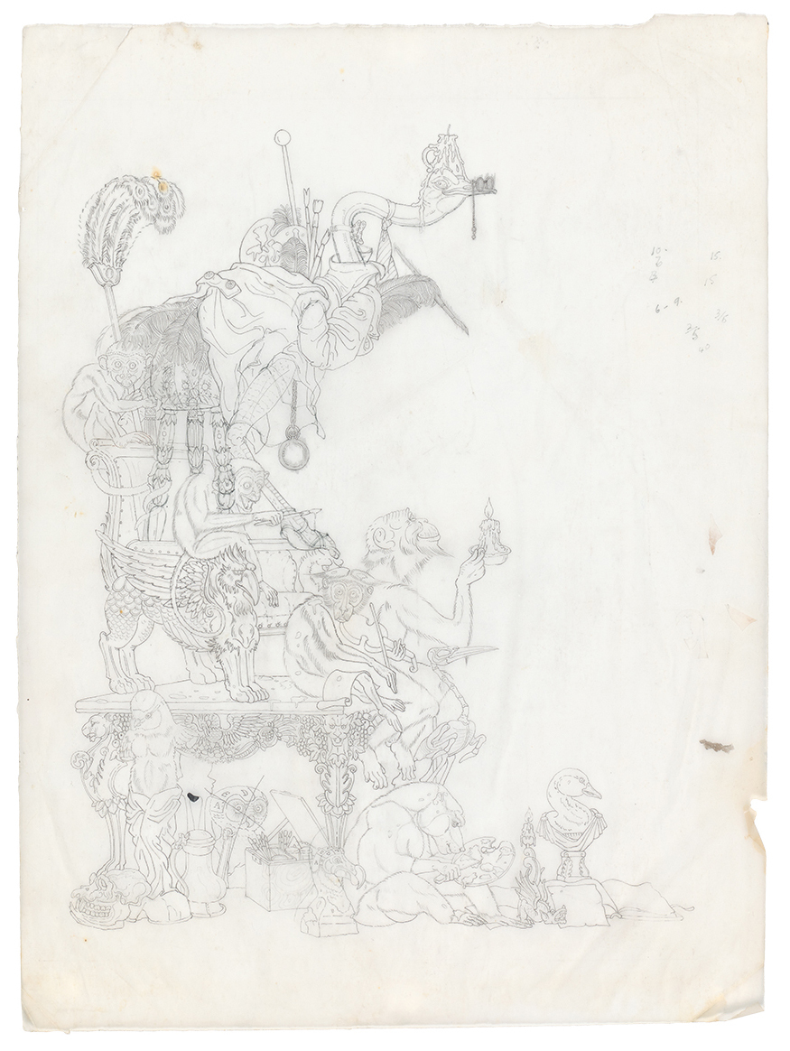
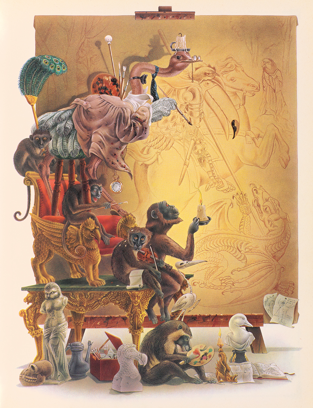
The Lion’s Cavalcade (1980), shows the unique working practice of Aldridge and Willock. At his home in Norfolk, Aldridge would piece together the skeletal design in pencil of each illustration, using references from a range of image sources, which he would trace using a Grant projector. When this was completed, Aldridge would meet up with Willock in London, always at the smoke-filled Museum Tavern. The pencil tracing would be handed over to Willock, who, in turn, would hand Aldridge his finished airbrushed artwork from their previous meeting. So it would go on until the book was completed. These ‘before and after’ images demonstrate the astonishing amount of work Willock put into these artworks.
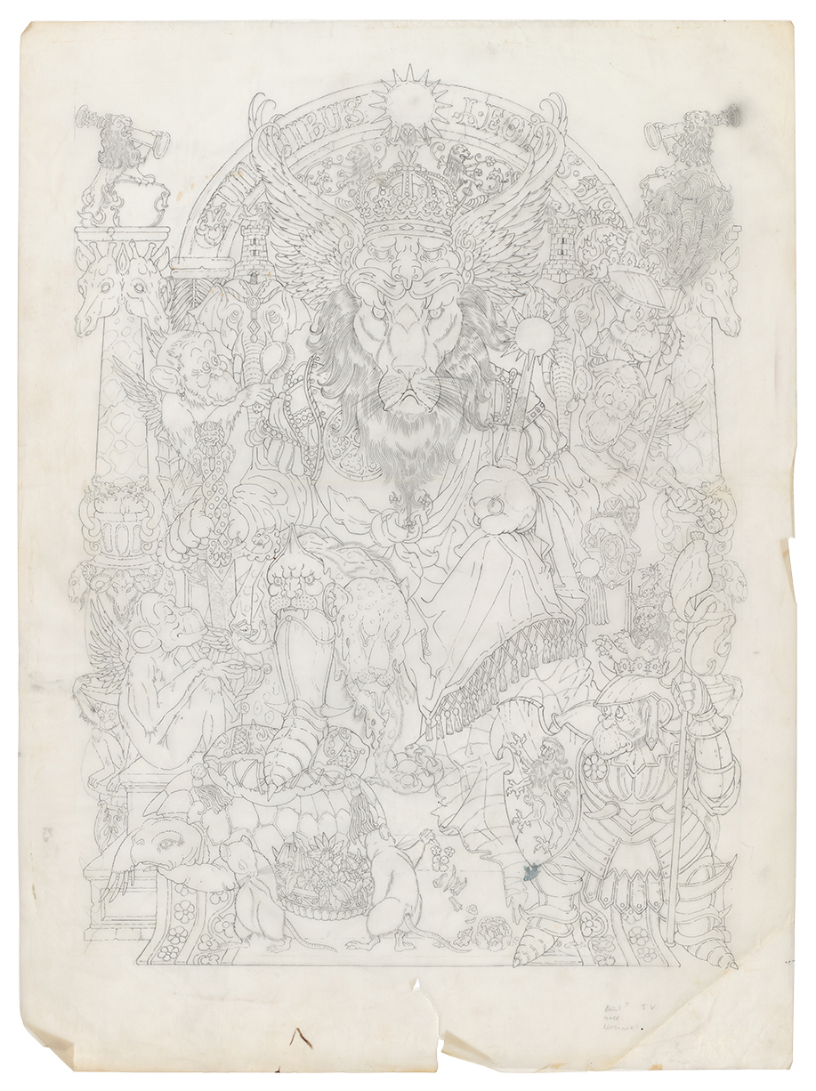
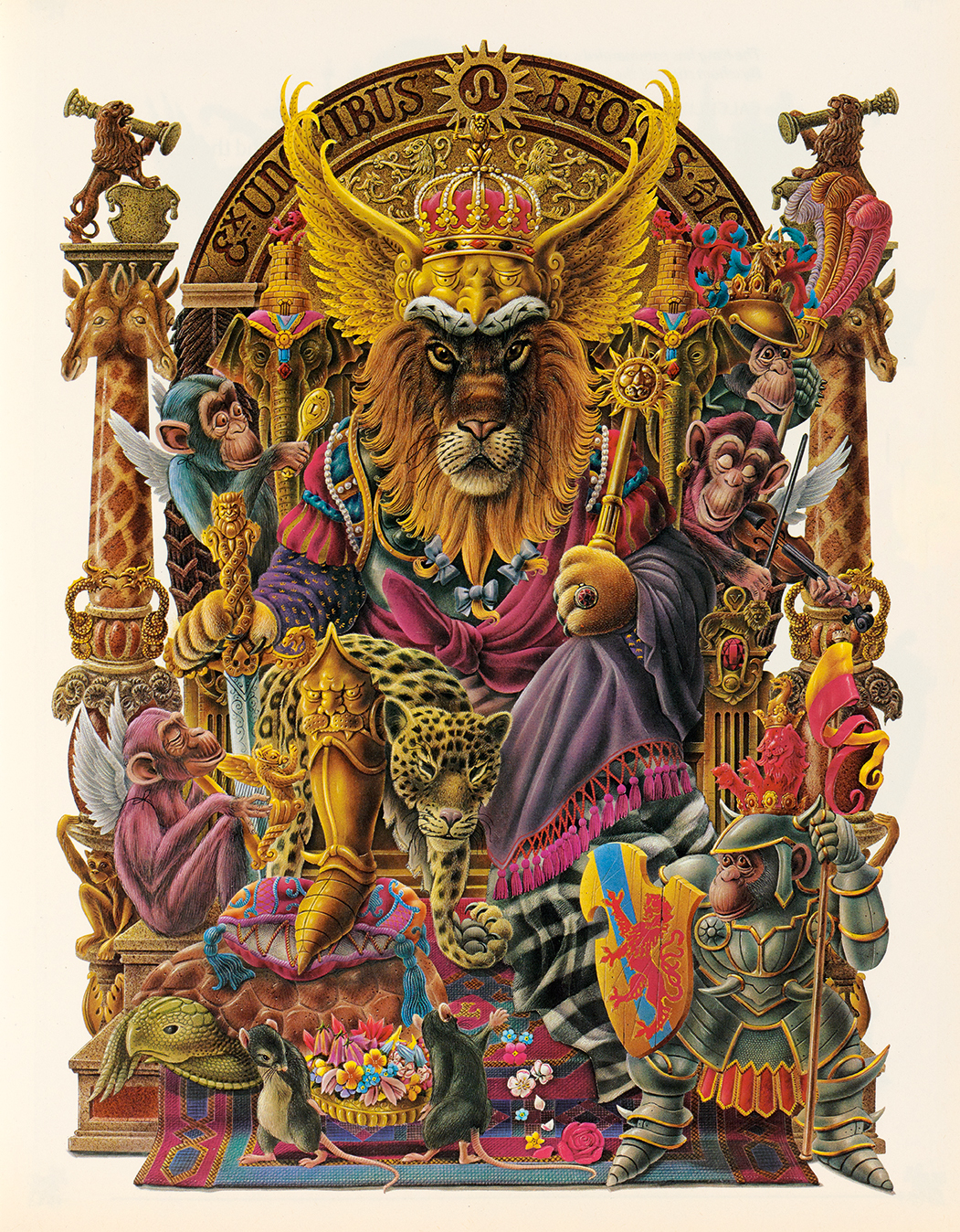
This is the rhythm they continued for all of their collaborations, including the album cover for Elton John’s Captain Fantastic and the Brown Dirt Cowboy (1975) and three further books: The Ship’s Cat (with author Richard Adams, 1977), The Peacock Party (1979) and, finally, what Willock considered their best collaboration, The Lion’s Cavalcade (1980). It was only on the last two books that Willock had a credit on the front cover, and it was half the size of Aldridge’s. Even then, it never quite explained what Willock did. But publisher Tom Maschler of Jonathan Cape did know. In a letter to Willock in August 1977, which included a copy of The Ship’s Cat, Maschler wrote: ‘May I take this opportunity of congratulating you once again. It seems almost impossible that your work should get better and better and better and yet that is just what is happening.’
Over ten years, Aldridge and Willock continued their clandestine Museum Tavern meetings. Aldridge would hand over his tracings to Willock, and they would go their separate ways. Once home, Willock would rework the often overly complex Aldridge pencil tracings. There would be no indication of colours, as that was Willock’s forte. Aldridge’s tracings often included inspiration from the works of his heroes: the nineteenth-century painter and Bedlam inmate Richard Dadd and the fifteenth-century Hieronymus Bosch. Three weeks later, the two would meet again in the Museum Tavern, and Willock would quietly unveil another staggering example of his masterful skill.
Aldridge got more immersed with Elton John and John’s lyricist Bernie Taupin on the idea of an animated version of their Captain Fantastic creation. Aldridge moved to Los Angeles, and collaborations with Willock ebbed away, leaving Willock to look for work elsewhere. It came from his old employer, The Sunday Times, via Misstear, who had been with The Sunday Times Magazine for many years and was now its art director. Willock produced a flow of wonderful header illustrations for a whole series of topics for her, from health to diet and DIY to electronics.
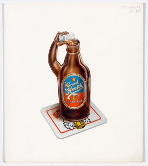
Post-Aldridge, Willock set about finding work. A stream of delightful commissions came from Gilvrie Misstear when she was art director at The Sunday Times Magazine. She would send Willock articles on a range of topics and leave him to come up with ideas, such as this thirsty beer bottle, a small banner heading for a series called ‘ABC Diet and Bodyplan’, ca. 1984.
‘I would show Harry the copy and he would produce a meticulous piece of work, entirely his own ideas,’ she recalls. ‘I think he enjoyed this freedom. I knew that Alan took all the credit, and tried to keep Harry’s enormous input secret. This annoyed me greatly and I along with many others talked to him about this. It was so unjust. Alan was so flamboyant, talked the talk, whereas Harry was the quiet, extremely talented, hard-working man behind the scenes. [Alan] was the fixer, got the commissions, but he would not have had the fame without Harry. This was obvious when Alan moved to LA. Harry was irreplaceable.’
At the suggestion of a friend, Willock was then persuaded to take on a one-day-a-week teaching post at Kingston School of Art. Over a period of fifteen years, Willock saw many of his ex-students surface in influential design companies, and he was often commissioned by his former young charges when they were fully fledged in their own right. He found this particularly touching.
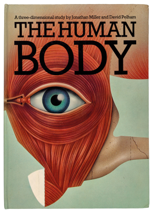
The Human Body (1983) by Jonathan Miller and David Pelham was an intricate 3D pop-up book. Pelham was keen for Willock, who he knew from his own Penguin years, to illustrate all of the body parts, internal bones and complex network of organs in specific segments to work as part of the pop-up paper engineering. The book was a triumph and earned a D&AD Silver Award in 1984. It cemented Pelham and Willock’s collaboration on many more projects.
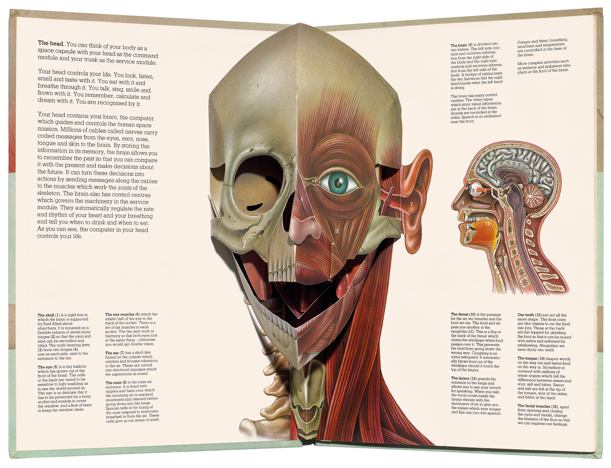
In the early 1980s, a welcome opportunity came from ex-Penguin art director and then Pentagram partner David Pelham. He asked Willock to collaborate with him on the book The Human Body (1983), an ambitious, sophisticated educational pop-up book written by Jonathan Miller. Pelham had found a basement studio on Great Titchfield Street where he, Willock and Miller could work together. Pelham recalls that this was a wonderful time and great fun. He was astonished at Willock’s masterful work, and the ingenious result picked up a D&AD Silver Award in 1984.
The Human Body (1983).
This led to more collaborations between Pelham and Willock. The Facts of Life (1984) and The Universe (1985) were two more highly successful pop-up extravaganzas. Pelham had become the doyen of pop-up books and moved to Los Angeles to take up the post of creative director of Intervisual Books, founded in the 1960s by Waldo Hunt. It became the world’s leading company in the paper engineering of pop-up books and was responsible for the production of most of Pelham’s 30 titles to date. While there, Pelham invited Willock to the city to collaborate on the production of his first children’s book Sam’s Sandwich (1990). Willock found working with Pelham a fantastic experience.
In 1994, Willock was playing his regular game of squash at the local sports club when he suffered a heart attack. Luckily, he survived, but he was advised to change his lifestyle and cut out stress. He had never thought of himself as being under stress, but it soon became clear to him that the years of tight deadlines and the exacting nature of his technique, sitting intensely hour upon hour, must have taken its toll. He continued for a few years working on smaller, less demanding projects. At the same time, the illustration world was changing, and demand for airbrushing had ebbed away. In the late 1990s, Harry finally put away the airbrush for good.
Aldridge died in 2017, aged 74, following the onset of a rare form of Alzheimer’s. Looking through the various obituaries from the time, there is not one mention of Willock, and yet he had worked on virtually all of the artwork featured in the tributes. There is no doubt that Aldridge was a highly imaginative and inventive man, but, sadly he never had the inclination to shine a light on and share his success and rewards with the very man responsible for turning his imaginings into magic on the page.
As Willock was descending the stairs to leave the Design Museum on that overwhelming evening back in October 2008, he bumped into Pelham. As they were chatting on the stairway, Aldridge appeared. Pelham recalls the startled look on Aldridge’s face. Turning to Willock, Aldridge said: ‘What are you doing here?’ Pelham’s view of that odd encounter was that Aldridge lived in constant fear that his secret might one day be revealed – a view echoed by many of the contemporaries I have spoken to in researching this feature.
Pelham, who knew Aldridge well, has a forthright view of the relationship. ‘Alan’s supreme gift was that of self-promotion,’ he says. ‘An immoderate egoist and naive fantasist, he took all the plaudits for the technical brilliance and achievements of his long-term associate Harry Willock, an outstanding master of the airbrush – who himself was airbrushed out of the picture by Aldridge. Harry didn’t simply follow, he contributed a good 80 per cent of the magic.’
Now 88, Willock is quietly philosophical about those heady days with Aldridge. Yes, he could have been more forceful and demanded that his key role in the relationship be credited and rewarded financially, but this is not in Willock’s nature. He feels blessed to have spent his life doing something he loved, and he is proud of the body of work he will leave behind. So I hope that this story cements the true stature of Willock’s involvement during his creative partnership with Aldridge and that he is, at last, given the acknowledgement and praise he richly deserves.
Mike Dempsey, graphic designer, writer, blogger, broadcaster, London and Dorset
First published in Eye no. 103 vol. 26, 2022
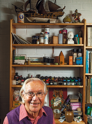
Portrait of Harry Willock by Philip Sayer, 2022.
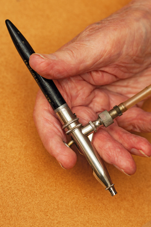
Harry’s airbrush. Photo by Philip Sayer. Read the side bar ‘Harry’s airbrush’.

Eye is the world’s most beautiful and collectable graphic design journal, published for professional designers, students and anyone interested in critical, informed writing about graphic design and visual culture. It is available from all good design bookshops and online at the Eye shop, where you can buy subscriptions and single issues.