
Spring 2010
Deep in the archives
Contemporary type designers Christian Schwartz and Paul Barnes select some historical type specimens that excite and intrigue them.
Wilson 1789
Some typefaces defy the classification of time and place. Wilson’s Roman of 1789 is a perfect example; it has features of an old style and a transitional, but it looks neither like a Caslon, nor a Baskerville. Whoever cut the typeface had a sureness of touch that transcends time, a masterful demonstration of subtlety. It is a typeface that has inspired many revivals, and if one looks closely at the ubiquitous Georgia, one can see that some of the DNA of Wilson’s typeface lives on.
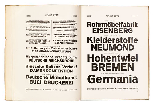
Venus, Bauer 1907-27
With each new development in typesetting, huge numbers of typefaces get left behind. You can see them in type specimens of old, but for the main part they remain artefacts to look at rather than typefaces to use. Venus is such a typeface. Issued by the Bauer type foundry, the sans serif was used widely in Germany in the early twentieth century: many early practitioners of the New Typography used it, not necessarily by choice, but through the printers’ limited selection. Coming in a wide range of weights and widths, it has a warmth and charm, but also eccentricity (note the unusually high cross bar of the ‘E’ and the small bowl of the cap ‘R’). Sadly it is now a shadow of itself, with a mere handful of weights available.
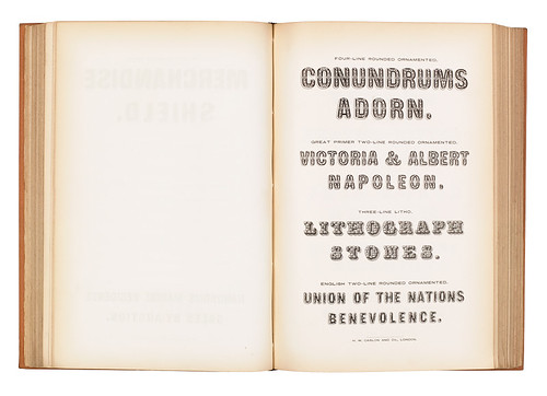
Caslon Rounded Sans Serif 1836
There are few new ideas in type design. Look back far enough, and there is a good chance you will find the idea done before. This rounded sans serif, which dates back to 1836, is a good example. This came from the endless variations on the basic Modern forms: take a serif, make it into a slab; remove the slabs, make it a sans; condense it, make it a condensed sans; round it, make a rounded sans; inscribe a line, make a ‘shaded’; add some ornaments, make an ornamented; and so on. These days we can do such things quickly, but then it had to be done manually.
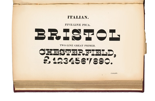
Caslon’s Italian ca. 1821
The early nineteenth century was a remarkable time in typefounding. New innovations appeared with great rapidity: fat faces, Egyptians, sans serifs, Clarendons. This Italian – which first appeared in 1821 though perhaps earlier in France – is perverse. It follows all the conventions of contrast in a fat face, but in reverse. Fat becomes thin, thin becomes fat, but like the Wilson, it is done with sureness and confidence: the cap ‘S’ is a perfect example.
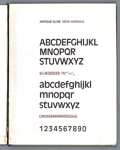
Antique Olive, Excoffon 1962-66
Roger Excoffon’s Antique Olive is a perfect example of a typeface that has suffered from its context. It is by no means a bad design – in fact, it is a brilliant piece of work – but it has become so over-used (and often badly) that it is ripe for rediscovery. A deliberate reaction to the evenness of Univers and Haas Grotesk, Excoffon emphasised each letter’s unique character, demonstrating in the process how a cohesive and highly legible whole can be made up of unusual parts (‘a’ and ‘t’ are quite distinctive, but even the ‘O’ is strange – the type has a top-heavy feel). Gerard Unger once noted that Excoffon’s typefaces became a de facto corporate identity for twentieth century France, and even though Air France recently retired his logo, his mark on the French visual environment is still highly visible.
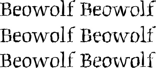
Beowolf, LettError 1990
At 3.15pm on Saturday 1 September, 1990 in Oxford Town Hall, LettError’s Erik van Blokland and Just van Rossum introduced the world’s first truly random typeface to a bemused audience. Beowolf looks different each time it is printed, by cleverly hijacking the printer’s Postscript interpreter. Turning the notion of digital perfection inside out, it could only ever exist in a digital environment. Van Blokland said at the time: ‘The idea was there, we just needed a font to host it.’ Radical as it is, Beowolf’s underlying forms are rooted in the Dutch tradition and the teachings of Gerrit Noordzij, creating a tension between the structure and surface.