Summer 2021
Visual systems of life and death

various designers
uncredited designers
John Burn-Murdoch
Caroline Nevitt
BBC News data visualisation
Felippe Rodrigues
Irene de la Torre
Scott Jarvis
Sarah Rainbow
Harriet Agerholm
Ed Lowther
Audrey Carlsen
Yaryna Serkez
Lazaro Gamio
Karen Yourish
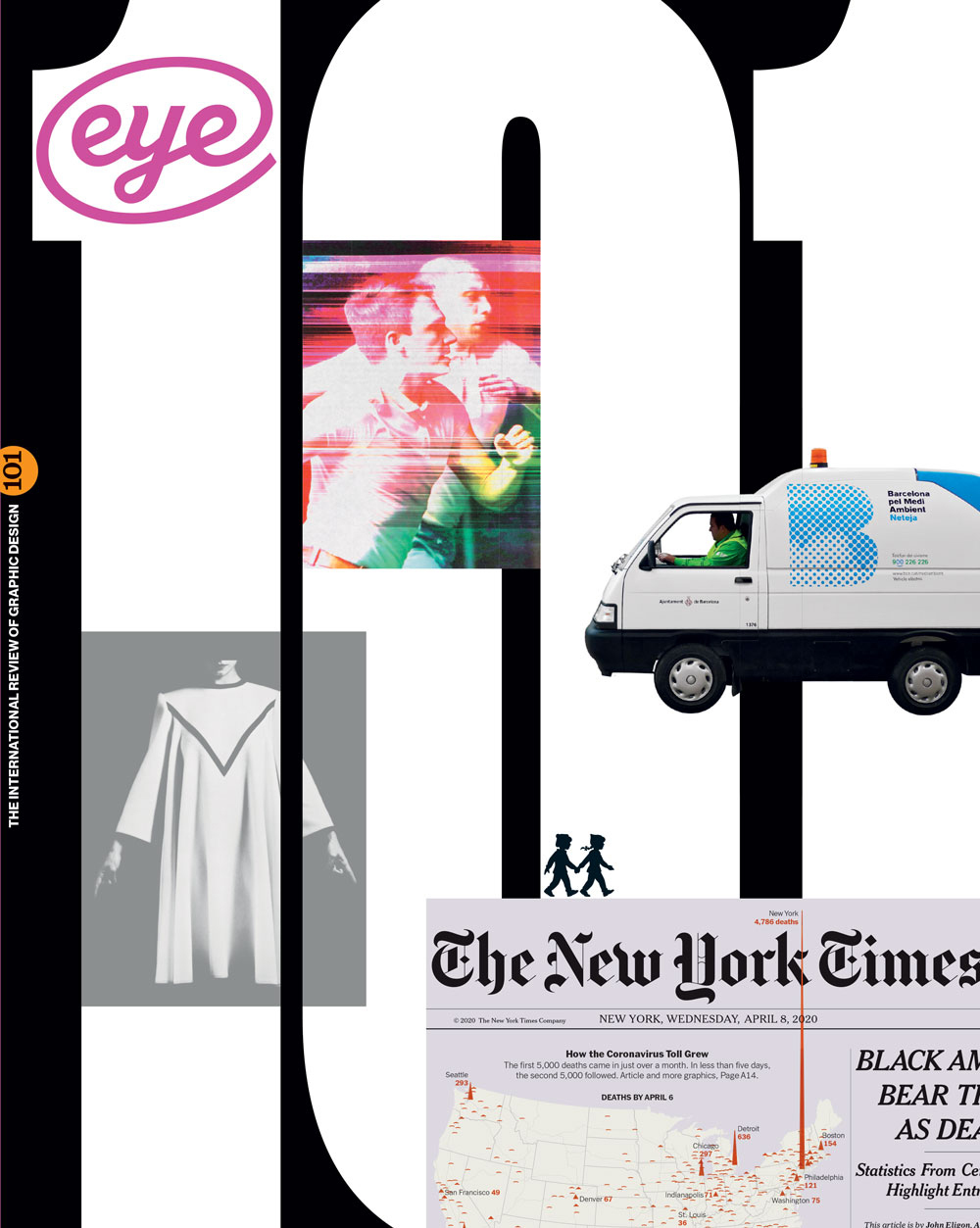
In this appendix to ‘The pandemic that launched a thousand visualisations’, Paul Kahn outlines more of the dynamic visual systems that help our understanding of Covid-19

‘The curve of a line, the spikes of a histogram and bubbles on a map have become the brush and the background upon which we see our world changing,’ writes Paul Kahn in his Eye 101 article, ‘The pandemic that launched a thousand visualisations’.
Below are more examples of data visualisations from the COVIC collection which show the many different methods used to depict the spread of the virus worldwide and the effects of the vaccination programme.
Coronavirus: How can we imagine the scale of Covid's death toll? Infographic by the BBC Visual and Data Journalism team: Irene de la Torre, Scott Jarvis, Sarah Rainbow, Catriona Morrison, Harriet Agerholm, and Ed Lowther. Above: Still from an animated flow chart in The South China Morning Post.
The BBC team designed an animated graphic that drew a growing stem of cases from which the circles of monthly death counts fanned out into a spiral. The result is an asymmetrical pattern resembling a flower, with the light smear of circles representing the rise and fall of fatalities.
Tracking Covid-19 excess deaths across countries. Interactive chart for The Economist.

The Economist is known for its Daily Chart, but this interactive example presented the concept of excess deaths compared across countries, with a switch between viewing absolute and proportional numbers.
Which States are Leading in the Race to Get Their Populations Vaccinated? Bubble chart by Audrey Carlsen.
Audrey Carlsen’s bubble chart in the NPR’s website shows for each US state the relative population by bubble size and proportion of people vaccinated by position on the x-axis. The user can view the position for ‘one dose’ and ‘fully vaccinated’.
Which States Have Vaccinated More of Their Population? Cartogram by Audrey Carlsen.
The same NPR vaccination tracker opens with a cartogram, de-emphasising the relative population and area of each state. The three-level colour scheme exposes regional similarities.
Major Coronavirus Vaccination Barriers. Scrollytelling cartogram by Yaryna Serkez.
Yaryna Serkez’s cartogram in the New York Times also emphasises regional trends using small multiples of five-pointed radar charts and colour to compare vaccination barriers. Animation is used to annotate the different issues.
See How the Coronavirus Death Toll Grew Across the U.S. Scrollytelling triangle map by Lazaro Gamio and Karen Yourish.
Lazaro Gamio and Karen Yourish’s triangle map of the US death count appeared online as a time series, dramatically emphasising how quickly death numbers grew in large cities. New York’s count expands out of the frame.
Coronavirus: The Story of New Zealand’s Covid-19 Lockdown, in Graphs. Scrollytelling graphs by Felippe Rodrigues.
Felippe Rodrigues’ story in Stuff of how New Zealand flattened their infection rate presents a masterful tour of curve permutations. His animated line graphs demonstrate the result of linear and logarithmic scale and show what ‘flattening the curve’ actually looks like.
Visualising Hong Kong’s Biggest Covid-19 Super-Spreader Event. Animated flow chart by The South China Morning Post.
This animated flow chart from The South China Morning Post draws lines to visualise how dancers who visited several Hong Kong social dance club spread their infection to a large group. The story ends with a bubble map showing the location and number of cases at each club.
These examples and thousands more have been collected and categorised (by subject, visualisation type, publisher, and date) in COVIC. The entire collection will become available for research and teaching purposes in the fall of 2022.
Paul Kahn, information designer and lecturer at Northeastern University, Boston
Read Paul Kahn’s article ‘The pandemic that launched a thousand visualisations’ in printed form in Eye no. 101 vol. 26, 2021
Eye is the world’s most beautiful and collectable graphic design journal, published for professional designers, students and anyone interested in critical, informed writing about graphic design and visual culture. It is available from all good design bookshops and online at the Eye shop, where you can buy subscriptions and single issues.

