Opinion


Rick Poynor
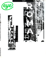
Two high-profile fine art magazines treat themselves to typographic makeovers. Critique by Rick Poynor

Book design,
Typography,
Monitor,
Steve Hare
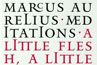
Penguin uses design to revitalise its back catalogue with Great Ideas and a revived Reference Library
Peter Hall
Agenda Summer masterclasses devoted to developing design basics are popular, but limited: after running a…
Features
Alice Twemlow
Excavating the history of lettering gives this New York foundry a contemporary edge
Phil Baines, Catherine Dixon
Nicolete Gray’s 1960s snaps inspire a re-examination of the capital’s streetscape
Jessica Jenkins
For a time, traces of Berlin’s prewar past could be glimpsed in fragments of shop signs
Simon Esterson
The AR’s Manplan is a tactile reminder of a time when magazines lived dangerously
Ewan Lentjes, Wigger Bierma
With visual culture triumphant and content marginalised, how can typography be defined?
Matt Soar
Why is Mistral the typeface of choice for so many of Montréal’s small businesses?
Roger Sabin
Turning Python’s TV humour into cold print required some very serious graphic design
Katherine Gillieson
The appearance of Britain’s fried chicken joints are a uniquely British take on an American theme
Ivan Chermayeff
Collected by Ivan Chermayeff, Chermayeff & Geismar Inc., New York.
