
Feature: Typography
Type as entertainment
Why Not Associates are the wild boys of the British typographic scene … How do they get away with it?
Word art
In post-war art the visual and the literary have blurred. Typography is the point at which they meet
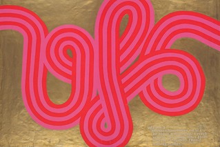
Day-Glo mind blow
Psychedelia hit late 1960s London in an explosion of silk-screen colour
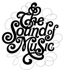
Up close and tight
The legendary Herb Lubalin brought humour, sensuality and a contemporary flourish to complex typographic arrangements.
The United Nations of Type
Look beyond the confines of the Latin alphabet, urges Johannes Bergerhausen of Decodeunicode
Back to basics in Basel
Basel School of Design's First Summer Program was a life-changing experience
Sense of place
Three new typefaces for local institutions draw on Sheffield’s cultural and typographic history
If the image of the text … has more value than its content …
With visual culture triumphant and content marginalised, how can typography be defined?
Face lift: new cuts at The Times
When technological developments at The Times demanded a change in the newspaper’s typography, a brand new typeface was commissioned, prompting a new analysis of the font’s long and complex history
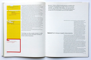
Read me! Part 2. Literacy in graphic design education
‘Relativist’ debates within the profession have extended to the way design and typography are taught. If there are no agreed standards – no absolutes within design – how can one teach? Are we heading towards a state of ‘institutional ignorance’ as tutors have less knowledge to pass on to their students?